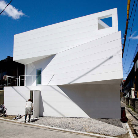
Japanese architects Suppose Design Office have completed a residence in Hiroshima, Japan, with offset floors allowing natural light from above to penetrate each level.
The house can can be naturally illuminated while maintaining privacy on a small, crowded plot of land.
The interior comprises a series of terraces, each shaped differently according to its intended purpose.
See more Dezeen stories about Suppose Design Office:
House in Matsuyama
House in Nagoya
House in Saijo
House in Jigozen
House in Sakuragawa
House in Kamakura
Here is further info from Suppose:
--
House in Minamimachi
During the process of designing for a small plot of land, there are a lot of times in which the form of the building is steered by legal constraints.
If you are thinking of how you can have the most floor space, the outer shape of the building is automatically decided by how the permitted ratio of square footage to property size, so the architectural design comes out of the number of stories built just to increase the floor space.
Here, I’m thinking about the possibility of space that can be made by subtraction.
This building was made to slightly exceed its allotted coverage ratio, so each floor fluctuates in shape.
The sections that slide out function as lighting design elements, bringing in the outside environment.
I’ve changed the shape of each floor freely according to its intended purpose and features, turning them into spaces with a sense of distance and perspective, maintaining privacy even in crowded urban areas where housing units are close together, creating a bright, well-lit living space.
Before you know it, design that starts from the rules, from the legal restrictions, can become stronger restrictions than the rules.
By starting the design away from the legal constraints, by designing the way we start to plan, we can have buildings that possess a degree of freedom. Just by changing the bottom line a little, I want to pinpoint the things we’ve overlooked, the elements of richness, and design richness around that subtraction.

