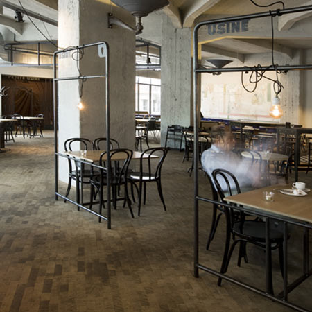
Grand Cafe Usine by Bearandbunny
Amsterdam designers Bearandbunny have completed the interior of a cafe in a disused factory in Eindhoven, the Netherlands.
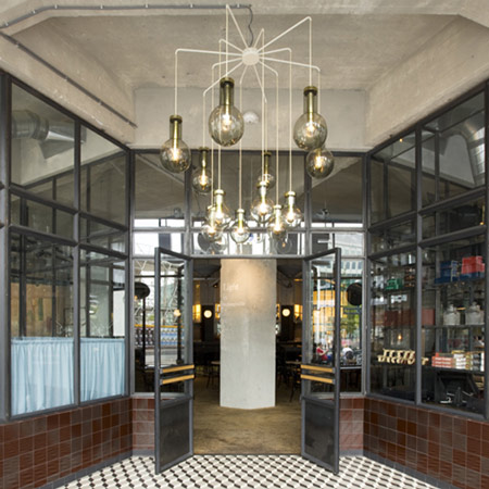
Called Grand Cafe Usine, the cafe is located on the ground floor of the building where Philips light bulbs were once produced.
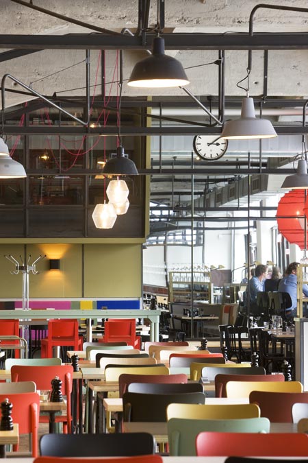
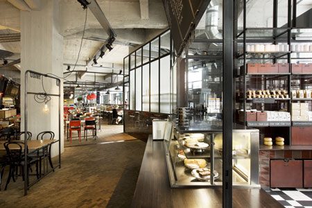
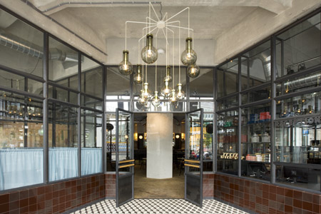
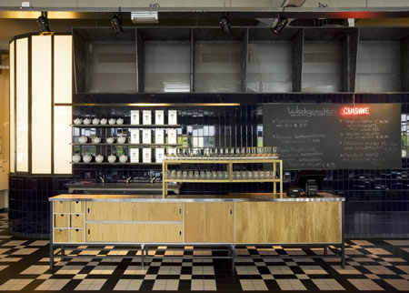
Bare concrete walls and tiled floors form the background to a collection of different lamps, with trailing flexes wound around metal frames that divide the space.
Bearandbunny was founded by Design Academy Eindhoven graduates John Maatman and Carlijn Kriekaard.
Photographs are by Arjen Schmitz.
Here's some more information from the designers:
--
The former Philips light tower in Eindhoven is now host to Grand Cafe Usine which is based on the ground floor of this iconic building.
In the early days light bulbs for Philips where produced here. Nowadays the building is one of Eindhoven's well known monuments.
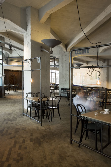
An old Philips poster with the caption: ‘Les plus grandes usines du monde’ was the inspiration for the restaurant. For the concept it was changed into: ‘Usine le plus grand cafe du monde.’ A grand cafe for everyone!
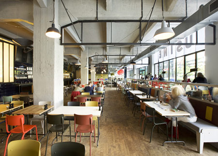
Project Usine concerned the development of an overall concept where the menu, the food as offered, the service as desired, the opening hours, the graphic language and the interior should all bind together.
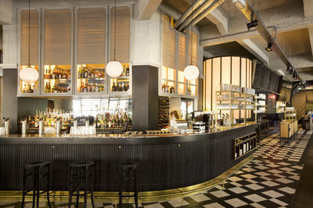
Bearandbunny therefore first visualised the moments of the day and analysed Usine’s consumers. With these analysis as a base we created the different zones in the restaurant; entrance, kitchen, bar, cafe, brasserie, restaurant, function room, childrens corner, shop, smoking area, office, toilets, storage and the terrace.
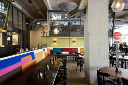
When making the lay-out Bearandbunny started by planning the toilet area; we believe that enough space and attention for this particular zone emphasizes the level of service as provided.
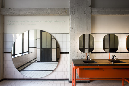
A large entrance was created to liaise with the existing architectural language and to get a strong sense of atmosphere. Big windows characterise the architectural aspects of the building and guarantee the interior space has a strong focus towards the outside. However, the raised flooring near the windows creates an intimate atmosphere indoors.
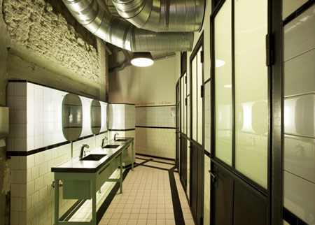
When we refined the details and selected the materials, our main goal was to make the contemporary interior fit flawlessly in the structure and characteristics of this characteristic building.
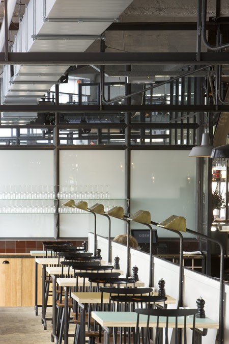
By combining old and new together in a natural way an atmosphere was created as if Usine has been there already for several years. Bearandbunny was responsable the overall part of the design of the furniture.
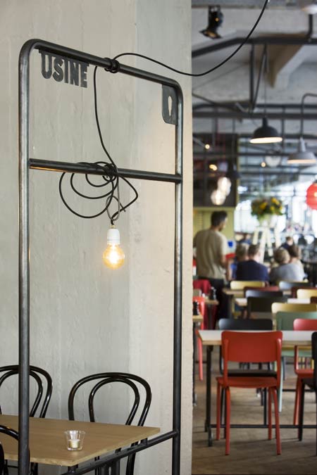
We were also responsible for the graphic design. We created the name, the logo and all other graphic elements, varying from menucard to tea labels.