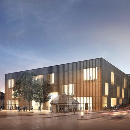
Kunsthaus Zurich Extension by David Chipperfield Architects
David Chipperfield Architects have released new images of their design for an extension to the Kunsthaus Zurich in Switzerland.
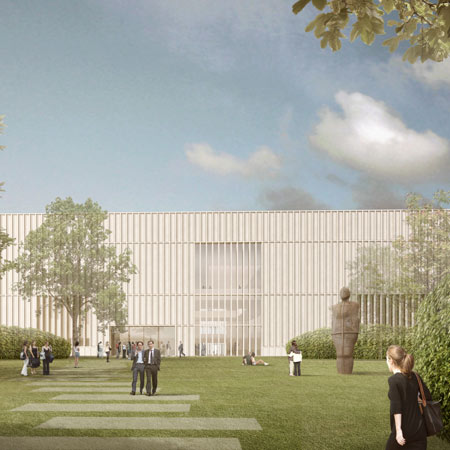
Having won a competition to design the extension in December 2008, the architects have now altered the design according to the jury's feedback.
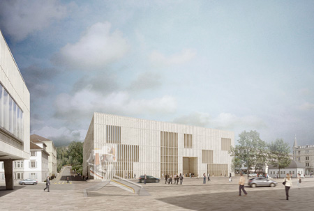
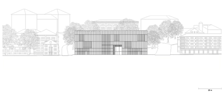
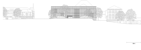
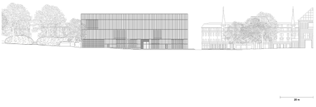
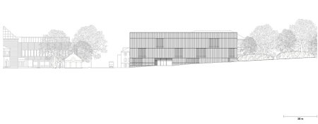
The building will have two main entrances and two side entrances, making it accessible from all sides and improving access to the main hall.
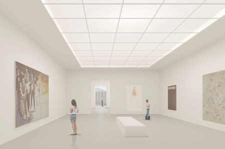
The overall size of the structure has been reduced and outdoor exhibition spaces increased.
See all our stories about David Chipperfield Architects in our special category.
All images © David Chipperfield Architects.
Here's some more information from David Chipperfield Architects:
--
Winning project for the Kunsthaus Zürich extension optimized
David Chipperfield’s winning design for the Kunsthaus extension has been optimized in line with the jury’s recommendations for its function within the fabric of the city as a whole, and with regard to its internal organization.
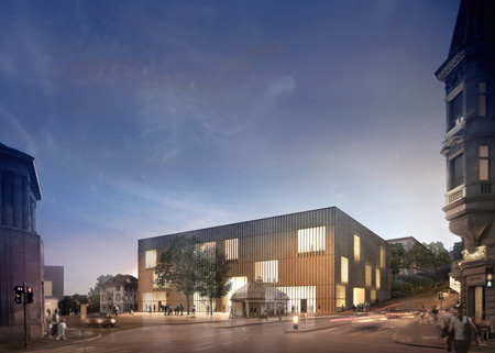
The revision comprises a managed reduction of the building’s volume, a more precise location on Heimplatz, greater openness to the extension’s surroundings on all four sides, and an improved art garden.
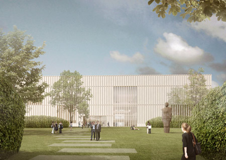
During the first half of 2009, the ascetic elegance of the design submitted by David Chipperfield Architects, which had been chosen by the jury as the winner of the competition for the Kunsthaus extension in December of 2008, was optimized in line with that body’s recommendations.
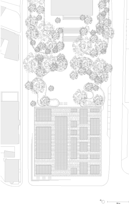
The project has now been revised with respect to its volume and the extension’s inclusion in its surroundings, and has seen the accessibility of its central hall improved, along with the conception, topography and design of the art garden. At the same time, the revision process has also clearly vindicated the jury’s choice, with the winning proposal’s basic architectural concept remaining intact.

In order to embed the Kunsthaus extension more satisfactorily into its environs, both its footprint and its above-ground volume have been reduced by some 6%, the latter to a total of 79,000 m3. The planned breadth of the building has also been reduced, in this case by 2.8 m; and the corresponding enlargement of the walkways running along its sides has eased pressure on the structure’s exterior space, in particular along Kantonsschulstrasse and Rämistrasse.

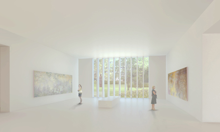
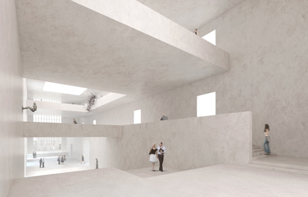
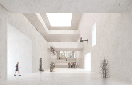
A shift of 1.4 m to the north and the abridgement of the structure’s length by the same amount, furthermore, has made it possible to extend the area immediately outside its main entrance on Heimplatz, while the location’s excellent definition has been preserved, along with the spatial tension between the planned building and the existing Kunsthaus. The plan now includes two main entrances and two generously proportioned side entrances. The building is to be open and conveniently accessible on all four sides. The central hall has been reduced to its essential scope: now asymmetrically laid out and with increased permeability, it will better serve its function as a site for encounters between art and the public.
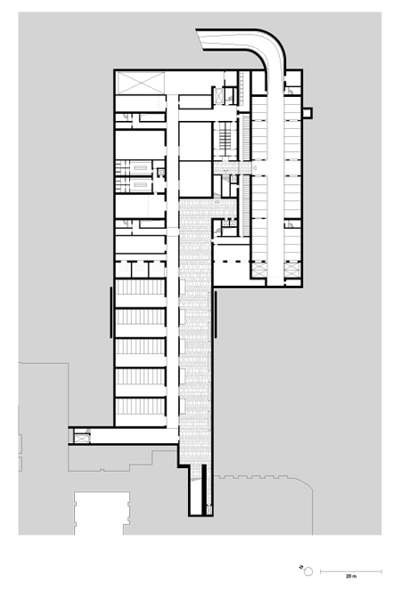
While the building’s planned exhibition space has been only slightly reduced, its workshops for art appreciation have been significantly re-dimensioned. The space available for exhibitions, meanwhile, and the dimensions of the banquet hall remain virtually untouched. The proportion of the façade reserved for windows has increased, and the vertical reach of those windows, deliberately extended beyond the horizontal bands comprised by its façade, gives the building a more abstract, less historicizing look. Its size and positioning will allow the structure to enter into dialogue with other prominent buildings along Rämistrasse.

A lower location for the delivery area has allowed the garden level to be sunk. A single-run stairway now suffices to connect the garden to the hall, and to enhance the optical dialogue between inside and outside – on the side facing the cantonal school as well as that turned toward the existing Kunsthaus. The new design will make it possible to integrate the inventoried grounds of the old cantonal school in the green space planned for the Kunsthaus extensio
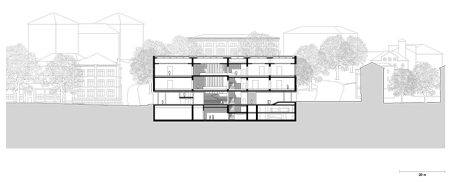
The garden thus takes on the function of a hub, organically connecting the Niederdorf neighbourhood and Heimplatz itself with the university district further up the slope.The revision addresses all of the recommendations made by the jury.
The partners and future principals of the Kunsthaus extension – the Zürcher Kunstgesellschaft, the city of Zurich and the Stiftung Zürcher Kunsthaus – have now been presented with a better project, greener and more open: in a word, feasible. At the end of October the partners will establish a project corporation.
At the political level, the next steps in the project process are to raise the extension’s development loan, planned for this legislative period; to elaborate a design plan for approval by the parliament; and, provisionally scheduled for 2010/2011, to put a credit facility to the vote by the electorate of the city of Zurich. The total projected cost, adjusted for the rise in building costs and including municipal reserves, is estimated at CHF 180 million (based on the construction cost index for April 2008).
Financing, in the form of a public-private partnership, includes the CHF 75 million already pledged by the Zürcher Kunstgesellschaft. Until the extension is ready for use (the goal is 2015), the Zürcher Kunstgesellschaft will continue to raise funds among private sponsors, foundations and corporations. For the city of Zurich, the intention to expand is consistent with the overriding political and cultural interests of its urban development department. The project, which is on the agenda for the current legislative session, meets the objectives of the 2000-Watt Society, while the Kunsthaus notes that the revised design fulfills its core requirements for use of the structure.
The building is to be devoted to the exhibition of art created since the 1960s, and will make possible a range of shows – of new media, prints and drawings, and photography, as well as pictures, installations and sculptures – and thus offer an exciting contrast with the classical format of the galleries intended for the private Bührle Collection. When the Bührle Collection is installed in its new home, finally, the Kunsthaus will see its collection of classical modernism complemented by a new speciality: French painting and Impressionism. The project's aims and progress, the latter updated continuously, can be reviewed at www.kunsthaus.ch, where links provide access to background information, including the experts’ report and the outcome of the requested revision. New renderings, current floor plans and blueprints can be downloaded from the press page. By the end of the year, ‘The Idea’, a brochure published in 2008 setting out the extension’s intended use, will be supplemented by ‘The Form’, an illustrated guide to the exterior look of the new building and to its internal organization. The new brochure will be available at the Kunsthaus.