Docks en Seine Signage by Nicolas Vrignaud
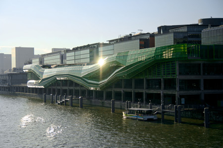
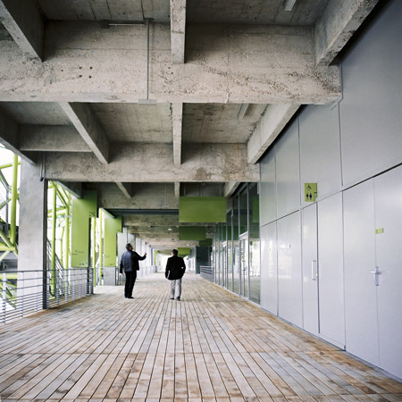
French designer Nicolas Vrignaud has designed the signage for a building comprising a fashion school, shopping centre, exhibition hall and restaurants on the banks of the Seine in Paris.
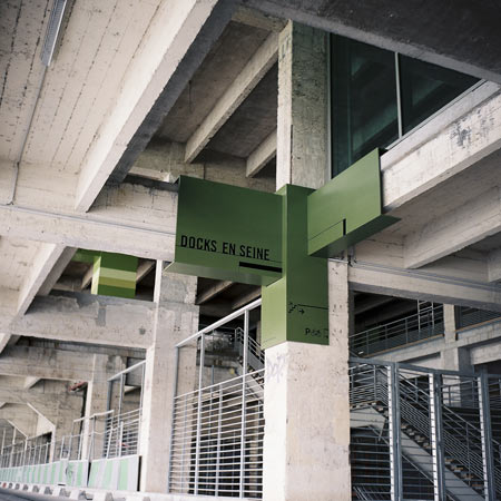
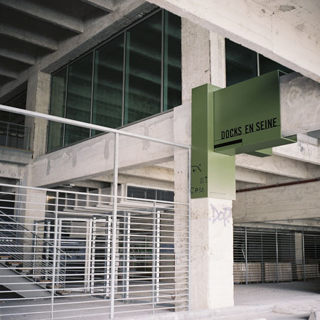
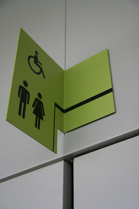
Created for the development (called DOCKS en Seine) by architects Jakob+MacFarlane, the signs wrap around the existing concrete structure.
Vrignaud designed the project in collaboration with architect Lorenzo Ascani and graphic designer Fanny Naranjo.
Here's some more information from Vrignaud:
--
The signage intervention in the building DOCKS en Seine plays with the usual needs of signage and with the context.
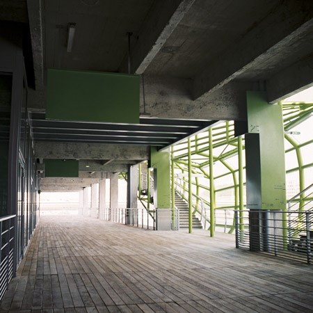
The building is a sign. It participates in the urban renewal of the 13th district of Paris and it becomes one moment along the Seine, as a sequence, a cursor.
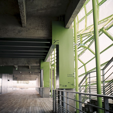
This signage project is based on this idea of sequence and also on the idea of promenade, of wandering.
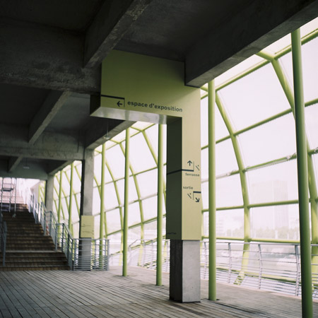
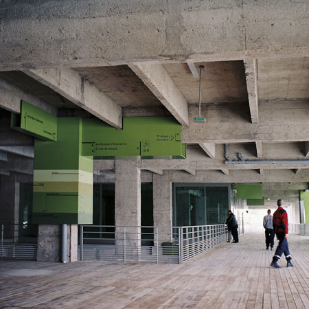
The preconception of this signage project is to punctuate this horizontal movement by "beacons", and to create a declension on four levels since the access at the bank level of the Seine towards the rooftop.
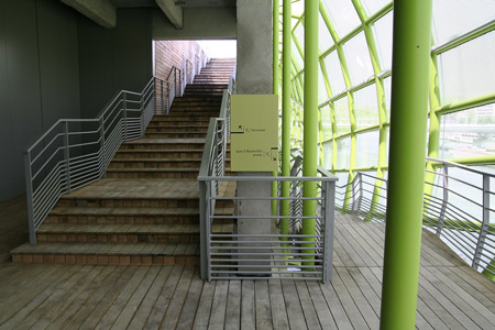
The fact of preserve and renovate the existing building keeping the concrete structure offers the support of the signage system, which is as a moulding of this structure, to create a new relation with the architecture.
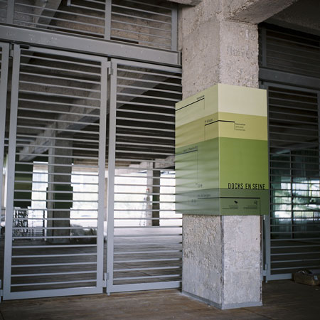
It takes place at different points: circulation, shop, communication, etc.
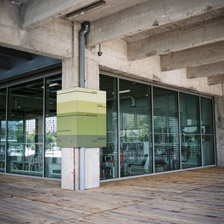
These moulds called "plugs", are separated from their support to become independents. Every plug is unique. They are grouped by type according to their application.
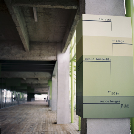
The plugs are used like billboards all along the building, and the graphic design, in opposition to the Plugs, could evolve according to the visual identity.
DOCKS en SEINE, Cité de la Mode et du Design
Shops, restaurants, fashion school, exhibition hall.
Quai d'Austerlitz, Paris 13
12400 m2
Architects : jakob & MacFarlane
Signage design : Nicolas VRIGNAUD (with Lorenzo Ascani architect, & Fanny Naranjo Graphic designer)
client : Icade
