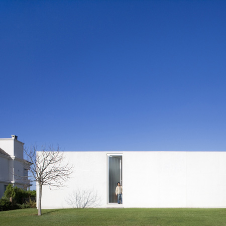
Architectural photographer Leonardo Finotti has sent us his photos of a house in Argentina by Estudio Aire, based in Rosario, Argentina.
Called Caja House, the project comprises a long, single storey building arranged around a central courtyard.
A strip of water in the courtyard reflects the sky and glass panels allow the surrounding rooms to be opened onto this outdoor space.
Here's some more information from Estudio Aire:
--
The project was developed between personal wills and external demands. We enjoy narrating this process without too much theory but with architectural responsibility and enthusiasm instead.
During the first meetings we tried to talk with our clients about architecture itself not specifically a home project. We realised it was our opportunity to develop something different between both parties. We were very enthusiastic for we could have the possibility of reviewing our architectural repertoire. At the beginning there were no specific orders, which arrived as time passed by and started working together.
We had feeling to work as a team, sometimes sharing some points of view concerning design, some others not. Our clients were much concerned with the issue of privacy and intimacy as regards life in private neighborhoods such as Kentucky. We considered it important to be able to appreciate from the inside the decisions taken (morphology, geometry, materials, how to manipulate the natural lighting) rather than the criteria used in such spaces so far.
We started working on a criteria based on a central open space . Little by little it became more radical and the rest of the situations began to subordinate to the yard. We were questioning the modern language leading elements to an almost primitive instance. The concept of continuous space extends beyond the physical limit of covered surface. The Interior unroofed surface regulates the link with the outside world. One of the faces is an opening with two glass doors. Opening completely enabling to redefine the concept of externality and integrating the rest of the area.
The water here incorporates the built mass reflexes. The House becomes its own landscape. Fragmentation in the section cover is another particular moment of thought and analysis which occurs not only to fill the interior of light but to establish a link with nature, incorporating the sky.
In general we usually describe our work as a box with a yard inside it denoting a formal will at first place. However the best is inside, the richer inner space as a result of it. With two photographs from outside the story would be resolved, but it would be impossible from the inside.
The strongest effort was to decide about what not to be done or how to make it simpler.
We came to only four materials. On top "white" dominates all items, aluminum resolves openings to the inner patio , the metal for the perimeter gates and glass for transparent and translucent cladding.
This reduction is the reaction to a need to avoid excessive thinking of achieving simplicity as a concept.
Click for larger image
We are satisfied for having being able to provide a contemporary answer leaving aside modern language. Now that the work has been completed we have began to look in time to more distant examples of it.
Click for larger image
The colonial House is the first example that appeared. The potential of the yard, the opening toit, the gallery, tectonics condition, force walls, the dispossession of ornamentation, the height of the Interior.
Click for larger image
We are now studying the pompeyana House , which carry this same situations to a more primitive and radical state . All this working under the concept of modern space.
Click for larger image
We believe that the contemporary does not have to do with a completely new production or with an indiscriminate repetition of recipes. We are interested in reviewing everything that has already been produced and intervene as little as possible. We have very clear it is almost ridiculous since our activity lies in filling free spaces.
Click for larger image
This paradox is which obsessively leads us to focus on the space resulting of it through the manipulation of shapes. We love thinking that we produce air.
Click for larger image

