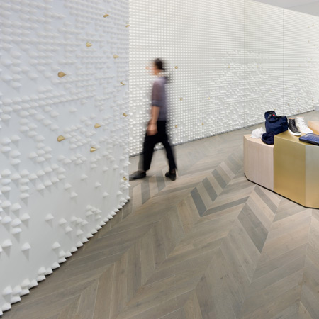
New York design office Leong Leong have completed a flagship store for fashion brand 3.1 Phillip Lim in Seoul, Korea.
An existing building was remodelled to create the four-storey store.
The designers took the 3.1 Phillip Lim's Los Angeles store - which they also designed - as a "base element" for the new store, cropping, cutting and stacking the original to fit the Seoul site.
The facade is clad in convex concrete panels while interior surfaces feature panels with protruding foam cones.
See also our story from June 2008 about Jamo Associates' store for Phillip Lim in Tokyo.
Photos are by Iwan Baan.
Here's some info from the designers:
--
December 2, 2009
LEONG LEONG
Project Description: 3.1 Phillip Lim Seoul Flagship
79-16 Cheongdam-Dong, Gangnam-Gu, Seoul, Korea
Text by Dominic and Christopher Leong, Leong Leong
The second flagship store designed by Leong Leong Architecture for 3.1 Phillip Lim is located in Cheongdam-Dong, Seoul’s premiere fashion district. In a period of eight months, Leong Leong designed and oversaw the construction of the 550-square-meter store in an existing four-story building.
The Flagship Typology - Sameness vs. Difference
This project is a single store within 3.1 Phillip Lim's global roll-out campaign, which will include many international locations.
Aware of the inevitable repetition that is necessary for such a commercial expansion, we thought of the typology of a flagship store as being characterized by the simultaneous need for sameness and difference.
Typically, the consistent repetition of brand traits is necessary to reinforce an identity, while novelty can refresh the aura and desire for the brand.
In this particular case the client, a relatively new fashion house launched in 2004, emphasized the need to establish a legible consistency in order to unify the different existing stores in New York, Los Angeles, and Tokyo.
As a result, we questioned the inherent contradiction in the flagship typology. Can the need for sameness and difference become a generative friction rather than a trap?
The Playbook - Diagrammatic Maneuvers
“The Crop” + “The Stack” + “The Cut” + “The Inkblot” + “The Liner” + “The Fade”…
We decided that an effective approach would consist of a playbook of organizational maneuvers that could respond to specific constraints (programmatic, site, economic, construction, schedule etc.) encountered in different store locations and contexts.
It seemed logical to use the Los Angeles flagship as a kind of base diagram to which we could apply a combination of these plays in order to exploit the constraints in the Seoul site.
The Crop + Stack + Cut
For example, the smaller footprint of the existing structure in Seoul is accommodated by literally cropping the continuous curving wall of the Los Angeles store into a smaller frame, creating four enclaves.
We stacked the enclaves to fit within the two levels of retail space. Each enclave accommodates a different use -- display, fitting rooms, storage, and stairs to the upper floor retail space.
Since the existing space also had extremely low ceiling heights we extended two of the enclaves vertically to cut out double height spaces one of which became the new staircase to the upper floor.
The main entrance to the store is also a type of enclave, cropped and recessed from the façade with a continuous glass storefront.
The Inkblot
The existing perimeter walls are lined in mirror, multiplying the “cropped” curving wall into a field of enclaves extending infinitely in the reflection of the mirror.
While the Los Angeles store uses mirror to double the enclosed spaces between the curving wall and the existing wall, the Seoul store uses mirror to expand a continuous visual field of space in which the “cropped” enclaves float.
The Liner
We conceived of the façade and interior walls as being lined with evocative textures, a characteristic of Phillip Lim’s design sensibility. It was during this part of the design process that we collaborated very closely with Phillip.
The material liners create a narrative of atmospheres from one space to another, each offering an unexpected encounter with the clothing.
After many explorations we decided the best solution was to capitalize on the need for consistency by deploying a series of moves or techniques that “evolve” the materials established in the brands other stores.
Consequently, the pyramidal acoustic foam of the Los Angeles store evolved into a conical texture that erodes along the interior walls. We worked directly with a manufacturer to develop 5 unique foam panel types that could be organized into different erosion patterns.
The wallpaper is the result of an ongoing collaboration with artist Wook Kim. Phillip had a strong desire to reference the local culture which inspired Wook to develop a pattern derived from ancient Korean ceramics.
The herringbone floor pattern used in the Tokyo flagship is transplanted into the Seoul location and slowly transitions through a gradient of grey tones beginning at the entrance.
The Fade
The 20-meter façade is also a material liner that wraps the existing building with a supple gradient of convex concrete panels.
The eight different 600mm x 600mm panels types progressively flatten as they climb the façade.
It seemed appropriate that the supple texture of the façade should fade into the often overcast and depthless grey sky of the city.

