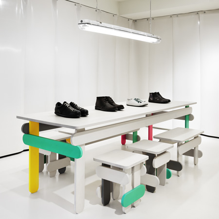
Swedish designers TAF have completed the interior of a store for shoe brand Camper in Malmö, Sweden, based on ice cream colours and lolly sticks.
The designers made models using lolly sticks then scaled these up to create solid birch furniture for the store.
Stock for the shop is hidden behind a rubber curtain that's the colour of vanilla ice cream.
Photographs are by Patrik Lindell.
More about TAF on Dezeen:
Adaptable
Carema Healthcare centre
Soft Parcel
Bottle light
Workplace
Trestle
IOU Design
Here's some more information from TAF:
--
Ice Cream
The first Camper shoe store in Sweden recently opened up in Malmö.
The design concept of the store derives from the well known truth that “everybody loves Ice Cream".
Several scale models were built by real Ice Cream sticks to be re-scaled into full size furniture.
The furniture collection is made to expose at least 40 pair of shoes and consists of tables, stools, benches and one cash desk.
The tabletop and the sticks are made out of color stained solid birch.
All the used colors come from different tastes of Ice Cream.
The curtain walls are made out of vanilla colored sliced rubber to hide the stock of shoes on the backside.
The floor is vanilla colored concrete. All the existing walls and the ceiling are painted in matt vanilla color.
INFORMATION FROM CAMPER
In 1981, the first camper store opened in Barcelona. After seven years of successfully marketing products through multi brand stores. Camper realized that such shoes needed an alternative, dedicated setting that would allow customers to interact with the shoes and the brand. Here began the development of unique stores.
The concept was self service. A shoe store that showed all styles and sizes available. The new Camper store was revolutionary but also conceptual showcase for a new graphic experience; boxes, posters, bags with messages, and displaying the shoes in this new way confirmed that the brand was able to open a dialog with the costumer – and the costumer understood. The stores become the window for Camper, through which to look out and to be looked at. The world saw camper´s shoes and philosophy but it also gave Camper the opportunity to see what was happening on the other side of the glass.
International expansions began in the early 1990´s. For many brands their stores where the same regardless of the country and although really well thought out the result was uninspiring. At camper the concept of identity and diversity always go hand in hand. So the strategic decision was that every store should be different.
Walk in progress
The “walk in progress” concept was born in 2000. The concept was the brainchild of Camper and Catalan designer Marti Guixé.
Camper wanted to continue with international store openings. But faced the problem of acquiring store space quickly, then trading as soon as possible to pay the investment! Out of necessity, to fulfill the company philosophy, the temporary Walk in Progress was born. The idea is simple: to make a temporary, provisional, interactive design, with furniture made from recycled materials, allowing the store to open and trade before the definite design and decoration are complete. With this idea as the objective, execution is simple, quick and in expensive. The stores are decorated with a central table made shoe boxes, for displaying the shoes. The walls are painted with a “imagine a better world” title to invite the customers to write and draw their messages, ideas, dreams, impressions etc., emphasizing the interactive nature of the walk in progress concept. The store is always self-explanatory.
Many Camper “Walk in Progress2 stores have been inaugurated. The first one was in Milan, via Montenapoleone 6in March 2000. Since then many have followed across the world including Rome, Piazza di Spagna 72, Paris, 14-16 rue Faubourg st. Honore, Hong Kong, 2-4 Kingston Street, Berlin, Neue Schoenhauser STR 11 – and San Francisco, 39 Grant Avenue, then London at 209 oxford street. The Walk in Progress store concept is both practical and fun as it allows full interaction between the costumer and the brand.
Throughout the history Camper´s personality and in particular the one reflected in its stores, has been enriched with the contribution of designers, architects and artists. Carlos Rolando, Javier Mariscal, Neville Brody, Óscar Mariné, Peret or the Memphis Group, among many many others, aside from characters like Fernando Amat. Oleguer Armengol, Jordi Nogués, Shiro Miura or Marti Guixé, have contributed in making these spaces always different and always special, becoming, together, an important active of the brand because they transmit the true values and image the client.
It now gains more strength than ever with these new projects, in limited edition, like the ones developed “together” with Jaime Hayon, Alfredo Häberli, the Campana brothers, Maria Blaisse, Konstantin Grcic, Bernhard Willhelm and the Bouroullec Brothers.
Camper continues innovating and opts for new languages that communicate the essence of a brand that is always loyal to its original spirit.
Title: Camper
Object: Shoe Store
Client: Malin & Patrik Moreau.& Camper
Design: TAF, Gabriella Gustafson & Mattias Ståhlbom
Co-Worker: Lisa Sterner
Photo: Patrik Lindell
Date: 2009

