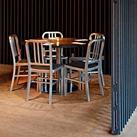
London studio Vonsung have completed the interior of a Vietnamese cafe in Shoreditch, London.
Called Viet Hoa Cafe, it's walls, floors and ceilings are clad in oak, with the walls covered in black lacquered strips.
Doors to storage and bathrooms blend into this surface but are marked with handles.
Seating is mainly arranged around a nine metre-long table.
A bar downstairs, also designed by Vonsung, is due to open in February 2010.
Here's some text from the designers:
--
VIET HOA CAFE: Completed 5th December 2009
Situated in the heart of a conservation area, Viet Hoa Cafe is the first Vietnamese restaurant established (est. 1995) on Kingsland Road, London, E1. Since then, Vietnamese restaurants have been flourishing on the same road to create a mini "Little Saigon", but none of which boast aesthetic accolade compared to the upscale Thai or Chinese restaurants.
The area of (East London) Shoreditch has been growing and expanding for the last few years and as a result, the clientele is demanding a lot more service and quality vis-a-vis West-end London restaurants.
When we sat down with the client in August 2009, I was not alone in wanting to resist the endless march for efficiency in place of dining and basically, human interaction.
People are wonderfully chaotic, messy, unorganized, complicated creatures and as one of them, I was not convinced breadth of design choice is what we needed right now.
I felt that the restaurants' or shopping centers' customers are constantly being shunted into a carefully shaped box that we don't fit perfectly. When we researched Vietnam and its culture in general, we were pleasantly surprised to see less chaotic stock and more people in their atmospheric surrounding.
Thus we started with the brief of 'less is more' to become the design mantra as we craved simplicity and added individuality to the restaurant's main focus.
Discovering that the building's structure was strong enough to support heavy materials, we decided to construct the entire restaurant's floors, walls and ceilings with solid, thick European oak planks. The oak wood scent every corner of the restaurant and the floors and walls are smooth and inviting to the touch.
The floors and walls are made of 4 meter long pieces that stop one-inch short of the purpose-built acoustic ceilings to create lateral openings across the top of the West side of the restaurant made of lacquered black wood strips. The gap is to show how the restaurant breathes - the heating and air conditioning are channelled through the strips and it makes the restaurant feel longer and higher.
To maintain the infinity of the space using the strips, Joseph Sung (Creative Director of VONSUNG) avoided revealing the surfaces whenever possible. Storage area and even the toilets disappear into the walls only to be opened by a hidden door handle. The entrance to the restaurant has been positioned out of view, eliminating the need for additional second entrance door.
Click for larger image
The main task was to uniformly unify the space in terms of color and materials - as we set about to acquiring furniture that would have an impact. The palette was earthy and neutral yet structured with distinct lines, like sculptures, are references to Vietnam's surrounding water and sky. The furniture finishes amplify the straight lines of the restaurant's wood and strip panelling. My design sensibility were formed in the 1980s, and many of my inspiration comes from that period - 'Power Dressing'. The main feature of the restaurant is the 9 meter-long center table which houses the King & Queen chair underneath the David Chipperfield chandelier.
Click for larger image
Intimacy was achieved by focusing on the smallest details and by trying to surprise and delight guests - by way of branding designs. We developed the new identity by creating the HOA - 'blossoming flower' in Vietnamese - these intimate Hoa logo mark can be found in all way-finding, branding collateral, packaging and uniforms. We hope to continue the design acumen to the Viet Hoa Bar downstairs scheduled to complete in February 2010. A notion of creative individuality will be approached to color which will transform this quiet Vietnamese restaurant and bar into a feast for the eyes.

