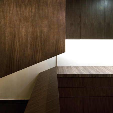
Singapore based architect Kevin Lim of Studio SKLIM has completed the renovation of a public housing apartment in Singapore, where the space is organised by large wooden cabinets.
Called Redhill Apartment, the project incorporates an entrance hall, living room, dining room and kitchen.
Lim designed a set of built-in furniture pieces to divide the apartment into separate areas and provide storage.
Photographs are by Jeremy San.
Here's some more text from Kevin Lim:
--
Redhill Apartment
Redhill Road, Singapore
Public housing has come a long way in Singapore providing the needs for 80-90% of the population. The perception of public housing in the world is perhaps not of the best, but in Singapore, the quality and standards of these apartments well rest above the poverty line, driving prices rocket high.
The client had just returned from a three-year long diplomatic stint and was looking to refurbish his apartment to welcome his new addition to the family.
As with all projects, pragmatics was the primary driving force of this project. The main challenge was to reconfigure a public housing apartment amidst the regulatory constraints into an object of spatial flow.
The present main foyer/dining/living/kitchen space was segmented with proportions that were not user friendly. The foyer area and the kitchen entrance were too generous and encroached upon the dining room.
After a study of the existing structure, we removed one of the non-load bearing walls and reconfigured the rest of the surrounding spaces. The concept was simple: to create a large space with distributed furniture and a mirrored surface to reflect the surrounding spaces. The kitchen was subdivided into a wet and dry area with part of the latter extending to become a foyer cabinet.
The dining space became larger and visual continuity was achieved with all the surrounding built-in furniture; from the foyer to the dry kitchen to the living room set. It became a set of separate furniture pieces for one big space!
The design approach to the individual furniture pieces were derived from their inherent functions and their relationship to each other in that particular space. For example, the slope of the entrance foyer piece was a reflection of the inclined shoe rack enclosed in the bottom cabinet and the gap between the top and bottom pieces provided natural cross ventilation and a view towards the entrance from the kitchen.
The furniture pieces were designed as a set for the space and related to the bigger spatial flow with geometry and material continuity.
Facts & Figures
Client: Private
Architect: Studio SKLIM - Kevin S. K. Lim.
Main Photography: Copyright - Jeremy San, images courtesy of Studio SKLIM
Gross Floor area: 110 m2

