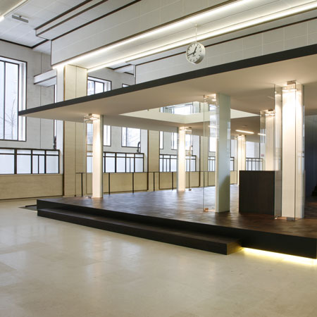
De Loketten by Giuseppe Farris Architects and Stefan Schöning
Antwerp designer Stefan Schöning and Giuseppe Farris Architects of Italy have collaborated to convert a room at the Flemish Parliament in Brussels into a public meeting place.
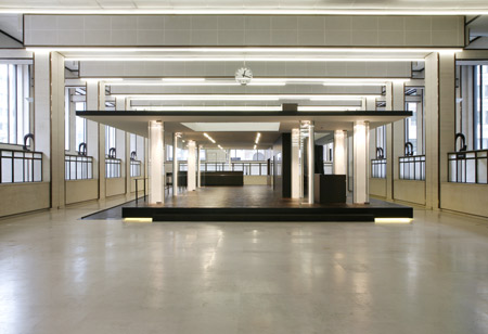
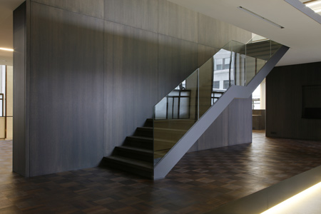
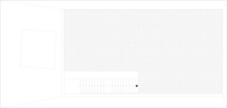
Called De Loketten (the Counter Room), the project involved installing a two-level platform in the middle of the existing interior, which was designed in 1937.
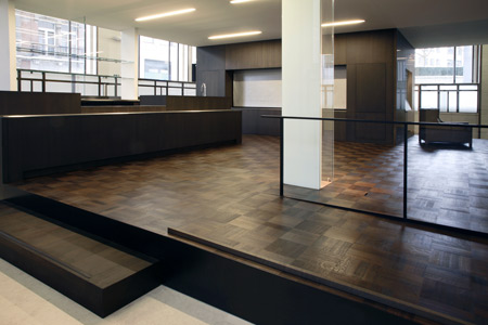
This new addition will be used as a space for reading, a cafe, a shop and a lecture or exhibition space.

Photographs are by Ilse Liekens.
Here's some more information from Farris.Schöning:
--
De Loketten
The duo farris.schöning won the closed competition for the redesign of the counter room. Through a second competition the assignment for the design of the reception desk in the same building was also granted to them.
These designs offer a solution to the practical demands of the Flemish Parliament in which they integrate their projects in a beautiful and elegant way in the existing architecture of the protected monument.
history
The counter room (De Loketten) in the Flemish Parliament in the former postcheque building in Brussels was designed by architect Victor Bourgeois in 1937.
In his original design he already planned a public function for this room. Bourgeois considered the counter room as the most symbolic space in the building, the place where administration would meet the general public. It was supposed to radiate the postcheque’s power.
The large size of the room (78x22x8m) was meant to copy the dimensions of the streets in the city to create a public inner space. Bourgeois elaborated on this idea by using similar materials for the inner walls to those used for the outer walls.
assignment
During the redecoration of the postcheque building for the Flemish Parliament, the counter room was completely restored.
Following the original plans, the Flemish Parliament wants to turn the counter room into a Flemish meeting place in Brussels once again, a ‘covered market square’ where a number of functions — essential for emphasising the transparency and openness of the Flemish Parliament — will take place in a carefully considered combination: a corner for reading and information, a Parliament shop, a brasserie and an area for exhibitions and/or lectures, debates, cultural events. This project is regarded as representative for the Flemish Parliament and for Flanders as a whole.
concept
The concept for the design of De Loketten is based on the idea of a pavilion that is placed in the space as a loose element. The difficulty with this assignment was the confrontation with the rational and repetitive architecture of Victor Bourgeois. In order to avoid competition with this protected monument, the design distances itself.
By adopting a few architectural characteristics, a relationship with respect to content is established regarding the existing architecture.
Another aim of the design is to promote the connection of the activities in the pavilion with regard to the surrounding area.
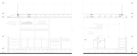
Click for larger image
realisation
The project distances itself from the architecture in that the design is different from the counter room in form and choice of material. Furthermore the pavilion is physically isolated from the space because it is built on a floating platform. The indirect lighting under the platform reinforces this visual effect.
Architecturally there is a relation concerning content with De Loketten through the modularity which can be found in the architecture as in the attention to detail.
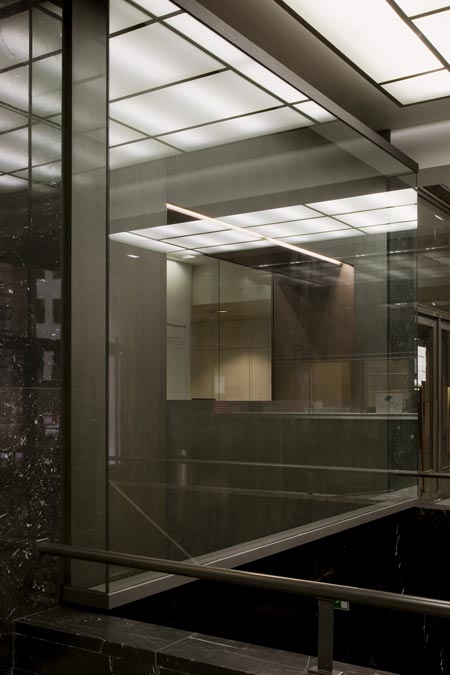
To safeguard the view on the counter room, the pavilion is designed as transparently as possible. Therefore the columns and the ceiling are elaborated as narrow and thin as possible.
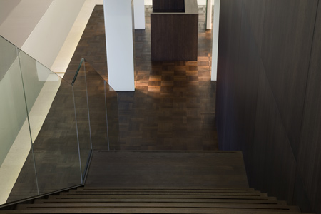
The duplex provides a new way of experiencing the building. The upper floor, with an extra opening, creates new viewpoints for the visitors of De Loketten. From the street, interaction is being created with what happens inside, and curiosity of the outside world is aroused.
functions
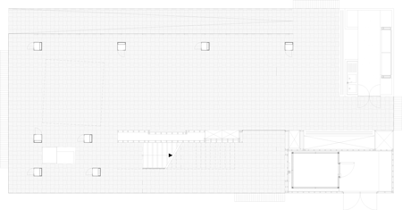
The assignment demanded to rethink several functions in one design: a brasserie, a shop, a forum and a reading corner. Instead of placing these functions next to each other, the conceptual starting point of the pavilion is to mix all functions together.
The glass columns which are spread around the pavilion serve as a shop window and an exhibition space in the brasserie. Through that the shop isn’t a separate unit but becomes part of the circulation in the pavilion. The purchase of Flemish design can now be combined with a coffee or a lunch.
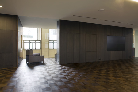
A video wall has been provided in the central wall next to the stairs so that the brasserie can also function as a forum. This video wall can be used for presentations but also to virtually attend to the plenary session.
Behind the central wall you can find a quiet space which is equipped as a reading corner. An internet connection is available and newspapers and magazines can be consulted.
The upper floor is ample enough to accommodate groups up to 60 people.
choice of material
The construction is built up out of steel, woodwork finishing and the whole is placed on a rubber floor in order not to damage the protected monument. The parquet floor consists of smoked oak that has been darkened with oil. All furniture is finished in pin oak that has been darkened with oil as well. The finishing in the kitchen part is executed in stainless steel.