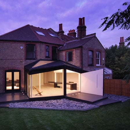
Park Avenue South by Studio Octopi
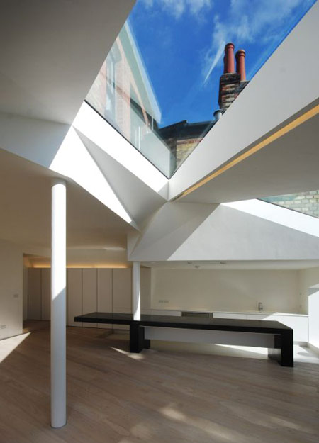
London architects Studio Octopi have completed an extension to a Victorian end-of-terrace house in north London that features an angular roof and large triangular skylights.
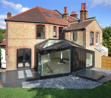
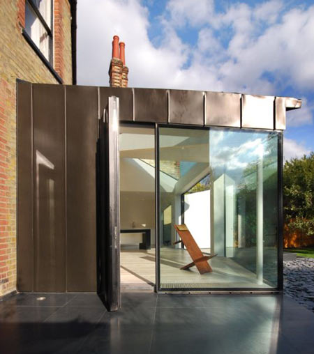
Called Park Avenue South, the extension is clad entirely with black zinc.
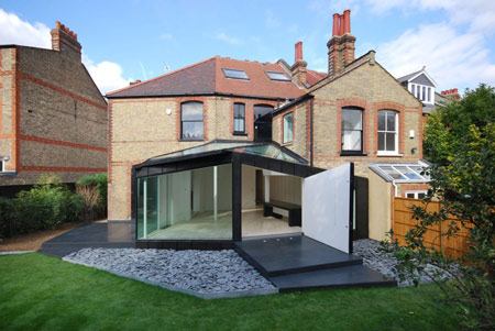
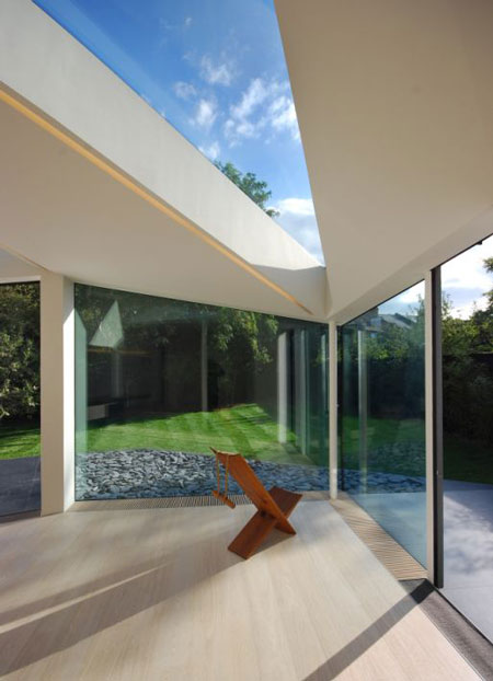
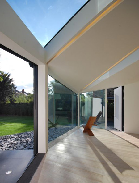
This addition to the original house doubles the size of the kitchen/dining room, which now connects directly to the garden through a section of wall that swings outwards.
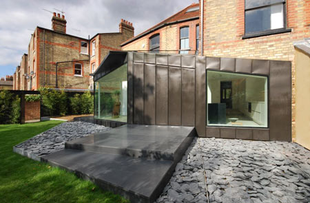
Photographs have been taken by Lyndon Douglas.
Here's some more information from Studi Octopi:
--
PARK AVENUE SOUTH
The extension to this Victorian end of terrace house is located between Crouch End and Muswell Hill.
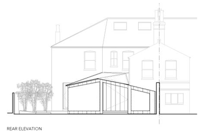
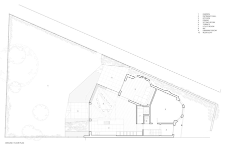
The original builder was also the house’s first resident, and made the most of his triangular plot by allowing the side of the building to fan out to meet the line of the adjacent public footpath.
On the ground floor this resulted in an additional fillet of space splitting the living and dining rooms. It was the divisional nature of this space (used as a utility room) that the client asked studio octopi to resolve.
By relocating the utility room, the plan was reordered and paved the way for an extension that linked the living spaces.
The design was developed through a series of folded paper sketch models exploring the nature of the triangular plot, the geometry and aspect.
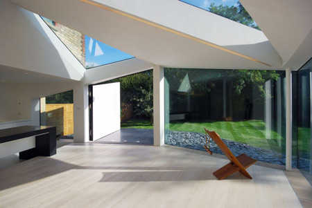
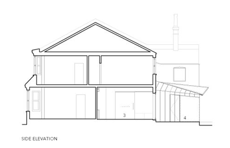
The lines of the roof ridges were drawn out from two points on the rear wall of the house, whilst the elevations extend the lines of the living room and the external rear wall of the kitchen.
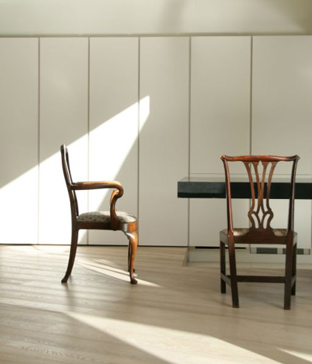
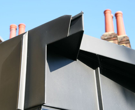
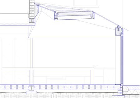
The structure is clad entirely in black zinc, with standing seams tracing a path across the roof, emphasising its complex topography and echoing the folds created in the paper concept models.
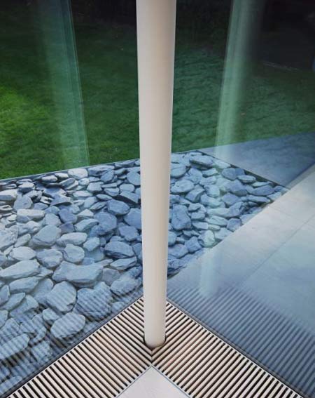
From a distance, the structure reads as a strong geometric form that has grown out from the back of the house, but at closer quarters, its edges appear to soften and the malleability of the zinc and the very slight billows in its surface come into focus.
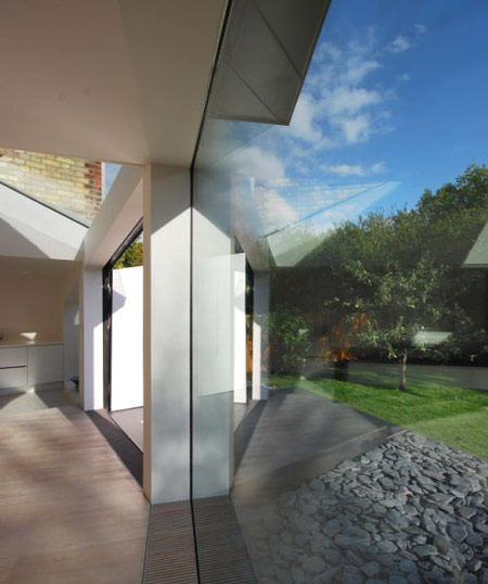
The impression formed is of a tailored garment turned inside out to reveal a complex structure of pleated seams.
Internally, the smooth planes and sharp facets of the ceiling recall an origami paper lantern, neatly folded and then popped up into three dimensions to form a bright lining to the dark fabric over-garment.
Seemingly in constant motion, the planes shift and tilt, alternating with triangular roof lights that frame views of the sky, trees and distant chimney-tops.
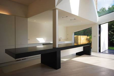
A cantilevered island unit clad in seamless black granite delineates the kitchen from the living space.
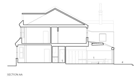
Bridging the step down to the kitchen it creates on one side a working surface at waist height, and a seating area on the other.
This monumental feature is echoed in the granite terraces that lead out into the garden.
Click for larger image
These are the first elements of the planned landscaping, with areas of paving and planting that will reflect the form of the structure’s openings like patches of light cast by the paper lantern.
Click for larger image