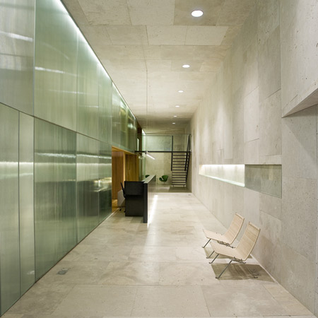
Oficina Caja de Arquitectos by Carlos Pereda Iglesias and Óscar Pérez Silanes
Spanish architects Carlos Pereda Iglesias and Óscar Pérez Silanes have completed the offices of a bank that was founded by architects for architects in Pamplona, Spain.
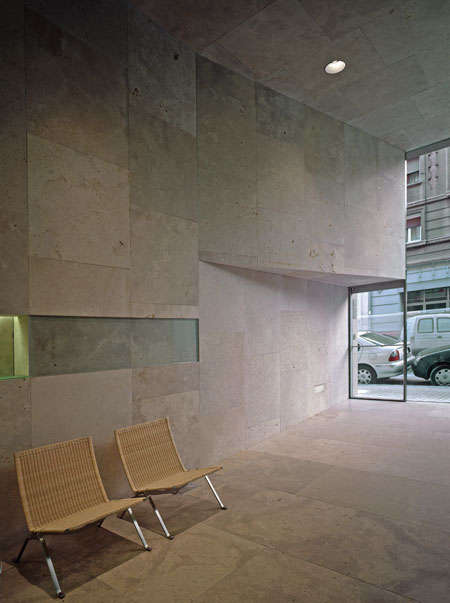
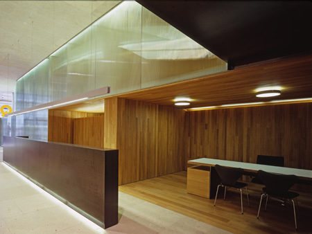
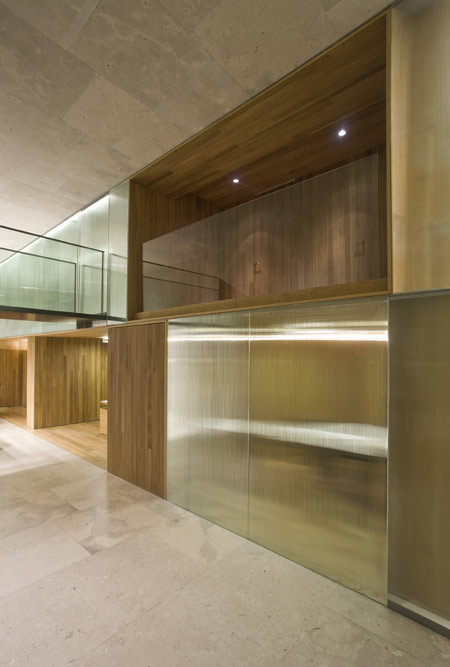
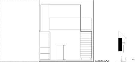
Called Oficina Caja de Arquitectos, the project includes meeting rooms and offices arranged along one side of the interior, with further offices above them on a mezzanine.
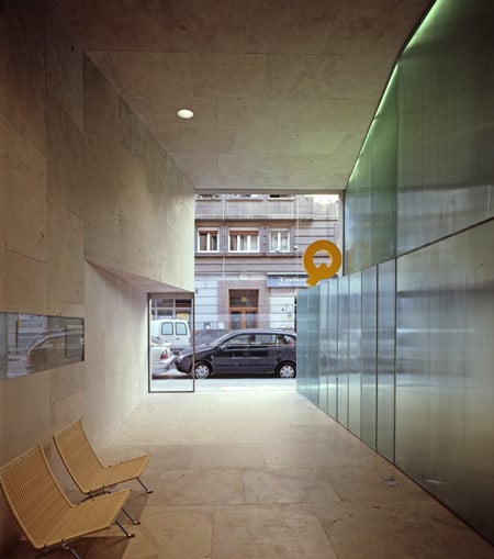
The remaining space forms a double-height stone-clad hall, allowing light to penetrate the offices through glass panels.
More about Carlos Pereda Iglesias and Óscar Pérez Silanes on Dezeen:
Reform of Housing in Pamplona (November 2009)
Dining hall in Medina de Pomar (October 2009)
The information below is from the architects:
The order was an improvement of the Architects Bank, sited in Iturralde y Suit Street, at Pamplona city (Spain). The program consisted mainly of an operation centre definition to place the management, offices, a meeting room, a rest area, toilets and a utility room.
In the other hand, the owner within its expansion policy, requested as a first aim to reach a quality image, essential point to achieve in a work with the required architectural energy which nowadays is not very common.
At the same time, in contrast with other companies, brand guidelines were not imposed as the project progressed. A complete trust and liberty were allowed during the development of the work carried out by the architect’s team.
The project also intended to fulfil besides its functional need a certain representation, reflected in an exercise of material sobriety which caused a unitary image, clear, attractive and recognizable.
At the same time an architectural work out of any trend was searched, an exquisite functional clarity was sought, the correct measurement of its material expressiveness, the pleasure of the formal simplicity and the search of the purity and the value of the space, the interest for the clarity of the ideas could be concepts used adjectivally which may help to understand this work.
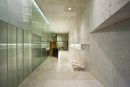
The structure of the space, based in the programme, established a reasonable arrangement of the different departments, placing the offices, the meeting room, and the rest of the enclosed requirements in half of the space and in the cellblock where this is widened, clogging it entirely, emphasizing, in such way the scale, depth, and the desired proportion of the resulting free space, to be used as operations centre and hall.
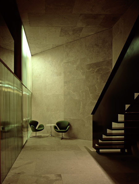
On the other hand, the development of the project had to face two additional problems which finally influence on the offices arrangement. In one side, it was required to solve the arrangement of the facilities and their control panels on the facade, since it was the only solution due of the absence of any right in any of the block yards, avoiding either the standard solution of hiding them over an additional ceiling provided with a grid to the outside or the typical arrangement on the side.
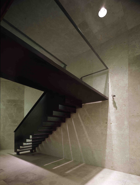
And in the other side the achievement of a mezzanine to arrange properly the enclosed areas of the program, and its level gap with the street, running an inclined plane to solve this gap, and long enough to define a plane and not a ramp.
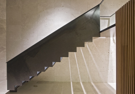
This plane with the tilted dihedral which contains the facilities equipment and control panels, define the access area and allows the light to pass through the whole width of the offices.
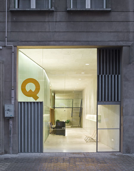
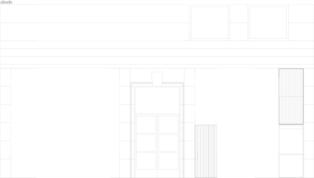
Moreover, all the elements defining the facade, where designed to be placed inner the block plane level, specifically where the coating material of the building ends, hiding at the same time the glass joint and seeking through constructive solutions which endow significance to the two facilities previously mentioned, giving a minimal and content presence of the offices within the environment they belongs, emphasizing the depth itself of the resulting volume.
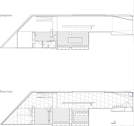
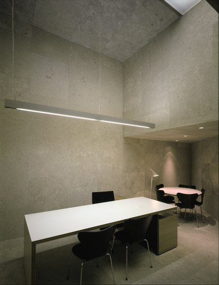
The presence of Campaspero stone, in three of the volume planes, presented in a large square format, the texture and its geometric arrangement, show in a clear way the space volume in the austere, clear and emphatic manner desired.
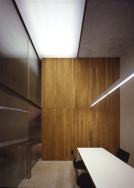
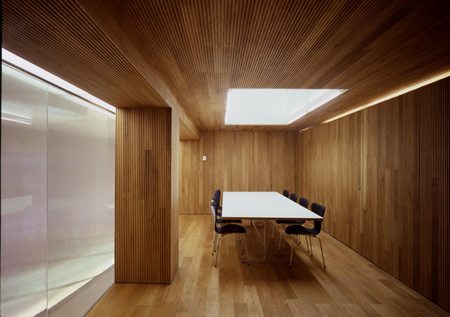
The fourth plan is made of faceted glass, trying to maximize in the volume the light coming from two skylights placed in the director’s office and above the meeting room.
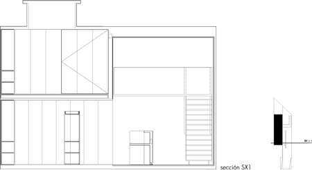
This solution avoids non desired ones as either transparency or on the contrary opacity and lack of daylight in the office.
Oficina Caja de Arquitectos
Iturralde y Suit 5 de Pamplona