Moroso headquarters by David Adjaye
Architect David Adjaye has unveiled his design for the new headquarters of design brand Moroso on the outskirts of Udine, Italy.

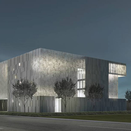
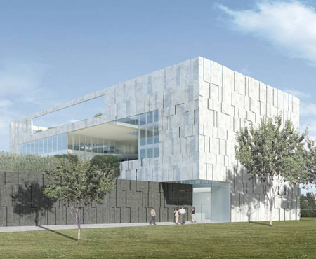
The building is conceived as a village of smaller volumes containing offices, linked by bridges and supported on a base containing the public showrooms.

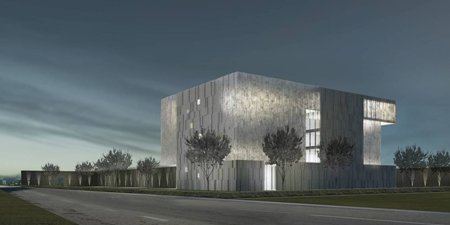
The whole will be wrapped in overlapping marble panels.
Here's some more information from Moroso:
The Site
The project site lies on the northern outskirts of Udine along the arterial Via Nazionale route on the site of the office and production facilities of the renowned Moroso furniture brand. The new office headquarters are to be located in close proximity to the current production building, respecting the 20m setback from the main road as stipulated by local guidelines and – if at all possible – safeguarding the row of existing handsome trees.
The site and its surroundings are characterized by a panoply of mainly low-rise commercial and industrial buildings along the main road and one- to three-storey residential buildings further inland. The overall area of the premises amounts to roughly 44.500 sqm with the new office headquarters occupying the south-western and the new production building the eastern portion. The immediate surroundings are fairly flat and in stark contrast with the 3000 meter high Alps mountain range framing views looking east- and northwards.
A small village of houses
The architectural concept we have developed is the creation of a very specific architectural gem which responds to the site, the brief and the Moroso philosophy. The project has been organised in the manner of a small village of houses that sit on a communal base. The base harbours the public functions of showroom and presentation room with the office spaces nestled within the houses above. These are linked by bridges. On the top floor communal areas such as a lounge / library / cafeteria and a large roof terrace are proposed. The articulation of three blocks combines an intimacy of internal spaces with the benefit of visual connectivity and excellent climate control. The positioning of the volumes, cores and cantilevers is in careful response to the suns daily movements, minimising glare and heat impact whilst allowing for adequate lighting conditions.
Introversion
The introvert nature of the project not only reflects the sense of togetherness of the Moroso working environment, but also responds to site conditions and the issue of orientation. This introversion is juxtaposed by maximising visual relationships with the hanging garden and stunning mountain range to the north.
In-between Outdoor Spaces
As a result of the articulation of three-dimensional volumes on a base and the partial wrapping of the overall form with the façade skin, intriguing in-between outdoor spaces become an important focus of the project. In combination with the sun’s movement an exciting play of light and shadow comes to the forefront, which is different every day.
Volumes
The central - south-facing – volume acts as the main distributor by housing the freestanding stair, the main void, lifts, restrooms and meeting rooms. The two other – east and west-facing - volumes are accessed via bridges and house the offices.
Circulation
The vertical circulation consists of a centrally located freestanding stair that acts as a main connector between the Ground Floor and the First Floor offices and three generous enclosed stairs, which also act as escape stairs. This distribution allows short routes from one level to the next, complemented by 2 no. lifts situated in the central volume.
Garden / Terraces
The boundaries between inside and outside have been blurred by introducing generous interlocking gardens and terraces, allowing outdoor spaces to become areas of meeting, presentation, inspiration, reflection, contemplation and relaxation. The new main garden consists of a wide 1.5m high perimeter hedge, a water feature and different tree species forming an arboretum in harmony with the existing trees.This is complemented by a hanging garden of ferns concealing the old production building and introducing a moment of quietness.
White Rock
The outer appearance of the new office building is characterised by nobility, a combination of translucency/solidity and a play of light/shadow. The external façade skin consists of white marble panels, which are staggered and set back, thus resulting in an intriguing day-and night-time effect.
Access
Visitors coming from the Client car park situated in the north access the building in its north-western corner. Staff members access the site via Via Dante and park their car in the underground parking garage located underneath the building. Deliveries also access the premises via Via Dante.
Materiality
Facades: white marble panels - staggered and set back / frameless fi xed double-glazing panels / push-out glass window doors / hinged glass window doors / glass balustrades
Internal Spaces: tinted, sparkled screed to showroom / timber-lined auditorium / timber floors to office spaces, lounge and cafeteria / tinted exposed concrete slabs / tinted exposed concrete staircases and walls