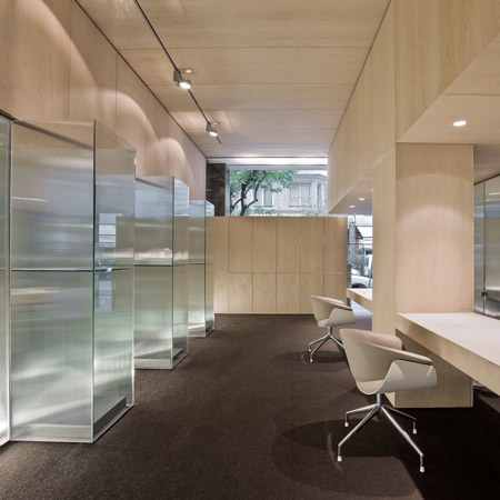
Spanish architects Carlos Pereda Iglesias and Óscar Pérez Silanes have completed a jewellery shop in Bilbao divided by rippled glass screens.
Called García Miguélez Jewelers, the shop is fitted out in maple and has textured glass display cases.
A felt-lined shelf in a block of concrete forms the window display.
See Dezeen's top ten stories about shops here.
More about Carlos Pereda Iglesias and Óscar Pérez Silanes on Dezeen:
Offices of a bank founded by architects for architects in Pamplona (February 2010)
Refurbished apartment in Pamplona (November 2009)
Dining hall and kitchen for a gastronomic society (October 2009)
The information below is from the architects:
The order consisted in the execution of a jewellery store in the urban expansion area of Bilbao. The building had a predictable typology within the area where it is located, a small façade and a deep arrangement towards the centre of the block, in addition of an irregular ground plan with the uncomfortable presence of a pillar near the access area.
The program showed mainly a sales area, a private room also to attend clients, a working area, toilets a utility room, and some exhibitors. The customer only defined two guidelines during the project development.
The first one was the importance of the privacy and security appearance, and the other was to place an exhibitor at the front of the façade.
The project layout is very clear and is ruled by the privacy level of each area in accordance with the characteristics of the store, moving from the sales area to the private one as walking through the store.
The decisions, which defined the project, were two, the first was to choose the formula of using two different kinds of materials, and these were faceted glass and maple wood. These two materials marked different functions.
The first one, faceted glass skin, solves the irregularities of the space, contains inside the wardrobes containers, defines the space in the back room and provides internal exhibitors and the second one, maple panels, regularized the general tracing of the store allowing to meander the skin of the glass.
Besides solving the functional and privacy requirements this solution enriched the space making a section, instead of separating it, achieving the light passing through to the top of the opaque facade and giving to the back room which is used to serve the customers a certain privacy within the general space instead of being a separate area,
The second decision was that the facade should be the icon of the store, which will give it a recognizable personality and presence.
It shows only rough concrete monolith, the rest of the composition is set by free carpentry glass within the centreline of the store, which the pre-existing Marquina black marble piers define and uniformly are present in the expansion area of Bilbao.
This concrete box inside is lined in gray velvet emphasizing the contrast between their anti-theft protection against the delicate appearance of the objects inside. Special mention deserves the door, carpentry free; in order do not disturb the presence of the concrete volume solving its opening and security with the design of a handle lock
Finally, the material geometry solves the uncomfortable presence of the pillar, being incorporating it in the design of the store as a pillar counter. Constructively, the colour and material balance solved with maple panelling, glass faceted and felt on the ground, acquires this compromise between the simple contemporary austerity and the recognizable taste for the luxury.
Project: Jewellery in Bilbao, Spain
Location: Alameda de Urquijo 48, Bilbao
Authors: CARLOS PEREDA IGLESIAS y ÓSCAR PÉREZ SILANES, arquitectos
Client: GARCÍA MIGUÉLEZ JEWELERS
Rigger: Juan Ruiz Cuevas
Lighting: CA2L
Furniture: La Sede
Area (m2): 89,96 m2 built
Photographer: José Manuel Cutillas

