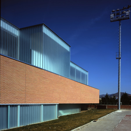
Primary school by Carlos Pereda Iglesias and Óscar Pérez Silanes
Spanish architects Carlos Pereda Iglesias and Óscar Pérez Silanes have competed a glass and red brick primary school in Pamplona, Spain.
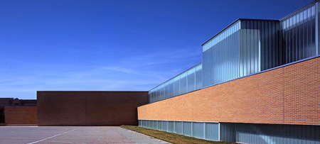
The building forms an extension to an education centre originally built in 1969 and now comprising five buildings.

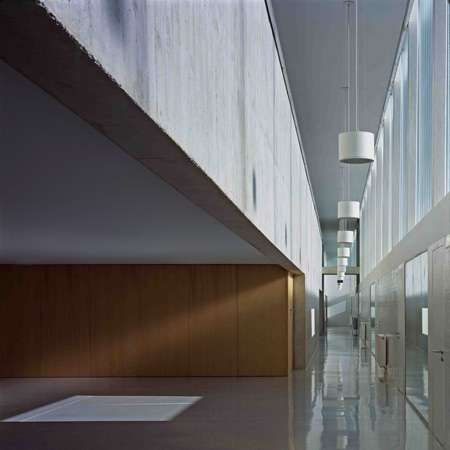
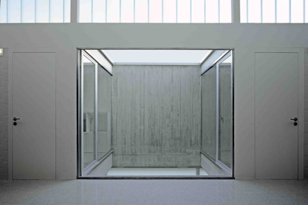
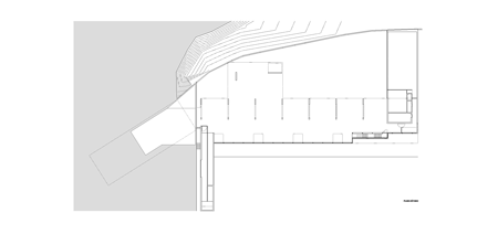
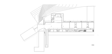
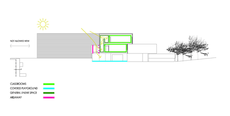
The ground floor contains a hall, chapel and auditorium, while classrooms on the upper storey are set back along a glazed corridor.
A dining hall and toilets are located in the basement.
More about the architects on Dezeen:
García Miguélez Jewelers (March 2010)
Offices of a bank founded by architects for architects in Pamplona (February 2010)
Refurbished apartment in Pamplona (November 2009)
Dining hall and kitchen for a gastronomic society (October 2009)
Photographs are by César San Millán.
The information below is from the architects:
Primary school
The building belongs to an Educational Center which is being extended as the new requirements came up. The whole centre consists of five buildings, all them are set for scholar use. From 1969 until now new volumes are being added to the original building without having any global plan, the only common property, is the use of red brick as global constructive line.
It should be highlighted Rafael Echaide’s contribution in the late seventies, a building for administrative uses with a number of gestures that bring a meaning to it and give a characteristic identity within the complex.
In 2000 Primary School program started, accommodated in a small building and always using the same material, nowadays that building has become kindergarten, so the new one that has been ordered to us will be used to house the Primary School.
The extension of an existing building always brings with many constraints that have to be solved as well as functional requirements that prearrange a formal solution; besides as far as the few materials used allowed as positive feature the uniqueness of the design of a fact that correspond to certain historic milestone, with its constructive consequences and their predetermined models, it has been sought with the new extension to answer with similar arguments and a different interpretation , since our time has not stopped.
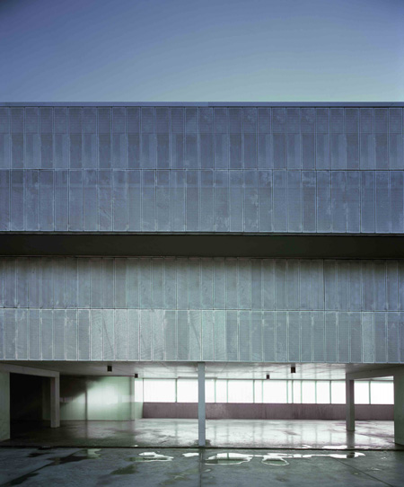
The continuous use of the material follows the style of Chantrea suburb, and its colour, red ceramic as a big mass inside the school.
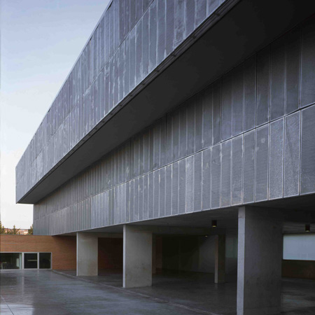
On the other hand the small original volume, complete in itself, with a well defined character of an independent object, a priori, it seems to repel the creation of a new volume next to it, so continuing visually the volumes, changing the planes, and separating from them could differentiate the new extension and integrate it on the existing one without being either repelled or crudely “stuck”.
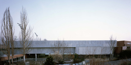
Those references are the ones that form the physical and conceptual scope of the project. The design is intended to actually be held by the basic criteria of economy and constructive approach, using a formal language that, in terms of its simplicity, clarity and abstraction, shows at the same time their direct dependence on functional advantages and the maximum adaptation capacity according the different site conditions.
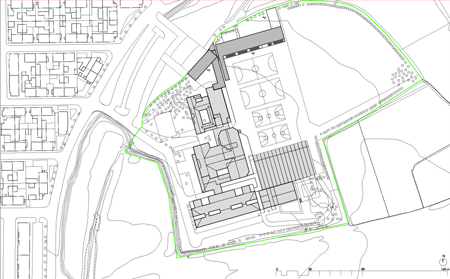
Click for larger image
The dimensions of the project coming from the existing building give the heights and the possibility of creating a large empty space at the ground level, free of use which in addition will allow the volume to "float" against the volume marked by the socket which owns the existing building; besides this decision of freeing the ground level space, the upper levels move one to another thus dividing the façade giving it lightness again in contrast with the existing one and giving value to the most meaningful space of the project which corresponds to the frontal concrete protruding which contains the chapel.
Click for larger image
The whole light surface is protected by a sliding railing all along its length in the same manner as the one which substitutes on the upper level of the existing level. In the other hand, the material and volumetric response of the yard and the sport area are completely different.
Click for larger image
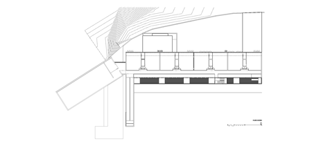
It’s necessary to capture light from the opening space looking to the south while keeping the spaces privacy, a U-glass main enclosure solution is selected to achieve it, blended with a protruding ceramic volume quite low in comparison with the height of the yard which breaks the vitreous plan and contains the offices, reception rooms, toilets, etc. and lighting and ventilation zones of those small spaces.
Click for larger image
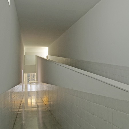
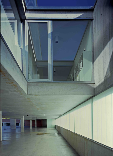
Finally to end this glass plane and as a liaison with the existing building the ramp volume is generated, parallel to the existing classrooms, made of brick, solid and at the same time sensitive with regard to the existing brick plane which gives additional value on it. In addition this protruding element creates a protection arcade which joins the plane with the floor as answer to the existing plane at the opposite side of the cover yard at the sport area.

Click for larger image
The building is developed in two levels and basement. Much of the formal and functional development of it is determined by the condition of being an extension of the existing one. Therefore, the access comes from the existing building and requires a notable extension of it; in the area where the administrative an meeting offices were; those are eliminated, the lighting and ventilation yard of the existing building is occupied and is communicated with the extension.

Click for larger image
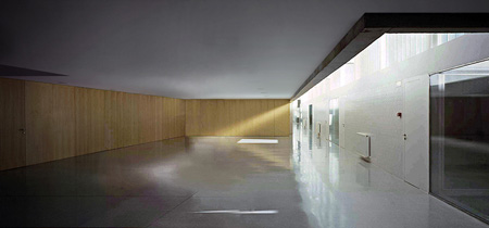
Obviously the communications are marked by this side access to a building with an important lineal component; the hall itself occupies partially the ground floor; space which connects and articulates the general zones. It is a referent space in the building, panelled with wood where all the spaces meet. In the rest of the ground floor are the chapel and auditorium as well as the classroom for the youngest children. Another’s exempted volumes are the offices and lighting yards of those.

Click for larger image
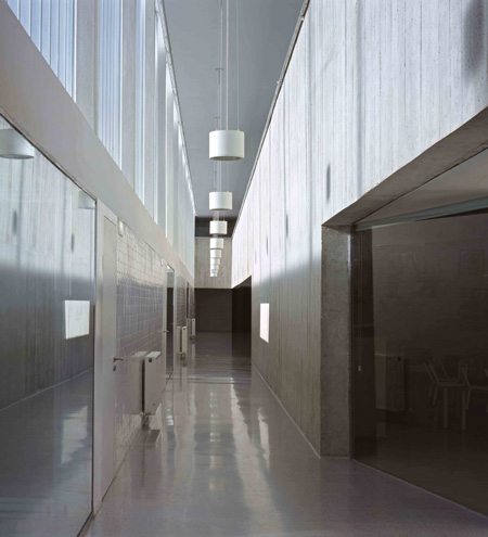
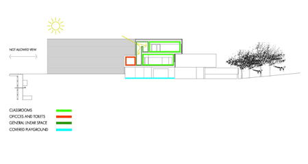
The higher level is moved to the back creating the access to the rest of the classrooms placed longitudinally with a double height along the building which gives the inside with a specific character. Also it is communicated with the existing building by a lattice bridge. In the basement floor is generated a covered courtyard with a red brick volume where dining room and toilets are located.
Click for larger image
Building volumes as it has been previously mentioned are generated from the cross section of it: a ground floor free of contain, first level with a prominent concrete volume, where the chapel is located, with a brick façade corresponding with the building playground and the highest level moved backwards from the first level.
Click for larger image
All volumes generated on brick, rear façade finished in galvanized perforated. The communication ramp is used strategically to delimit volumetrically the new intervention and to distinguish it from the existing building and the dining room volume. Those are the two presentations of the building : one to the school playground in a linear form with a restrained scale and marked volumetric with brick and glass to the volume of the ramp as a boundary while face to the street the building shows gradual form, floating on the supports of the arcade with a perforated metal skin that sifts the views and protects the classroom.
Total area is 2.032m_ with an arcade of 795 m_.
Project Information
Project: Primary school.
Location: Cintruénigo Street| Pamplona | Spain
Authors: CARLOS PEREDA IGLESIAS y ÓSCAR PÉREZ SILANES, architects
Rigger: Ignacio Visiers _ Javier Urdaci
Client: Irabia Foundation
Budget: 2.300.000 E
Area (m2): 2429,50 m2 built
Photograher: César San Millán