Established & Sons in Milan 2010
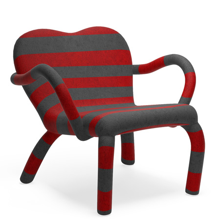
Milan 2010: here's a selection of new products launched by British brand Established & Sons in Milan this week, including this chair in a knitted cover by Dutch designer Bertjan Pot.
Top: Jumper by Bertjan Pot. Jumper consists of one continuous oversized woolen knitted cover, with qualities very much like that of a jumper, including buttons that fix the cover together on the underside of the chair, once the knitted cover is wrapped over the solid wooden structure and bent steel legs. The cover is knitted on a ‘Knit and Wear’ machine that is skilled for clothing garments, but this is where the fashion and design production processes divide. Once the garment is completed it is then run through a high degree wash to attain a seamless and upholstered effect eradicating most of the stretch from the wool but presenting a high quality fabric that layers the structure with precision and rigor.
Other pieces include a dressing table by Swedish designers Front, chairs by Konstantin Grcic and Martino Gamper and a table by London studio Klauser and Carpenter.
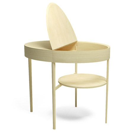
Above: Transformation Table by Front. On first viewing, the Transformation Table is a circular table made from beech with four legs and a lower shelf underneath. When closer inspected the table opens out by 180 degrees and transforms to reveal a secret compartment storage place in the centre of the table with the lower shelf evolving into a seat and a desk. Close it again and it becomes a hidden space for the laptop and your most important things.
See all our stories about Milan 2010 in our special category.
The text that follows and all captions are from Established & Sons:
Exhibition from Wednesday 14 - Sunday 18 April 2010 La Pelota, Via Palermo 10, Milan Press Preview Tuesday 13 April 2010, 2pm - 6pm
In Milan 2009 Established & Sons created an enclosed and concealed environment to display the collections, visitors were forced to enter into a ‘shanty’ or ‘township’ installation to discover the products. In 2010, Established & Sons’s latest and highly impactful concept will be quite the opposite.
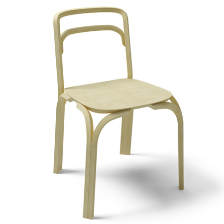
Above: Sessel by Martino Gamper. With his exhibition “100 chairs in 100 days” Gamper celebrated the fact that there is no perfect chair by studying and reassembling every archetype in a somewhat impulsive fashion. His creation of the Sessel was driven by a fascination of the traditional bentwood archetype and the way in which its industrialised production has been mastered throughout its 150 year long history. Aspiring to create his first production chair, Gamper dissembled the bentwood archetype to then rejoin the components and letting the assembly of the pieces create the Sessel’s shape. Rather than aiming to revolutionise the bentwood chair, Gamper decided to tweak the iconic original. He intelligently added strength to the joins through square bentwood panels eliminating the need for a supportive ring and creating a more angular aesthetic. Gamper further injected his own spirit by utilizing different woods and colours. True to his nature of enjoying ongoing design development, Gamper thereby created multiple configuration possibilities of the Sessel.
On entering the Pelota, the vast 10,000 square foot space that has become our home for the past five Salones, the visitors will once again be confronted with an installation of monumental scale.
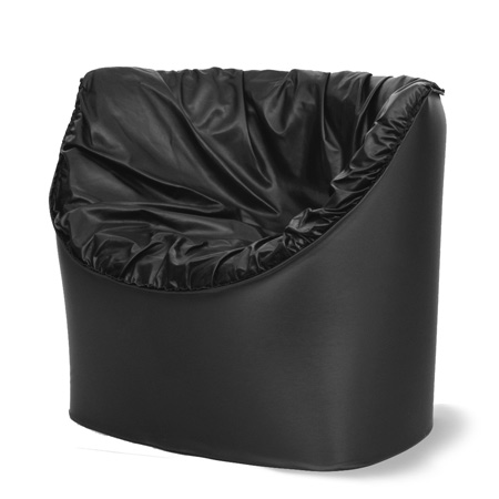
Above: Crash by Konstantin Grcic. Crash is an upholstered armchair. It consists of a tubular chair frame and a loose foam cover. The project reinterprets the construction of an upholstered armchair by separating the supportive frame from the soft upholstered upper. Splitting the chair into its two constructive elements rationalises production and simplifies transportation and storage. A two-inch thick layer of foam, which is molded to fit the metal frame, determines the formal language of the chair. Characteristics for Crash are its soft and voluminous curves. Crash is available in various cover materials.
The major difference in the concept this year is that all the products, including the 30 new products being launched, will be clearly visible from the moment you enter the space.
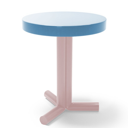
Above: Kink by Sebastian Wrong. Wrong’s Kink side table is focused on material and detail. The slip cast production of the ceramic table has a semi-translucent glaze, which in turn resonates inconsistencies within the surface finish. Wrong experimented with the aesthetic of folds in tube structures using kinked balloons, and has subsequently emulated the detail and its tangibility with Kink. The minimalist design of the table gives way to the authenticity of its detailed kink.
Working with four, 40 metre long white plinth extrusions that are terraced and span the full length of the venue, Established & Sons have created a high impact series of stages to visually display the extent of what this young business represents.
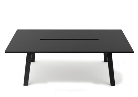
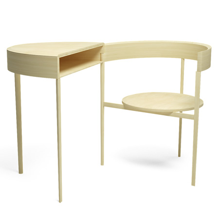
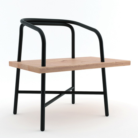
Above: Porter by Klauser and Carpenter. Klauser and Carpenter initially designed Porter for their new studio. From this custom desk they developed a family of tables that will suit any number of spatial situations. Porter is available as a single desk, a wall mounted desk, and a twin desk. The legs on these versions are cleverly positioned so all sides of the table can be used as desk space. Porter comes in black or white stained beech plywood with an optional top layer of linoleum. The solid beech legs are stained to match.
The human form is dwarfed by the height and presence of the furniture, which is elevated out of reach on the plinths.
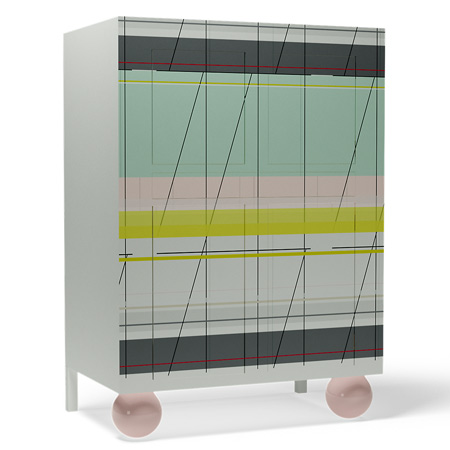
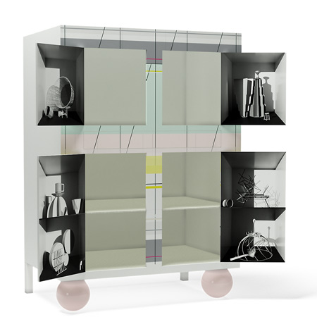
Above and below: The Amsterdam Armoire by Scholten & Baijings. The Amsterdam Armoire is a typically Dutch design, a traditional piece of furniture taking on a contemporary form. With two upper doors, a drawer over the full weight and two under doors, the front colour pattern is made from a ‘High Pressure Laminate’ (HPL) sheet. The two round feet are made of light pink hand-blown glass. The inside of every door pictures a still life. These still lives are made in collaboration with the Dutch photographers Maurice Scheltens & Liesbeth Abbenes, depicting the work method of Scholten & Baijings and made with paper and cardboard models of the design duo. The shelves and the drawer are covered with a printed grid.
Once the initial experience has registered the visitor will be invited to enter the various terraced walkways. All the pieces that sit on the extruded plinths, will also be replicated on their adjacent walkway allowing for closer inspection and interaction on a one to one level.
See also:
 |
our special category | 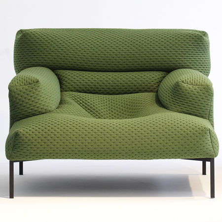 |