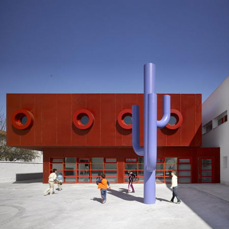
Architectural photographer Roland Halbe has sent us some images of an extension to a school in Cuenca, Spain designed by Madrid studio GRG Arquitectos.
Above and top photographs are copyright Roland Halbe
Called Hermanos Amorós Public School, the project consists of an extension to the school, which already had six separate buildings.
Above photograph is copyright Roland Halbe
The exterior walls of one part of the extension are painted bright red and feature round circular windows protruding from the facade.
Above photograph is copyright Roland Halbe
Blue metal sculptures in the shape of large donuts and a cactus have been inserted in the courtyard.
Above image is from the architects
All photographs are copyright Roland Halbe except where stated otherwise.
Above image is from the architects
Here's some more information from the architects:
The Project consists of an extension and refurbishment of “Hermanos Amorós” Public School in Las Mesas, Cuenca. Its location in Castilla La Mancha´s autonomous region it’s close to Quixote’s route. Places of “giants” and vineyard on the manchega´s plain; and a traditional white architecture that stands the strong Castilian sun.
Click for larger image
Las Mesas population is increasing and so are the towns around it. From this, comes the need to extend the original school, redistributing the existing one and expanding the scope of the original program: a new library, some multipurpose classrooms, administrative areas, etc. During the visit to the site we discovered a school divided in six pavilions of traditional architecture unconnected to one other.
Click for larger image
First of all, we considered schools buildings. Schools are meant for children; this is how the idea for a fun proposal entered our heads. We wanted to create a school to be a habitable “toy”, to be educational, functional and to meet the demands of the program. The approach to the project was to create the “seventh piece” on the existing complex.
Click for larger image
The seventh pavilion resolves the functional requirements and the interconnection around school’s program, behaves as joint organization between elementary education pavilion and high school; this new pavilion is different from the others in form, construction and colour. As we progress on the project with the “seventh piece” we realize the school requires more intervention than the scope of the competition initially required.
Click for larger image
This is how the library communicates with the new pavilion through a bridge, the external spaces are organized by new entrances into primary and high school, and a new main entrance pavilion is proposed to welcome everyone to school. The area becomes scattered with little interventions as a result of the functional solution, which contribute to increase the comfort of the educational centre.
Click for larger image
Their appearances in the school transform the existing relationship between pavilions and urbanization, creating new social-spaces; configure the entrance courtyard, the library courtyard, the playground, etc. Almost all new pieces make themselves visible to the street. Once defined the colonization system through punctual strategies, we decided new pieces to be constructed on dry joint to stand out from the traditional and existing buildings.
Click for larger image
Also, a red metallic skin as a wrapper emphasizes a more conceptual approach to the building. The architectural language selected derives from the concept of occupation of the new pavilions different from the existing ones. Although their presence contrasts with the existing structures, leads to dialogue between those new and existing buildings, making possible new and different relationships that were previously non-existing.
Click for larger image
Due to the low budget, high resistance and easily maintained materials were chosen in the interior of the building. On the other side, materials are kept simple and neutral to perceive the red skin when walking through the interior of the building. The most singular interior space is the library, a space double the high with colours not previously used, yellow on the pavement and black c on the main front.
Click for larger image
On urbanization, the design criteria is to make the minimum intervention. Just some circles on the polished concrete floor are designed to emphasize the existing acacias trees. Also, a new quince tree accentuates the main entrance to the multipurpose building and new elements of urban furniture emerge: some circle bench painted in blue in the library courtyard, to make more tranquil and a blue metallic cactus that appears in the entrance courtyard as a surrealist element.
Project Data
Architects: GRG Arquitectos - Blanca Rosa Gutiérrez Rodríguez + Natalia Gutiérrez Rodríguez
Location: Cuenca, Spain.
Type of project: Educational
Structural engineers: Engineering 3D3
Project architect: Blanca Rosa Gutiérrez Rodríguez, Natalia Gutiérrez Rodríguez
Design team: Blanca Rosa Gutiérrez Rodríguez, Natalia Gutiérrez Rodríguez
Collaborators: Dominica Minang Ntang, Grover Gazapa Quizpe
Funding: GICAMAN S.A.
Client: Regional Education Ministry, Castilla La-Mancha, Spain.
Tender date: 2007
Start on site date: February 2009
Contract duration: Twelve months
Gross internal floor area: 3.200 m _
Form of contract and/or procurement: Working Project and Healthy & Safety Research Assignment on the Refurbished School in Villarrubia de Santiago, Toledo.
Total cost: 3.600.000 € (VAT included)
M&E consultant: Engineering 3D3
Quantity Surveyor: Mayte Martinez Catalina (Project), Julian Calvo Chicano (Work)
Planning supervisor: Regional Education Ministry, Castilla La-Mancha, Spain
Main contractor: Banasa Construcción
Selected subcontractors and suppliers
Quality Assurance and Quality Control Inspection: ITC
Geotechnical Research: ITC
Annual CO2 emissions: 51,96 t
See also:
.
| Public School by GRG Arquitectos |
Kindergarten by Magén Arquitectos |
Infant Educational Centre by Solinas + Verd Arquitectos |

