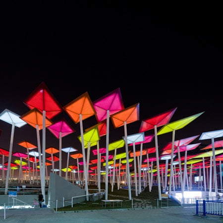
Mexican Pavilion for Shanghai Expo 2010 by Slot.
Shanghai Expo 2010: here are some images of the Mexican pavilion designed by Mexican studio Slot. at Shanghai Expo 2010, taken by Iwan Baan.

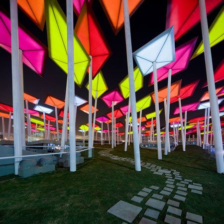
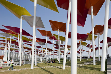
The pavilion features an array of kite-like shapes sitting on top of slanted white poles on a sloping piece of land, which leads visitors into a grand plaza.
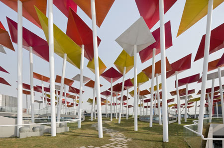
The 'kite forest' features 130 plastic 'kites' in five bright colours that appear like bright lanterns when illuminated at night.
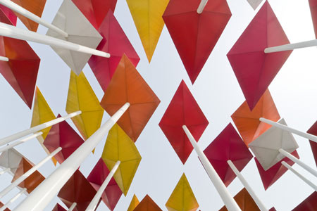
Holes in the poles spray out cool air as people walk in between them.
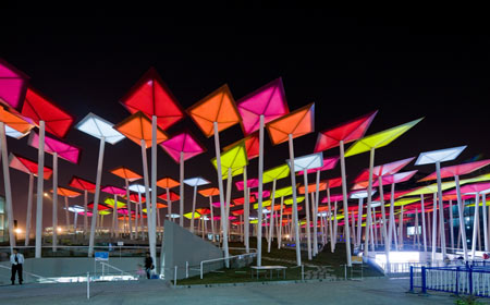
The pavilion is divided into three separate areas, representing the past, future and present of Mexico.
The past is is represented on a plinth, the present at access level and the future represented by the kite forest.

A restaurant inside the pavilion showcases and serves traditional Mexican food.

All photos are copyright Iwan Baan.
See all our stories about Shanghai Expo 2010 in see all out stories about the expo here.
Here's some more information from the architects:
Mexican architects SLOT have won an international competition to design the Mexican Pavilion for the Expo Shanghai 2010. SLOT was awarded first prize in an open design competition which included 156 entrants.
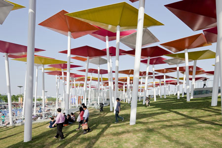
The pavilion’s design is born from the idea of representing Mexico through its traditional elements which haven’t been exploited in these kinds of fairs. The proposal scheme is centered around the idea of creating a green space within the expo which at the same time represents our preoccupation to offer a better life standard for cities through the recovery of green areas rather than creating a protagonist building.
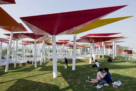
The Mexican pavilion is a volume defined by a talud (slope) which transforms itself into a plaza privileging public space as an urban gesture within the expo. Space is divided in three levels which represent three different moments of urban life in our country. The past is represented on the plinth, present time Mexico at the entrance level, and future on the platform.
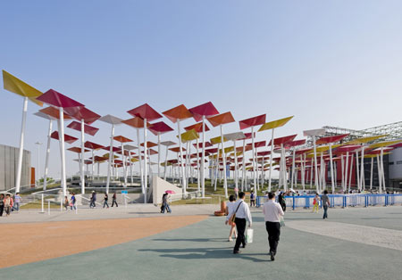
The pavilion’s main feature lies within the design of the papalotes (kites), a word that comes from the Nahuatl papalotl which means butterfly, used as a cultural meeting point between Mexican and Chinese cultures.
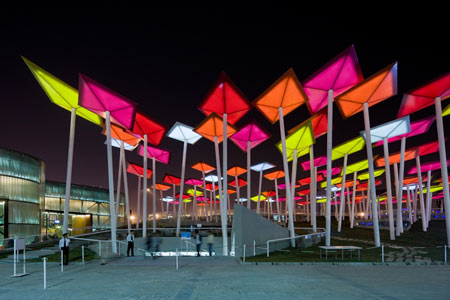
Our proposal is to look into a future with areas which are thought, destined and planned specifically for leisure, the recovery of parks and green areas, where new generations might meet in a city with a “better living”.
CREDITS
Project: Mexican Pavilion for the Universal Expo Shanghai 2010
Use: Exhibition space
Theme: Better City, Better Life
Site: Shanghai, China. Expo Fair, American pavilions area, zone C, number 8.
Total Area: 4000m2
Built area: 3500m2
Dimensions: 80m long X 50m wide
Client: Promexico
Completed: May 2010
Design
SLOT: Juan Carlos González Vidals, Israel Alvarez Matamoros, Moritz Melchert, Mariana Tello Rodríguez, Edgar Octavio Ramírez Corrales
Colaborators: Michel Trejo, Aaron Hernández, Efraín Ovando, Jimena Gonzalez Pie, Jorge Pardo Torra
See also:
.
 |
see all out stories about the expo here |  |
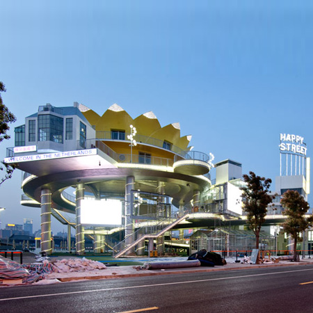
| Netherlands Pavilion by John Kormeling |
see all out stories about the expo here | More photography stories on Dezeen |