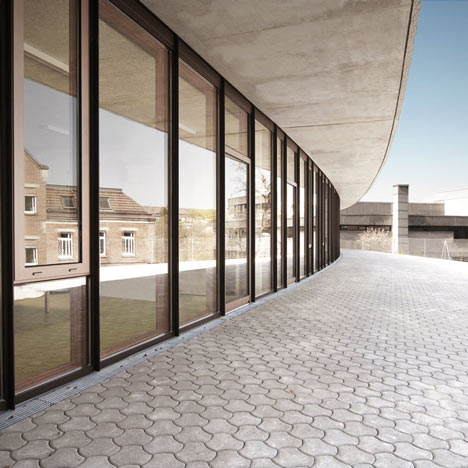
Architects SOMAA of Stuttgart have completed an extension to a school in Leonberg, Germany, made of board-formed concrete where the boards were skewed to form a pattern.
The extension to the Pestalozzi School will be used by students with learning disabilities.
It has a blank facade facing the road and a glazed front overlooking a courtyard and the main school building.
Here's some more information from the architects:
PESTALOZZI SCHOOL LEONBERG, Germany
SOMAA. and collaborator Gabi Dongus, would like to announce the completion of the Pestalozzi School in Leonberg, Germany.
The new Pestalozzi School is located outside of Stuttgart, in the small city of Leonberg, Germany. While Leonberg is known for being the home of Architect Frei Otto, the new school is a contrast to the lightweight structures Otto is famous for. Built partially of massive concrete walls, the school overlooks a valley and is bordered by ordinary, single-family housing units, a community center from the sixties and the brick Pestalozzi School, constructed around 1900.
The Pestalozzi School is an elementary school for children with learning disabilities, and was designed to be an environment conducive to a different way of learning. By using the topography of the site, the architects created open and closed spaces which protect the children from the exterior and promote play and social interaction from within.
The building is set into the slope of the site and has a closed, rough, board-formed concrete facade bordering the street. On the opposite side of the building, the closed street façade is contrasted by an open glass façade facing the old Pestalozzi school building. The building orientation creates a courtyard and establishes a visual relationship between the old and new school.
On the interior, the building is divided into three parts: the circulation, the service functions, and the classrooms. The circulation consists of a gently curving, lilac, corridor that spans the length of the street side of the building and connects occupants to the classrooms and service spaces. It was given a generous width and is ancillary space for resting and playing. Large, circular skylights give the space natural light and the lilac color and complimentary, green flooring contribute to a friendly and open atmosphere. At the end of the corridor, a private outdoor classroom has been carved out of the site and creates a feeling of protected openness within the building.
The service spaces are located in between the corridor and the classrooms and help to generate generous entrance space for each classroom. Surfaced in intensifying shades of green, these spaces also differentiate the entrances to the classrooms. Each classroom is located along the curving, glass façade and has a prominent view, of the old school and the valley.
The floor to ceiling windows and additional circular skylights provide a generous amount of natural light and, because of this, artificial lighting is rarely needed during class time. All classrooms also have direct access to the new playground, which spans the length of the glass façade. The direct connection with the outdoors and abundance of natural light encourages learning and concentration among students.
On the side of the building facing the street, a closed, concrete façade was created by altering the traditionally used method of board-formed concrete. The construction consists of two shells of concrete separated by insulation. For the façade formwork, three different board sizes were overlapped to create a pattern.
Within this pattern, special boards were inserted and used to rotate the subsequent boards. This causes the building to look as if it is leaning against the topography. The boards used for the formwork were rough-sawn and the result is a subtle, yet sharp and undulating facade with a rough texture.
By using the challenging aspects of the site to their advantage, the architects were able to close spaces where privacy was needed, and to open spaces where social interaction was welcomed. The result is an innovative school design that creates a feeling of community between the new and old school.
Click above for larger image
Click above for larger image
Click above for larger image
Click above for larger image
Click above for larger image
Click above for larger image
See also:
.
| Mensa Triangle by SOMAA |
West Buckland School by Rundell Associates |
Public School by GRG Arquitectos |

