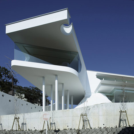
This house in Takarazuka city by Japanese architects EASTERN Design Office has a studio supported above the residence on two mounds of crushed marble.
Called Mountains and Opening House, the project on a sloping site is a home and studio for a footwear designer.
The living areas are on the lower floor, sheltered on three sides by the earth of the sloping site.
Meanwhile the studio above cantilevers out and overlooks the Osaka Plain.
More about EASTERN Design Office on Dezeen:
Horizontal House (October 2009)
Slit Court (October 2009)
MON Factory/House (October 2009)
Slit House (October 2009)
Photographs are by Koichi Torimura.
Here's some more information from the architects:
Mountain/Opening
Deck on the Mountain
The Material of the Mountain
The outside (exterior) mountain is formed into a mound by piling up soil excavated from the slope. The surface of the mound is a type of raw material made from crushed marble called “Kansui”. Glittering fragments of crushed marble on a whity surface shine brilliantly. There are two white mountains. The living quarters are inside the white mountain while atop the white mountainous wave is a deck.
One of the two white mountains functions as a structural support for this building, while the other mountain conceals the bathroom. These two mountains are also set into the living spaces of the residential quarters.
The Structure of the Deck
The framework of the upper floor is steel and the lower floor is reinforced concrete. The upper floor evokes a sense of being on the deck of a boat and in order to achieve this feeling architectural columns and walls are designed as to make one unaware of their existence.
Entering the house from the northern road, a 14meter wide opening and the 16.5 meter x3 meter terrace outside create the feeling that your own body is floating in the scenery. This is a deck.
To achieve this, we used two different methods.
- Revaluation of the trusses. It is not immediately apparent; however, since horizontal slits were cut into the northern wall, trusses were set into it. It is like the structure of a bridge. Bridges are set into the upper part of the horizontal slits which allow the floor to float in the air while concealing the structural device.
- Concealing the structural members in the curves Columns are in the curves forming the openings and this also is concealed. The curves of the openings respond each other with the curves of the mountains. A fantasy created by the repeated curves appearing over and over again.
Living Space + Opening + Mountain
The lower floor fully utilizes the slope of the mountain. The hidden areas become mountains、while the areas that is required light become valleys. These rolling undulations are all part of the design.
Two Horizontal Eaves
There are two thin iron plate eaves on the openings: one with the length of 14 meters on the upper floor and the other with 16.5 meters on the lower floor.
The upper and lower floors are used in different ways. The upper floor is a design room.The lower floor houses residential quarters. That is there are public spaces within the residential quarters.
The demand of how the spaces should be is different; therefore, the structure is also different.
Click above for larger image
Taking balance to unify the upper and lower portions, the curves of the mountain are made continuous with the curves of the openings.
Click above for larger image
There are two thin iron plate eaves on the openings: one with the length of 14 meters on the upper floor and the other with 16.5 meters on the lower floor.
Click above for larger image
The thickness of the iron plate is only 9mm. The straight line of these two eaves emphasizes the expansive spreading horizontal width of this house. Consequently, this makes you forget that the house is on a sloped site.
Click above for larger image
Blue and White
The overall whiteness is not just a general white coat of paint. It is white mixed with blue.
Click above for larger image
This is because we want white that corresponds with the blue sky. In addition, we intend this white to reflect the light of fragments of marble scattered in the raw material which covers on the surface of two newly built mountains.
Anna Nakamura+Taiyo Jinno/EASTERN design office
See also:
.
| Horizontal House by EASTERN Design Office |
Slit House by EASTERN Design Office |
MON Factory/House by EASTERN Design Office |

