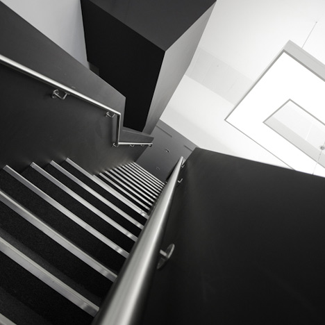
UK designers Studiofibre have complete the west London headquarters of fashion brand Net-A-Porter.
The project incorporates office, retail and events space, and a photography studio.
Studiofibre inserted two mezzanines in the ten metre-high space and a glass meeting room at the entrance.
All photographs are by Pantling Studio.
Here's some more information from the designers:
Fashion doesn’t get much dreamier than this… welcome to the fabulous new world of Net-A-Porter and to the husband and wife duo behind it, Ian and Fiona Livingston, owners of design agency Studiofibre.
In moving from Whiteleys to Westfield, the brief was to create not simply an office, but more ‘a progressive working environment’ which formed a hybrid between office, photographic studios, retail and event space.
The Net-A-Porter brand has a strong masculine presence, with a feminine finesse and a key element of the brief was to capture the essence of this brand.
From an operational point of view, the business model is constantly evolving as are the projected headcount figures, and with this in mind it was important to create an environment that was flexible and that could accommodate such rapid change.
The location was Westfield’s ‘leisure box’, previously destined to be a swimming pool and sports centre and was presented as a shell with no CAT A elements, a vast, cavernous ‘airplane hanger’ with 10M ceiling height.
The timeframe and budget were very aggressive, completing the 44,000 sq ft space from shell to pristine finish, at an average of £60 / sq ft ( including furniture ) within 8 months.
Our solution was to create a ‘working wonderland’ which exploited the ‘non-standard’ nature of the location ( without the use of standard office elements ) and which embraces the ‘progressive’ work environment whilst building a 3D embodiment of the Net-A-Porter brand.
To achieve this, we used smooth vaulted fabric ceilings, bespoke contemporary lighting rafts, elegant Murano glass chandeliers, soaring, oversized panelled doors, sculpted bespoke furniture and a mixture of matt and high gloss finishes that scoop out dimension in an otherwise flat, monochromatic palette … together with a carefully chosen, eclectic collection of budget conscious furniture, very simple carpet spec and painted finishes.
Structurally, two new mezzanine floors were created, each with its own bold statement staircase to offer a more interesting circulation around the space, whilst a floating glass meeting room hovers at the entrance to the main hall, offering fantastic panoramic views across the working landscape and a vast wooden sculpture of steps sets the context for the ‘Theatre’ area at the heart of the space.
A typical working day at Net-A-Porter could take place in any number of ‘settings’ and could involve an appointment in the exquisite, panelled buyers’ suite, a brainstorm in the ‘Living Room’, an informal chat at the front-of-house self-service bar, under the skylight and ornate ceiling (sampled from the original ceiling at the Dome in Whiteleys) or in one of the padded ‘diner-style’ booths.
Whether stealing a quiet moment under the ‘hood’ of the brooding gothic thrones in the ‘Library’ or sitting on the ‘Theatre’ steps whilst a backdrop of runway shows plays out on the wall at cinema scale proportions, the mix of classical/minimal, traditional/contermporary, whether in the form of sliced moulding details or oversized paneling and door proportions is always apparent and reminds you that you are at the heart of a new technology driven cycle that is today’s world of Fashion.
Click above for larger image
See also:
.
| DURAS Daiba by Chikara Ohno |
Studio East by Carmody Groarke |
More interior stories |

