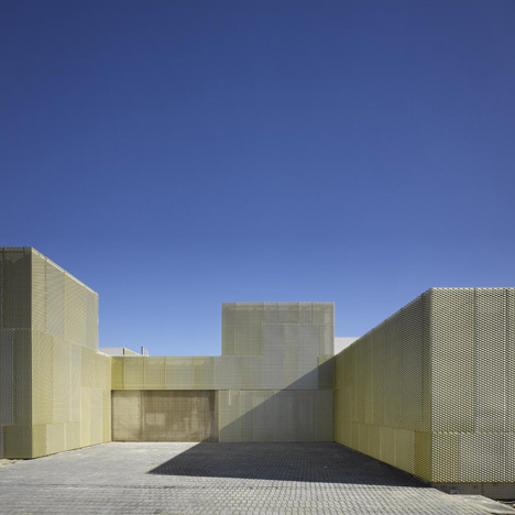
San Blas, Usera and Villaverde by Estudio Entresitio
Architectural photographer Roland Halbe has sent us his photos of three health centres in Madrid by Spanish architects Estudio Entresitio, all with identical floor plans but executed in different materials.
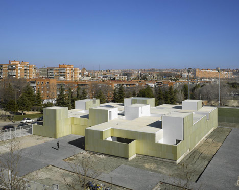
Above and top: Usera. Photographs are copyright Roland Halbe
San Blas, Usera and Villaverde were all built on previously unused sites surrounded by social housing.
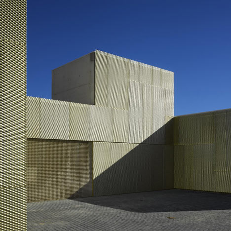
Above: Usera. Photograph is copyright Roland Halbe
Usera is clad in perforated metal panels with a gold finish.
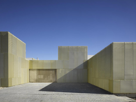
Above: Usera. Photograph is copyright Roland Halbe
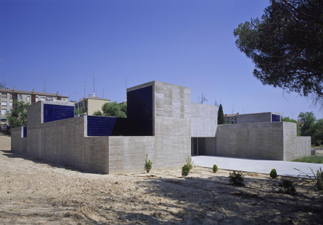
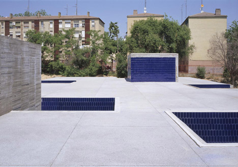
San Blas is a concrete construction cast in horizontal timbers and finished with blue tiles.
Above: San Blas. Photograph is copyright Roland Halbe
Villaverde, which is finished in a mixture of opaque, translucent and transparent panels, was a separate commission to the first two and sits on a smaller site.
Above: San Blas. Photograph is copyright Roland Halbe
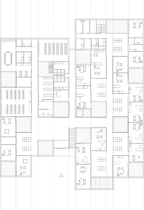
All three have a single storey comprising a mixture of private and public rooms punctuated by thirteen patios.
Above: San Blas. Photograph is copyright Roland Halbe
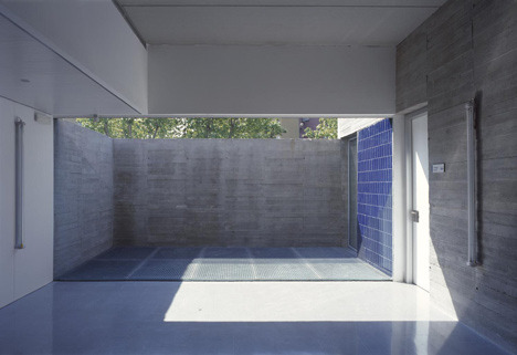
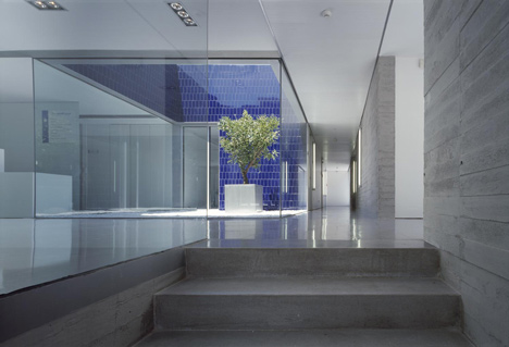
Breaks in the roof above the patios combine with glazed partitions to allow natural light to flood the rooms.
Above: San Blas. Photograph is copyright Roland Halbe
Here's some more from the architects:
Do you remember that Bill Murray’s movie from the nineties called “groundhog day”? In the film, each day was the same day and from 7am it started all over again, one time after another.
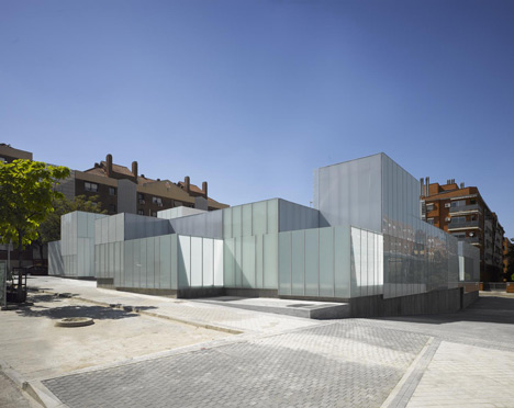
Above: Villaverde. Photograph is copyright Roland Halbe
Going seriously, it has been crazy at times but mostly rewarding to have the chance of building three times the exact floor plan. It all started with an unusual competition for doing two centres for the same client (Madrid’s city council), with the same budget and the same functional program but only two different sites.
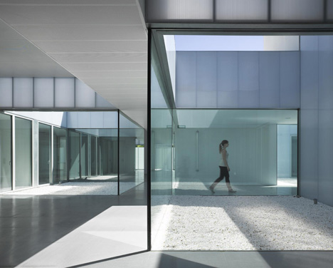
Above: Villaverde. Photograph is copyright Roland Halbe
Sites were in both cases quite irrelevant environments with anonymous social housing surroundings. Our answer to those initial conditions was to work with the idea of a “placeless building”. A great sense of formal+functional+conceptual autonomy was required to allow the building develop no matter where.
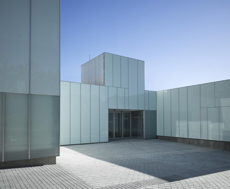
Above: Villaverde. Photograph is copyright Roland Halbe
To emphasize the spatial value of the interior, we resorted to the LeCorbusierian idea of “reconciliation of opposites”. The hermetic and heavy image of the exterior precedes the open and light space of the interior. The program for the healthcare centre is implemented extensively on a single ground floor.
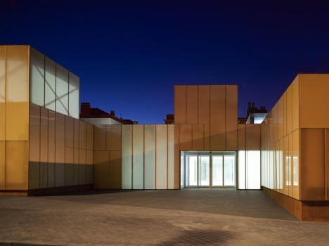
Above: Villaverde. Photograph is copyright Roland Halbe
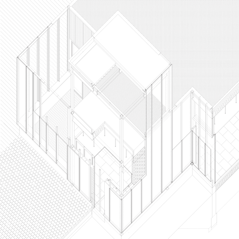
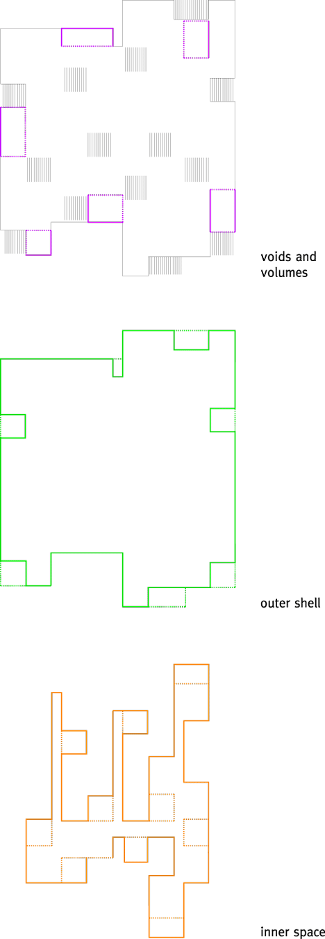
The different rooms of the program are organized on a loose irregular orthogonal grid, where thirteen patios are arranged in a zigzag pattern between the public and private rooms along three parallel (non)-corridors. There is a non stop visual continuity across interiors and courtyards that provides space enlargement. In opposition to this light system, split up by the patios, the solid and heavy façade is conceived as a continuous windowless mass. The absence of hollows in the vertical walls of the exterior enclosure causes the relationship between the interior and exterior of the building to occur vertically, almost with the sky above.
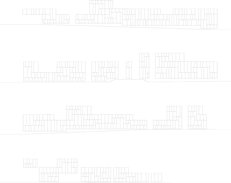
Click above for larger image (GOLD)
The glass panels do not define patios, but hollows in the horizontal façade of the exterior shell of the building, creating a vertical relationship that allows an isotropic interior space to be generated. The transparency and mirroring qualities of the glass creates multiple visions by reflected symmetry.
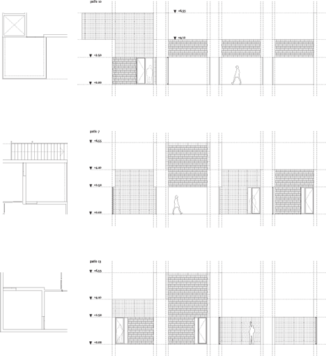
The corridor vanishes, it ceases to exist as the traditional linear connecting structure, because the alternating arrangement of the empty spaces and public areas allows a weak relationship to exist between the “x” and “y” coordinates of space.
San Blas’s centre has been the first one to be built.
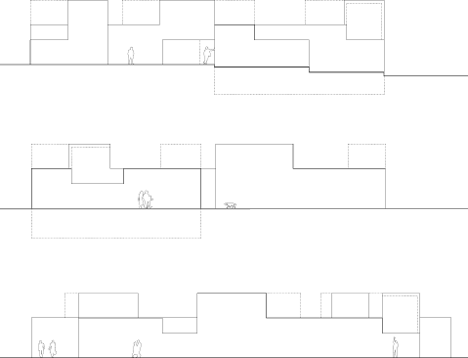
The idea of heaviness is reinforced by the rough texture formed by the horizontal wood planks of the concrete formwork. Put into contrast, the reflective qualities of the vertical walls of blue tile laid in a fish scale pattern help to create a spacious and luminous interior, almost as if the sky were brought inside the building.
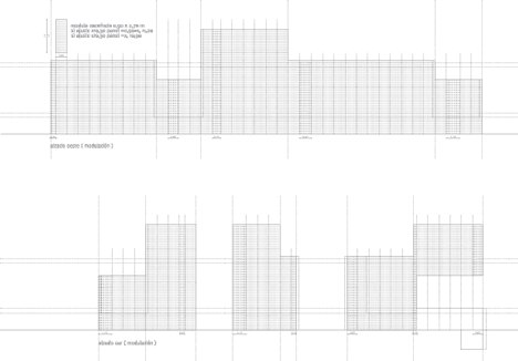
Usera’s centre follows, completing the work chances that materials such as concrete, glass and tiles had to offer in search of identity. But something along the way went wrong with the construction company and a change of company was needed.

Click above for larger image
A golden metal skin is the moving forward strategy needed to accomplish a positive direction in the construction process and also the reason for changing ceramic tiles colour to white. In the end, it is possible to read interior space as a more horizontal and abstract one in comparison to San Blas.
Click above for larger image
The third of the row, Villaverde’s centre, is the result of wining another competition in which luck played a big role. The site was smaller and had a stronger urban character but the floor plan we had fitted just perfectly and the client decided to make us winners again.

Some old ideas from the original project appeared again; what if we tried to build the same spatial scheme with a lighter construction system narrowing the distance between opposites. It was possible to soften the scar between exterior and interior by using a tectonic structure covered with panels, opaque but polished, translucent or transparent. New materials needed new rules and the result is more atmospheric. The hole process has been a challenging investigation between use, sensation and geometry; it is now your turn to make an opinion.
Click above for larger image
Project Three municipal healthcare centres in Madrid
Client: Madrid Salud. Madrid’s City Council
Place: Madrid, Spain - San Blas, Usera and Villaverde are three different neighbourhoods, East and South of Madrid
Dates: 1st competition April 2005, 2nd competition April 2007, Completion San Blas September 2007, Usera December 2009, Villaverde June 2010, Architects estudio.entresitio, María Hurtado de Mendoza, César Jiménez de Tejada, José María Hurtado de Mendoza
Team: Jorge Martínez, Laura Frutos, Vincent Rodriguez, Fabrice Quemeneur, Filipe Minderico, Clara Rodríguez, Marco Plazzogna, Miguel Crespo, Alvar Ruiz.
Consultants: Geasyt, SA, María José Camporro
See also:
.
 |
 |
 |
| 132 Social Housing Block by Estudio Entresitio |
Another building shot by Roland Halbe |
More photography stories |