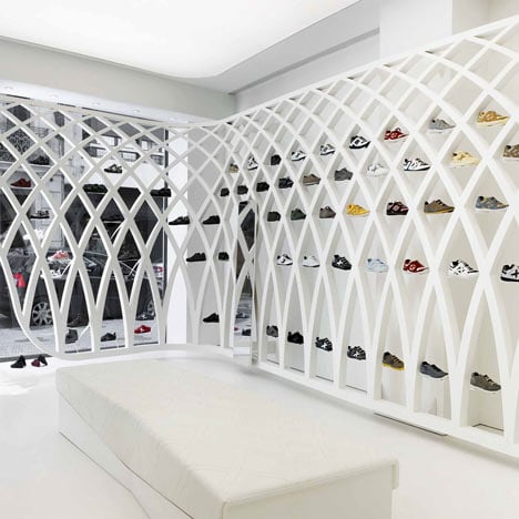
Munich Fractal Arena by Dear Design for Munich
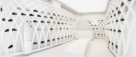
Barcelona studio Dear Design have completed this shop in Valencia with shoes displayed on a metal lattice for Spanish outfitters Munich.
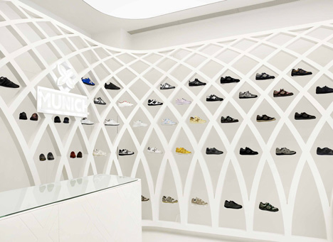
The wall-hung structure, which wraps around the perimeter of the shop, is inspired by the company’s X-shaped logo and finished in lacquer.
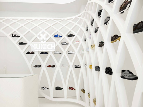
Munich Fractal Arena’s interior is illuminated by a light diffuser spanning the ceiling, and entirely finished in white with a glossed resin floor, painted walls and lacquered furniture.
All photos are by Xavier Mañosa.
Here's the press release from the designers:
MUNICH OPENS A NEW STORE IN VALENCIA
Munich Fractal Arena
Barcelona, XX September 2010. MUNICH, the fashion and sports footwear firm, is opening its second boutique in Valencia. Following on from its first store in the city’s Carmen neighbourhood, it is now opening a second store in Calle Jorge Juan.
Dear Design, the team behind the project, have designed a light, open space to exhibit the brand’s shoes. The main idea is to immerse visitors in the Arena (understood as a stadium), a space flooded with light framed by a hanging metal structure. Visitors enter the store from the street, from chaos to an organised space.
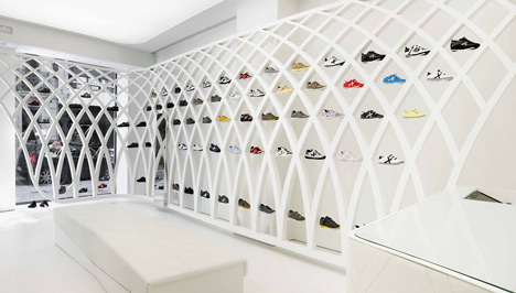
The Arena is shaped by the metal structure, a second skin that surrounds the existing container without touching it and also serves to exhibit the shoes.
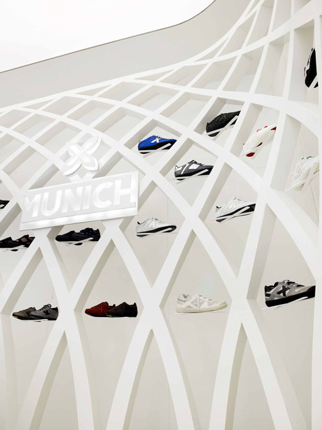
The structure’s fractal design is based on infinitely repeated Xs, the brand’s symbol, down to the last detail: the supports, the backstitching on the skin on the bench and the counter, and the system of catches – always performing different functions.
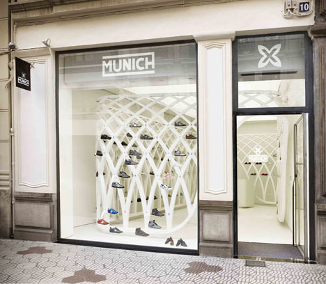
Each hole in the structure allows for easy access to the exhibited product, highlighted by the use of white. This is the main element on this stage, where visitors are the leading actors.
The simplicity to this project lies in saving materials – only sheets of glossy white lacquered iron for the perimeter structure, Corian for the lettering, a Barrisol stretched ceiling for lighting, natural iron for the joinery, white polyurethane resin with glossy varnished finish for the floor, and white skin and iron sheets for the furniture.
Text: Isa Casanellas
See also:
.
 |
 |
 |
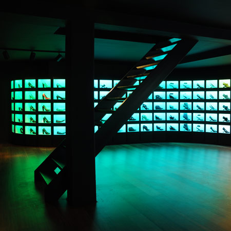
| United Nude Flagship store by Rem D Koolhaas |
Camper store Paris by Ronan and Erwan Bouroullec |
Kensiegirl Showroom by Sergio Mannino Studio |