SAYL by Yves Béhar for Herman Miller
Yves Béhar of San Francisco design firm fuseproject has designed an affordable family of office chair inspired by suspension bridges for Herman Miller.
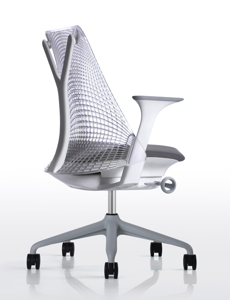
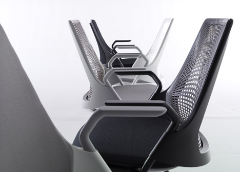
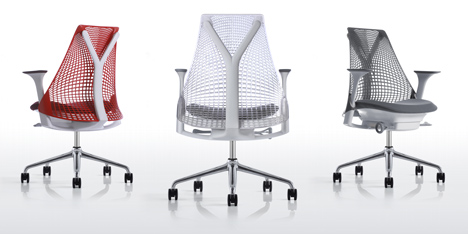
The SAYL chair features a frameless back, providing support by suspending the back material in tension between the under-side of the chair seat and the Y-shaped vertical structure.
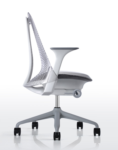
The chair has been designed completely from the ground up, reducing the number of materials and components in the process, achieving Cradle to Cradle Silver certification and also enabling it to be sold from the modest price of $399.
Here's more from Yves Béhar:
SAYL: LIFE UNFRAMED Yves Behar’s artist statement
I knew that creating a work chair is one of design’s greatest challenges, an intimidating project in every possible way. What makes it so difficult? There is no place to hide in a chair. Every part serves a structural or tactile purpose. Every part is about creating comfort while needing to be visually cohesive and beautiful.
In addition, a chair is also a symbol of its time, revealing the technological advances of an era, and expressing how humans live and work together in that era. Its daunting constraints, from ergonomic regulations to expectations, are only matched by its tremendous potential: to become a metaphor of its time.
And so, almost deliberately, I practiced for more than a decade and waited to tackle the work chair. And it is only after turning 40 that I feel ready for such an epic design challenge.
So how did we start? I believe that one of design’s most important promises is to create attainability. This has been a central pursuit of my studio fuseproject: from laptops designed for kids in developing world classrooms (OLPC) to energy-saving lighting and EV charging stations. So we approached this project with the following questions: How do we create a task chair that is attainable? And can we make a comfortable, supportive, healthy, and, yes, beautiful task chair at a fundamentally lower price than anything Herman Miller, the leader and innovator in the field, has yet accomplished?
Attainability can only be reached if every molecule in the product is working harder. Fewer parts and less material ultimately mean less cost...and less carbon footprint. We call this principle Eco-Dematerialization.
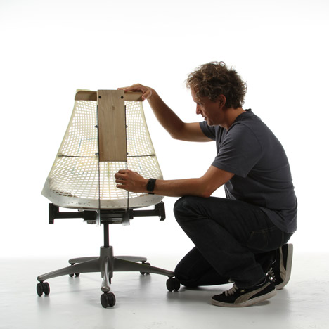
Early inspiration came from observing the way suspension bridges carry tremendous loads. The Golden Gate Bridge is near my home in San Francisco, and its structural towers and cable system led to some ideas: what if we use a tower for vertical support, cables for back tension and comfort, and a lower span as base? This early intuition led to some experiments in the studio’s workshop, and some early successes in defining the engineering principles of the SAYL chair. Iterating on the curvature of the lower ArcSpanTM allowed us to fine- tune the shape of the back of the chair to mirror spine curvature. Ultimately, between the fuseproject shop and Herman Miller’s, we produced 70+ prototypes, constantly building, testing, breaking, and starting all over again.
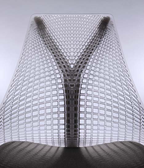
The next stage was also a question: What materials could bring our engineering experiments to life? To replace the wood and rope of the early prototypes we focused on injected soft materials that would be comfortable and support the body in specific ways compared to mesh textiles. After dozens of iterating pattern density, thickness, and tensile levels, we settled on an injected urethane sheet placed under tension between the Y-Tower and the lower ArcSpan.
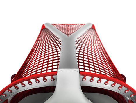
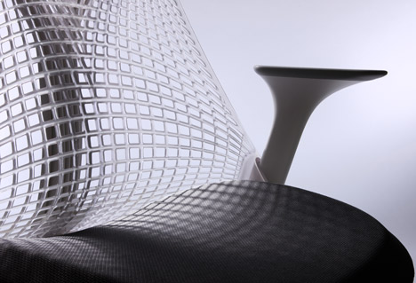
The result is a breakthrough: We can eliminate the use of a hard material to frame the SAYL back, allowing greater movement and the first frameless suspension back. No more hard edges! We are also able to change the performance of the SAYL back to reflect ergonomic support needs: more supportive and responsive areas through thicker injected sections in the sacral, lumbar, and spine areas, and softer areas in the upper back and edges. We named this approach 3-D IntelligentTM surfaces, and refined the feel of the back through 100 different patterns, material thickness, and tension strength experiments. The frameless back allowed us to design the parts to more easily twist and move with the user, encouraging movement and a more dynamic response from the chair.
Once the bridge suspension principle was refined and ready for final engineering, another opportunity became clear: to combine structural parts and achieve further dematerialization. For example, the ArcSpan, arm structure, and tilt mechanism undercarriage have been fused into a single triangulated part whose strength has the advantage to lighten the chair’s material requirement significantly, as well as its visual weight, becoming a multifunctional super-part.
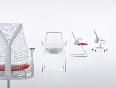
We also pursued the detailing of every part and every surface with two goals in mind: removing as much material as possible, and shaping every part to be beautiful, expressive, and tactile. Structural parts are simultaneously sculpted and hollowed-out, such as the Y-Tower and ArcSpan, which results in an aesthetic that reveals structure. Touch- points like the back tension knob and height adjustment paddle have the bare-minimum amount of materials with a tactility that informs the user of the part’s function.
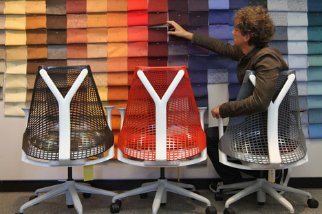
Too often, task chairs look assembled from a kit of parts, and often they are. There is a dance between SAYL’s functional engineering work and its cosmetic shaping, and there is a relentless desire to have parts run fluidly into each other. For example, I was particularly interested in making the arms look as if they were stretched and growing seamlessly out of their height adjustment posts. There is also the idea of separate parts drawn as if conceived as one: The SAYL’s frameless back is shaped to both express the tension distribution from the top attachments, and visually follow the form and exposed ribbing of the Y- Tower. As a result, the two parts are visually layered as if one.
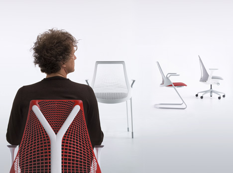
In my opinion, Herman Miller does not sell a style, but rather a set of inventions that are identifiable as the most radical in the industry. But what makes the chair relevant now? It was important to reflect the workplace now and communicate the new horizontal nature of 21st century corporate structures. SAYL gives a sense of visual lightness and transparency rather than a status-announcing design, and an ergonomic feel that is biomorphic. At the same time SAYL has a sense of humility and attempts to achieve high-tactility design rather than visual statement. The chair screams design intent when viewed and touched by the sitter in close proximity, but from afar it almost disappears. The workplace is not about chairs and what they say about the people that sit in them; it’s about the humans and their work. To that effect, SAYL appears smaller in scale, and its dematerialization makes it more transparent in the environment.
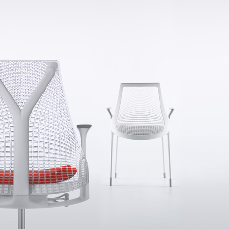
The final chapter has been to design a whole collection of work chairs, with side chairs benefiting from the material innovations and the 3-D Intelligent design of SAYL, and to craft a forward timelessness that puts the details at the center of the design.
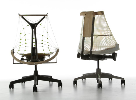
The whole SAYL design adventure was really a process of invention, iteration, constant failure and experimentation. It did not take place on the computer, but in the workshop and on the drawing board, with real prototypes leading to failures and successes. What Don Goeman at Herman Miller describes as “growing” a chair rather than “building” one is the idea the fuseproject team led by Bret Recor, Qin Li, and Naoya Edahiro took to heart for three years, and through a deep collaboration with a dozen Herman Miller engineers under John Aldrich, and the watchful eye of Jack Schreur, we really “grew” the SAYL line of work chairs.
Every design and invention should benefit the company that takes the risks to invest in a new innovation, but every product should also benefit the world by demonstrating a more sustainable and socially responsible way to do business. In addition to being dematerialized, lighter, and by default having a smaller carbon footprint, the SAYL is also manufactured on three continents to reduce shipping environmental costs, packaged in a half-size box, Cradle to Cradle certified, backed by a 12-year warranty, and receives all the service a conscientious enterprise provides.
There is an amusing parallel between the SAYL’s physical lack of frame around its suspension back, and my belief that we humans are increasingly benefiting from “unframed” expressions of our potential, taking on bigger challenges and to going beyond work or social expectations. This led me to give the chair the nickname of “unframed” early on in the process. The idea continued to grow in my mind, and eventually became bigger than the chair itself. “Life unframed” now describes all workplaces and life-places as having that freedom and potential. So somewhere along the way, SAYL started to feel just like the beginning of a bigger idea, a “life unframed” that is accessible to more of us and will continue to evolve.
See also:
.
 |
 |
 |
| VerBien by Yves Béhar |
PACT underwear by Yves Behar |
More furniture stories |