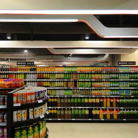
White lighting tracks with red edging swoop across the ceiling in this Shanghai supermarket by Head Architecture of China.
Called Lotus Fresh, the flagship store for the Lotus chain of shops is divided into two areas, with fresh produce in one, and preserved food and beauty products in the other.
Wooden canopies hang above display stands.
The information below is from the designers:
Lotus Fresh
Lotus is a well established brand in China with 70 supermarkets across the country. In an effort to appeal to discerning shoppers in the Pudong area and to compete with the many new luxury food brands moving in to the Shanghai, Lotus commissioned HEAD to develop a new flagship store transitioning from 100% local brands, toward a larger component of foreign products and services.
The store has been re-planned around two main areas.
Firstly a fresh section, followed by the dry area which encompasses non-food, beauty and preserved items. Many demonstration areas feature tables and customisable columns.
New chilled display counters are combined with back wall super graphics and timber canopies. New low-level shelving and counters across the fresh area create clear vistas to the back wall making the store feel larger and more open.
The open market appearance is further enhanced by open ceilings and a set of store graphics that incorporate clear hand scripted fonts in Chinese and English. New staff uniforms and training were a key component in the successful relaunch of the store in January 2010.
Click above for larger image
Project Address: B1, Superbrand Mall, Shanghai, China.
Total Area: 44,000 sq. ft.
Project designer in charge: Mark Panckhurst
Project design team: Robert Weller, Ceci Yuen, Karen Yim
Click above for larger image
See also:
.
| Rotterdam Market Hall by MVRDV |
More stories about retail |
More interiors stories |

