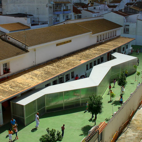
Spanish architect Julio Barreno has added a zig-zag covered walkway to this school building in southern Spain in order to connect what were previously separate sides for boys and girls.
Called Víctor de la Serna y Espina, the school was originally designed in 1957 and had a symmetrical design allowing for the sexes to be taught entirely separately, but a new system at the school required the two halves to be joined.
The tunnel is clad in translucent polycarbonate and provides a playground shelter for pupils as well as connecting the two entrances.
The renovation project also involved painting the existing building, with neutral colours for the classrooms and circulation picked out in orange.
More stories about education »
The information that follows is from Julio Barreno:
Víctor de la Serna y Espina public school. Ubrique, Cádiz, Spain.
The current school is located in an extended part of this city and it was the result of one of Antonio Sanchez Esteve´s works. Although the executive project was finished in 1957, the building was completed in 1963.
The plot has a rectangular shape, is almost horizontal, and is surrounded by three streets. The fourth side is occupied by the buildings that complete the block.
The intension not to occupy most of the area for the students breaks resulted in the construction of the building on two levels; the obligation to segregate the students by sex and other strict rules made the architect repeat the layout in a symmetrical way.
This is an example of the international architectural style carried out in this part of the world. The use of inclined roof made the design get close to the vernacular constructions. It is important to realize that this is an interesting response to those complex rules from a cultural context developed from the centre of Europe to this outlying site.
The final position of the building lines up with the long sides of the plot exactly in the centre. The southern façade of the building tries to protect the main programme from the sun by locating the server program, connection spaces, toilets, etc, there. This is the entrance façade.
The northern elevation is occupied by the classrooms using bigger windows looking towards the softer northern light.
About the current refurbishment.
Nowadays in Spain discussion continues about whether or not it is good to separate the students by sex in education. In the case we are working on there is no doubt that this organization became dysfunctional. The layout of the building is drawn up with a clear axis of symmetry that divides it into two identical parts. The impossibility of connection between those two parts is a problem today. Adding to that the strict education rules and programme for the new construction, the final design seems to be suitable.
The need of a covered area in the playground for the breaks in winter and the connection of those two parts made us transform it into a covered path that allowed people to walk from one part to the other without getting wet when it rains, a good solution, especially for disabled people.
It is interesting how this element and the existing building become a new entity or product without touching one to each other; a result where both pieces are interacting continuously.
The chosen geometry to generate this programmatic addition goes far from the original orthogonal geometry intentionally. This broken line connects the two entrances; at once trying to find the natural path and, at the same time, generating a personal identity.
For its construction, it was interesting to use a material that could both provide protection from the weather and also attempt to define the volume - permitting it to have a translucent appearance. The final material used was cellular polycarbonate; it becomes a light element, a soft piece that interacts with the existing building, taking care with it.
The intervention also considered the painting of the inside and outside; for the exterior we used the contextual white, colours for the interior; a soft beige colour for the classrooms and an intense orange colour for the connection spaces to bring them out from the others, making evident the original disconnection between parts and in this sense, highlighting the solution for that.
The electrical installation also helps us to explain the continuity of the generated spaces. In this case, it is not a fitted infrastructure but becomes a main character using it visible on the walls and ceilings. It is the blood system that brings the electricity to all parts of the building guiding the visitors in their visits.
This case of architecture from the past with certain malfunctions that forced us to improve them using our best tool: the Architecture. On one hand, the surgery-architecture to prepare the body first, and after that the prosthesis-bypass-architecture as a complement and extension; what we obtained is a kind of synergic architecture, something where the interaction between the two elements is more than the sum of the individual effects.
This artificial element is made so as to adapt to the body where they are installed, understanding the context and their purpose, without producing any rejection; in this case it is conceived as an alien in the patient, with a different geometry and a specific technique that generates specific identity. A quality of lightness, transportable, assembly, almost machines… generated by the constructive systems that distinguish them from the existing body.
In the end, we have an example where architecture and its techniques save the patient from its illness far from mummifying or letting it die, and all that using strange and untransferable machines, but at the same time, understandable, handy and stimulating.
Beautiful contemporary prosthesis, said once Manuel Gausa referring to the human prosthesis.
Architect: julio barreno gutierrez
Techincal architect: Rocio Roman Aguilar
See also:
.
| Canoes Landscape by Julio Barreno |
Living Around a Patio by Julio Barreno |
More design for education |

