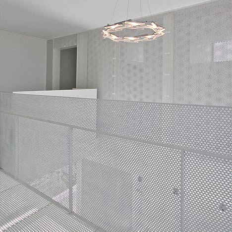
Japanese architects StudioGreenBlue have completed a house in Kōnosu City, Saitama Prefecuture, Japan, with an interior featuring white perforated screens throughout the space.
Called Distance of Fog, the project incorporates metal screens to provide sense of privacy within the open-plan space.
Th perforated partitions each have a different pattern and have been arranged to overlap each other.
This overlapping creates a constantly changing pattern depending on the angle of the viewer and provides a distorted view of whatever is behind the screen.
Here's some more information from the architects:
This house is called “Distance of Fog” and it is situated in the suburbs of Tokyo.
The project site is located on a cul de sac with seven other single family homes.
Cul de sac’s in Japan often are used as a common space for the families that live on them, and they are often used as children’s playgrounds or places of gathering.
But unfortunately, most suburban Japanese homes tend to be disconnected to the street.
This subdivision is certainly no exception.
The client requested an “expanse of space” and an “open floorplan” which suited their lifestyle.
Therefore, we decided to design a house with a bright presence.
We also wanted to extend the brightness into the rooms and naturally illuminate the common spaces within the home.
Privacy became the biggest challenge when deciding to open the home up to the street.
It became apparent that the proximity of the home to the road presented a challenge of separation between spaces.
So we decided to create a sense of distance with the concept of looking through fog.
This concept breaks up the visual range, without creating a solid barrier.
Using the concept of filtering an image, we adjusted the level of visual information penetrating through multiple layers, creating an effect similar to looking though fog.
First, we moved the house to the back of the lot and maximized the front yard.
Then we adjusted the level of visual information as it relates to the finish floor level, placement of walls, and also reflections on mirrors and glass.
Furthermore, we separated the private room by using perforated metal screens, each one of a unique pattern, and they were arranged to very specific locations.
See also:
.
| Ghost-like Architecture |
Nomiya temporary restaurant by Pascal Grasso | More architecture on Dezeen |

