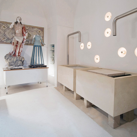
Design studio LOLA - Local Office for Large Architecture and architect Riccardo Cavaciocchi have completed the renovation of a paper restoration centre in Lecce, Italy.
Previously divided into small, badly connected spaces, the renovation has now created dedicated zones for each process of paper restoration.
The upper level has a slatted floor you can see through and features tables suspended from the ceiling.
Photographs are by Edoardo Delille.
Here's a bit more information from the architects:
CENTRE FOR PAPER RESTORATION
The Restoration Center is located in historical Lecce, in the midst of ancient and irregular streets flanked by buildings of small and medium size, all built in the traditional local stone. This is an office where many types of ancient paper are restored: manuscripts, books, parchments, prints, wallpapers and papier-mache statues.
The project area was previously divided into small, poorly connected spaces, which were the result of multiple renovations that had completely altered the original structure. The project’s goal was to create a room for the treatment of the papers (washing and drying), an area for scientific research, analysis and preliminary stages of the restoration work, an archive, a library, a space to wash the tools and a changing room for the staff. The first step was to recover the original structure by tearing down everything that didn’t have a historical or structural connection.
White was used to increase the reflection of light and the space was opened up as much as possible, trying to use existing openings and steps. The cutouts in the structure created between the walls rhythmically mark the strength of the space; the empty emphasises the full, which at the same time represents the hidden elements, creating perspective views through which are possible to read its depth. This is the language. A game of solids and voids where the local stone takes expressivity and is the absolute protagonist.
Elements were added which seem to rise and come to life by integrating with the supporting structure such as the staircases, the large tanks for washing the paper and other horizontal tanks for the conservation and cleaning of brushes and tools. The height has allowed us to design a floor that has the characteristics of an almost abstract environment so it wouldn’t oppress the spaces below.
We needed something light, solid but intangible, almost like a sole parasite which returned the light it was given during the evening. This creates a filter of light between the two environments that changes, as the light of day and night does. The staircase, made of local stone that protrudes from the wall and seems to float in the air takes you to this place, which almost deceives, a space in metamorphoses.
Empty spaces interrupt by box-shaped iron profiles that fold into steps, railings and balustrades of communication with the lower floor. This is a context, a little elusive, almost mysterious, where the suspended tables move and assemble together, sliding on rails placed on the ceilings.
Click for larger image
See also:
.
| Double 00 ‘09 by Case-Real |
More interiors on Dezeen |
More architecture on Dezeen |

