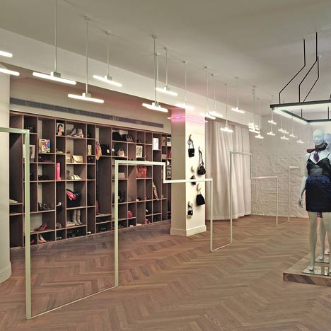
Rhus Ovata Tel Aviv by k1p3
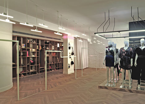
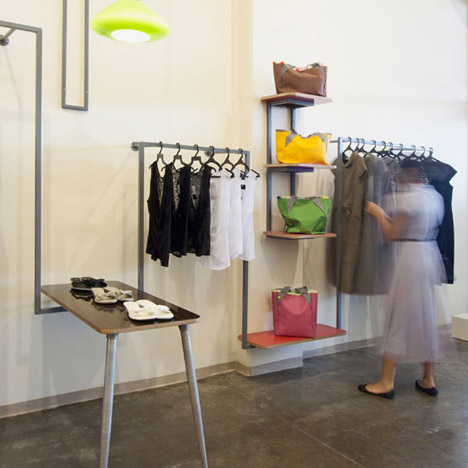
Karina Tollman and Philipp Thomanek of Israeli studio k1p3 have completed the interior for this fashion boutique in Tel Aviv, with a contiunous metal clothes rail dividing the store lengthways.
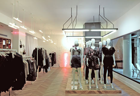
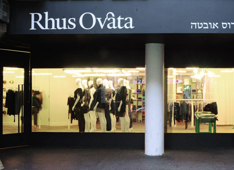
The shop's window was narrowed leaving a horizontal strip of glass in the centre, while mannequins and displays inside are lined up to run parallel with the street.
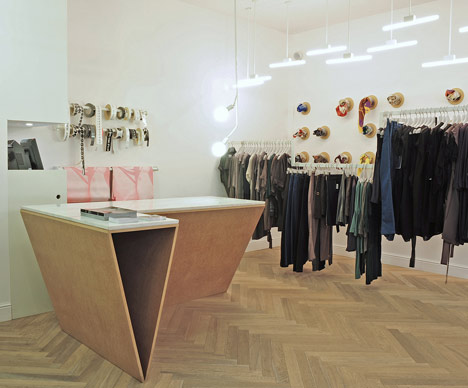
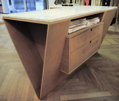
Display stands and counters are made of MDF while horizontal lights hover over the central rail.
More retail interiors on Dezeen »
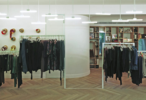
Photographs are by Daniel Sheriff.
The following information is from the architects:
k1p3 architects designed a new flagship store for the fashion label Rhus Ovata in Tel Aviv.
The premises are located on a busy fashion shopping street, the Rhus Ovata brand identifies itself as a subversive brand and therefore chose a shop set back from the sidewalk. The architects' concept for the shop was born from this position, trying to accentuate the depth of the shop. Creating a horizontal layering parallel to the street.
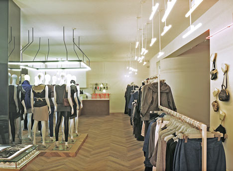
The shop façade was redesigned, using steel to close the lower and upper parts of the vitrine and leaving a clear horizontal strip through which the shop shines and draws passers-by in. Openings were introduced in the back wall exposing a back garden.
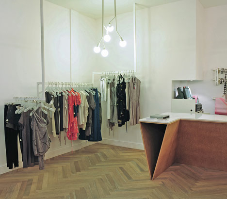
The materiality was kept minimal and basic in its nature narrowed down to a rectangular steel profile and MDF, and the style draws references from contemporary art.
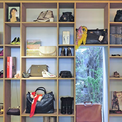
The shop displays both the Rhus Ovata collection and it's 'Borrowed' vintage accessories collection. The collections were organized in the space according to the layers concept.
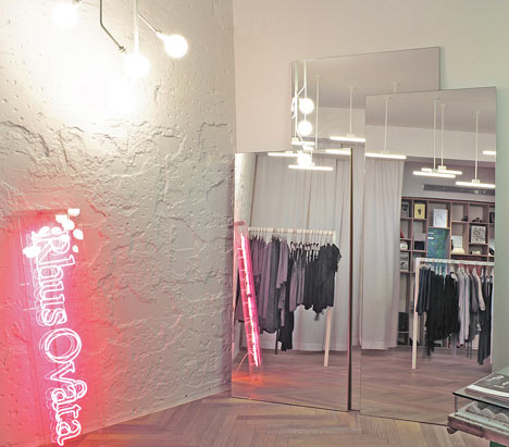
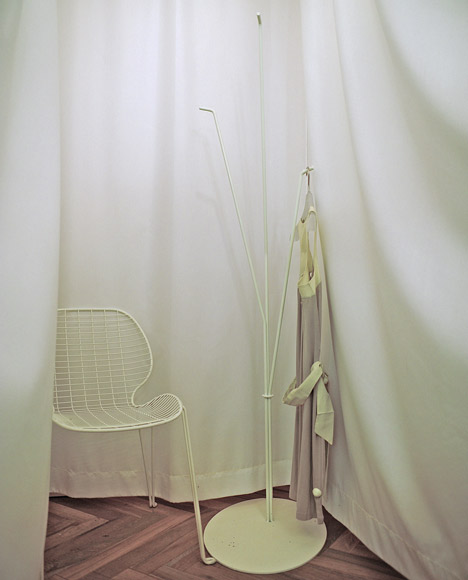
The majority of the fashion collection is hanging on a continues single axis across the entire width of the space with three passages crossing it where the steel profile is set into the floor. In the entrance the same steel profile suspends from the ceiling creating a topography within the space.
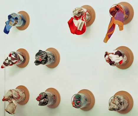
Along the backdrop of the shop, the 'Borrowed' collection is displayed in a library next to selected art books and alongside it is a wall installation of vintage scarves.
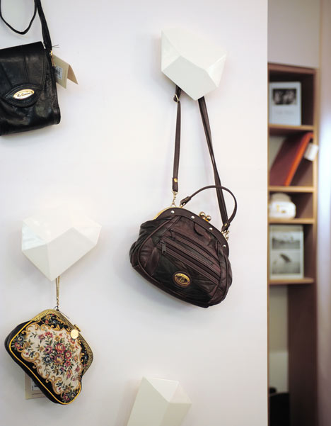
Special diamond shaped hangers were designed and hand made to present the bags on a single column.
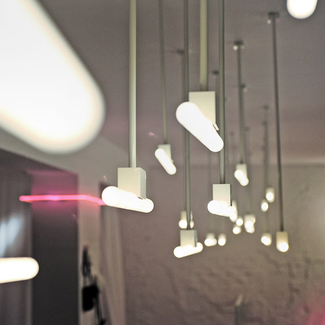
A great emphasize was given to the design of custom made light bodies. The light bodies generate a dialogue with the floor plan highlighting its orientation and creating a hierarchy in the space.
Long horizontal lamps were designed emphasizing the long suspended rack creating a 'highway' of light in alternating positions above it. Vertical, mushroom like, lamps were designed to highlight particular points in the space.
And pink neon was used for the logo, casually leaning against a wall, repeating around the single column. The logo and packaging branding is by Koniak design.
See also:
.
 |
 |
 |
| Ahoti by Studio Lama |
Hila Gaon bridal store by k1p3 |
Fashion Studio by Irena Kilibarda |