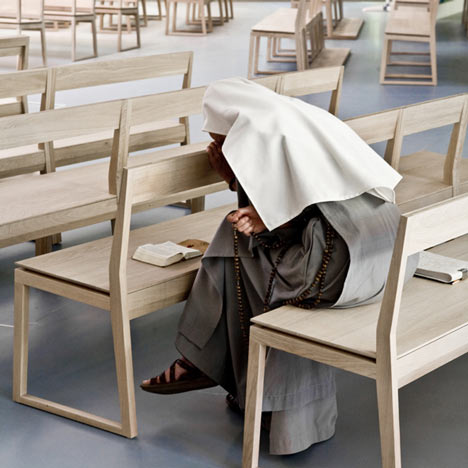
Grégory Lacoua and Jean Sébastien Lagrange of French design studio John Doe designed furniture for this Parisian chapel, which has been renovated by French architects 3box.
The Chapel of the Assumption was originally completed in 1961 by French architect Noël Le Maresquier, and features a swooping ceiling and floor-to-ceiling stained glass wall.
John Doe created oak pews and lecterns, a granite altar and stone font for the chapel, all with a 20mm gap between the supports and top surface to appear as though floating.
The font is formed by a simple depression in a slab of stone, which holds a litre of water.
Renovation of the chapel and circulation was undertaken by French architects 3box.
See Dezeen's top ten: churches »
Photographs are by Felipe Ribon.
Here's some more information from the designers:
Chapel of the Assumption by John Doe
John Doe, the design studio created by Grégory Lacoua and Jean Sébastien Lagrange has hallmarked the new decor of the Chapel of the Carmelites of the Assumption in Paris (16th).
A chapel already intended as an architectural gesture in 1959 by Noël Lemaresquier (a disciple of Le Corbusier), but which was very quickly made impractical following the canonization in 2007 of Saint Marie Eugenie of Jesus, founder of the congregation: a canonization which provoked an immediate flood of visitors requiring efficient organisation.
An original design and architecture strain that the nuns did not hesitate for a second to confide to contemporary designers to make it intelligible.
It is over to the 3Box team of architects to whom the reconversion of the chapel has fallen, by rethinking the reception and the circulation of the pilgrims.
Whilst the John Doe duo tackled liturgical furniture: pews; prie-dieu; altar; font; tabernacle and lectern; so many typologies beyond domestic design that John Doe handles accurately for his very first large- scale building project.
The paths of design being penetrable, it is always a question of a small, terribly human creative detail which unites and gives meaning to the furnishing as a whole.
The John Doe duo worked on a small, exactly 2cm hiccup.
A 2 cm gap between the levels and the supports, a small permanent elevation which draws a distinction in the formal vocabulary and that the nuns immediately seized upon to best adapt this new place.
The font, the altar and the pews consequently levitate together visually.
The impeccably designed pews have been produced in oak to allow large ranges and integrate other constraints, starting with prayer of the hearts: that is face to face, one of the Congregation’s peculiarities.
The centre of the chapel is therefore reserved for nuns who face each other, the regulars situated on the periphery.
A spacialisation highlighted by the rhythm of the sound of feet: as the centre is approached, the denser it becomes.
The seating is distributed according to different modules: stalls for the nuns (with or without integrated storage for psalters and bibles); 3 differently sized pews for the congregation with or without prie-dieu.
The black Zimbabwean granite altar, containing a relic of St Marie Eugenie, has been designed with the same unfailing care, as if it had always been there, a slab of pure stone above ground, the perfect résumé of the altar reduced to its primary function (an altar is originally a simple flat stone which can be mobile and conserve the whole of its function).
The font is made from Auberoche stone and by the softness of its line becomes "a simple drop laying a stone," as the John Doe duo desired.
Capable of holding a litre, it is as functional as it is minimal and delicate.
John Doe.
In the Anglo-Saxon culture, a John Doe is a corpse whose identity is unknown, someone anonymous.
Mocking show cased design, Grégory Lacoua and Sébastien Lagrange therefore chose the proper noun of a unknown generic, an identity which is not one to personify their design whose vocabulary claims to be as free as possible.
Free of the need to establish themselves as personalities, but very determined to play in the big boys’ arena in the permanent competition register aiming to determine the best response for each question asked.
See also:
.
| Lumen United Reformed Church by Theis and Khan | Kuokkala Church by Lassila Hirvilammi and Luonti | More churches on Dezeen |

