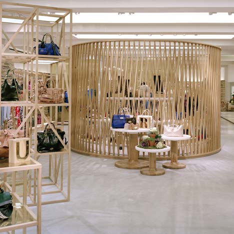
London firm Universal Design Studio have completed the interior of a shop on London's New Bond Street for fashion brand Mulberry.
Opening this week, the shop features a concrete floor, display stands made of oak batons and an 8.7 metre-long polished brass cash desk.
More about Universal Design Studio »
Photographs are by Leon Chew.
The following details are from Universal Design Studio:
Mulberry unveils new store and design concept for its London flagship location
In December 2010 Mulberry will be moving its flagship boutique from its current location at 41-42 New Bond Street, London to a few doors away at number 50. The move is another manifestation of Mulberry’s overall success, evidenced by the company’s mid-term announcement that sales have jumped 79 percent across UK stores compared to last year as well as the recent launch of their app for iPhone and iPad. The opening of the 50 Bond Street store will seal Mulberry’s standing as a luxury fashion brand with a unique emphasis on desirable and responsible creative British output.
The new store design is the result of Mulberry’s two year collaboration with Universal Design Studio. It is an innovative, thoroughly modern, dynamic retail environment that reflects the brand’s aesthetic, its commitment to craft, ecological and ethical concerns, and its ties to the English landscape.
According to Georgia Fendley, Brand Director, Mulberry; ‘We are immensely proud of our British heritage and our reputation for craftsmanship; we wanted to facilitate the translation of these quintessential elements of our brand into our retail interiors.
Rather than a pastiche of the craft used to create our products we have sought out the best of British craft for each material and function and let the quality and authenticity speak for itself. The teams have delivered an astounding result given the almost impossible brief we set – beautiful, totally Mulberry, authentic, responsible, flexible and innovative. They have wrestled with the sometimes conflicting agendas of aesthetics and ethics and their passion and commitment are evident in the attention to detail achieved. Unlike many slick ‘shop-fitted’ environments our new Bond Street flagship is designed to last and to develop a patina over time, like nearly all of the best things in life it will get better and better with use!’
The new design will provide an open and informal layout over 5,400 feet of retail space set on one level, where customers will be encouraged to meander through the sections at their leisure. To maximise the ability to reflect the change in pace of retail life the majority of fixtures are freestanding and fully flexible, allowing for the manipulation and reconfiguration of the internal architecture.
The finished store will reflect many features of a modern art gallery; juxtaposing informal, open spaces and daylight-simulating, energy-conserving light boxes. The vast open space and raw concrete ‘warehouse’ style floor will be a visual canvas for the refined, bespoke features such as handmade irregular tiles and the textural contrasts between crafted oak, smooth brass and white lacquered surfaces.
Different materials are contrasted in all aspects of the interior makeup, for example the brass tablets designed by Jonathan Ellery set into the floor, or in the service area where an 8.7 metre polished brass cash desk is contrasted with the gloss-lacquered panels behind that are designed to reflect light into the narrowest area of the store. There are also sculptured oak timber and textured brass ‘follies’ that break up the store space and offer an intimate shopping environment within the open-plan floor layout.
The environmental concerns of such a large space have been addressed as an integral part of the design brief. Mulberry has been working closely with Max Fordham, consulting engineers who implemented energy efficient concepts into the new store design. As well as the construction and design process there are measures in place for ongoing energy monitoring, designed to create an environmentally aware retail space and working atmosphere.
A key feature supporting energy conservation is an undulating stone wall forming the backbone of the store, created using the traditionally British craft of dry stone walling. The wall is an ingenious part of the mechanics of the store, retaining heat in the winter and cooling the air in the summer. Equally inspired is the adaptation of a simple Roman idea; polished brass back plates behind lamps in one of the follies reflect light back into the space, maximising the efficiency of the fittings.
Universal Design Studio is expecting the store to receive a BREEAM rating of ‘Excellent’ which is very unusual in retail constructions and space.
The new Mulberry Bond Street store will be the first flagship to feature this new concept, with several international stores currently under construction. By subtly contrasting the traditional with the modern, customers will be given the chance to immerse themselves in a new retail environment, maximising their enjoyment of the product and appreciation of the space around them.
Mulberry has also created a micro-site, www.fiftynewbondsteet.com, to house exclusive content regarding the project. There are interviews with those involved with the store’s construction, and a time-lapse film showing how it came together, as well as various images of the interior and individual design concepts. Information is being added regularly to build a rich depiction of this dynamic new store and the myriad of components and people involved.
See also:
.
| Louis Vuitton Maison by Peter Marino |
Reiss flagship store by Universal Design Studio | H&M Seoul by Universal Design Studio |

