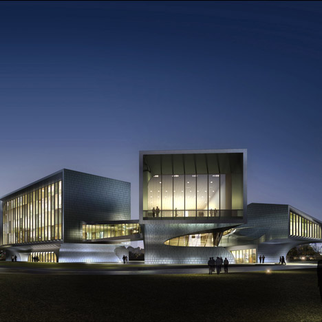
Beijing studio Sunlay Design have designed this building to house the headquarters for a technology park in Huainan City, Anhui Province, China.
The building will consist of two structures - a tower block and a two-pronged cantilevered building - which will be connected by a glazed walkway on the second floor.
The building will comprise a five-storey office building, an exhibition centre, an underground car park and a public square.
Construction is due to start in 2011.
All our stories on buildings with cantilevers »
The following information is from Sunlay Design:
Chinese architects office SUNLAY DESIGN shared with us their project for the HuaiNan Animation Technology Industrial park.
Located in HuaiNan city, AnHui province in China, this project mainly is a headquarter for the park that is going to be built. The building’s consists of 2 architectural parts connected by a flowing bridge on the 2nd floor.
West part – a 5 storied office building with a height of 23.1 m, total area 5500 sqm. - East part – a 2 storied exhibition center with a height of 18.45 m, total area 2800 sqm. - A public square with an area of 780 sqm and an underground parking space with an area of 3200 sqm , through which people can find access to both building parts.
Click for larger image
Building Concept :
The idea of the building's massing and spaces comes from the melting ice cubes. Ice cubes tend to creat a soft connection between each other as they melt down.
This concept starts with normal boxes through which architects get integrated and fluent spaces by disasemble and reconnect those boxes with curved surfaces. This kind of space organization brings the building much more complexity and diversity.
Click for larger image
Ice Cube Pattern :
Architects took the cladding gaps as part of the designning elements while they confronted with the cladding division problem, same to the massing, concept for the cladding also came from ice cubes. Ice cubs present an edge-to-center colour gradient due to the refraction happend as light beam comes through.
Edges always seem darker and more solid than it appears in the center. Architects tried to get the same effect by controling the gaps' distance and dencity, following expansion images are the final result for claddings.
Panel typology
Inorder to creat an gray-tuned gradient pattern, there are 3 different sizes of pannels padding to each surface, pannels with size 2 will be randomly put between pannel 1 and pannel 3 inorder to creat a smooth transation.
Panel 1,2,3 will be used for facade surfaces wile pannel 2,3,4 will be used for curved surfaces, hence there will be 4 pannel sizes in total.
Surface Optimization :
The building is mainly consists of 11 facaded surfaces and 14 curved surfaces that will be covered by cladding. 2 of these curved surfaces will be double curvature surfaces while 12 of them were optimized to single curved surfaces inorder to make cladding division and manufacturing easier to go.
Location :
The project is located in the far east to the industrial park which faces the south of ShunGeng mountain and takes a tunnel to get access to the center of the city.
Program :
B1: parking, staff restraunt and mech rooms
1F: exhibtion and sales center
2F: offices, meeting rooms and muti-functional rooms
3F: offices, meeting rooms and archive rooms
4F: offices, meeting rooms
5F: guest rooms
Click for larger image
Landscape :
Treated as an extension of the building, paving that surround the architecture is designed to embrace the connection part of the building where cladding tries to touch the ground, standing infront of the building, people will find cladding pattern gradiently change in to paving pattern, which makes the building and landscape a integrated whole.
Click for larger image
Structure solution :
The 2 parts of the building use individual structure system connected by a bridge on the 2nd floor. Both parts of the building use steel structure.
The maximum cantilevered part length is 20 meters, where there are enhanced bracing and steel beams for those cantilevers at the end of each part.
See also:
.
| Dove of Peace by Sunlay Design |
FRIEM Headquarters by Onsitestudio | More architecture on Dezeen |

