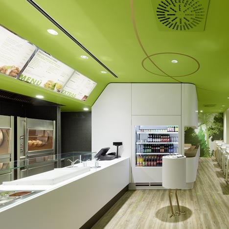
Stuttgart practice Ippolito Fleitz Group have completed the interiors for a fast-food chicken restaurant in Munich, Germany.
Called Wienerwald, the restaurant has tree motifs and forest graphics covering some of the walls and windows of the bright green space.
The use of brown and green througout the interior space is meant to reference nature and the forest.
The very first Wienerwald restaurant was opened in 1955 and the Ippolito Fleitz Group have been commissioned to rebrand all the restaurants.
Photographs are by Zooey Braun.
More restaurants/bars on Dezeen »
More interiors on Dezeen »
Here's some information from the architects:
Friedrich Jahn opened the very first Wienerwald restaurant in Munich in 1955. The synonymous fast-food chain expanded over the following decades until it was operating branches in 18 countries. Following the collapse of the group, the company was under varying ownership until the grandchildren of the founding family bought back the rights to the brand in 2007. Their goal is now to build on the long tradition of the company, exploiting both the strength of the brand and the uniqueness of their gastronomic concept. Our studio was commissioned to develop new corporate architecture for the chain, which has already been rolled out in two Wienerwald branches in Munich.
Wienerwald has not only relaunched its visual presence, but also its culinary offering. Chicken, with its naturally low-fat, healthy meat, remains the main staple of the menu. However a second focus on fresh chopped salads has been introduced to move the food chain into the sector of fresh and healthy foods.
The new interior design underscores the realignment of the brand, while translating the chain’s traditional strengths of high quality, comfort and German cuisine into a contemporary design idiom. Materials and colours reflect the principles of freshness and naturalness, which find their expression in materials such as wood, leather and textiles, as well as in the dominant green tones that complement the fresh white. Gold is used as an accent colour, conjuring up associations of quality and the crisp, gold-coloured skin of the main product, the Wienerwald grilled chicken.
The space has been organised to ensure good visitor guidance, crucial in a self-service restaurant, as well as respecting the need for a differentiated selection of seating. Upon entering the restaurant, the guest is guided towards a frontally positioned counter, which presents itself as a clearly structured, monolithic unit. Menu boards suspended above the counter visualise the range of food on offer. The food itself is also visible: An indirectly lit niche in the rear wall of the service area presents a selection of salads adjacent to grilled chickens turning on a spit. The wall is covered in anthracite mosaic stones, into which frameless, stainless steel units have been precisely inserted, thereby underscoring the high standard of the products. A neon green arrow in the centre of the rear wall indicates a hatch to the kitchen where fried chicken dishes are prepared.
Order and payment terminals occupy the far ends of the white, solid surface counter. The chopping station is in the middle. After ordering, this is where salads are chopped, chicken is portioned and toppings are added from containers set into the counter under the guests’ watchful eyes. In the wall adjacent to the payment terminal, a display refrigerator stocks drinks and desserts. The restaurant remains odourless thanks to a ventilation and extraction system integrated into the counter area.
In front of the service counter is a service station made of white solid surface, offering sauces, condiments and cutlery. It stands on golden chicken legs and looks expectantly towards the entrance. Green instructions and Wienerwald chickens set into the rustic wood floor show the customer how to navigate the ordering process.
The dining area offers a range of seating options catering toward different requirements. White solid surface high bar tables are available for guests with little time on their hands. These are supported by a single leg with a tapering cylinder at its foot, recalling the traditional turned table leg. Alternative seating is available in an elongated seating group upholstered in brown, artificial leather, a reflection of the traditional Wienerwald seating niches.
Guests are really spirited away into the ‘Wienerwald’ (English: Vienna Woods) here. Overlapping, rough-sawn oak panels on the rear wall quote the forest theme. Round mirrors printed with the outlines of tree and forest motifs are set into this wall. Different-sized pendant luminaires at varying heights hang over the tables. These are sheathed in a roughly woven fabric in three shades of green and ensure a pleasant atmosphere.
Forest images in different shades of green on wallpaper occupy one side wall, as well as transparencies on the windows. The view into the restaurant from the outside thus becomes a multi-faceted experience in which the individual elements on the mirror and glass surfaces reflect and overlap one another, making the brand world a truly holistic experience.
A display of dining plates on the wall is dedicated to the Wienerwald company and its long tradition, reminiscing on the history of the brand in 14 motifs. They pay tribute to Friedrich Jahn, the brand’s founding father, and show a photograph of the first Wienerwald restaurant. The new restaurant design repositions Wienerwald as a contemporary fast-food chain. Traditional elements of the brand have been incorporated and translated into modern spatial elements with an exciting twist.
See also:
.
| AG Cafe by Kidosaki Architects Studio |
Beijing Noodle No. 9 by design spirits co., ltd |
Blu Apple by Budi Pradono architects |

