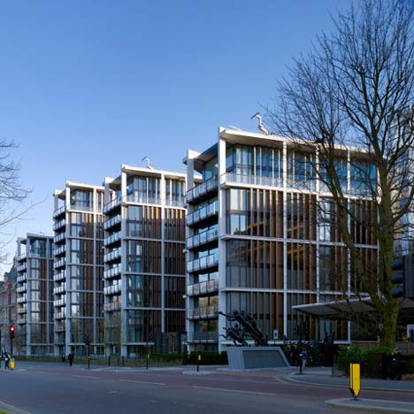
Here are some photos of the recently-completed One Hyde Park residential development in London by Rogers Stirk Harbour + Partners, which boasts the most expensive apartments in the world.
Opened in January this year, the project comprises four linked towers of differing heights.
Floor plans are wider in the middle and taper towards the ends in order to maximise views out over the city.
Circulation routes connecting the buildings are located between the blocks.
The development consists of 86 apartments with the top level of each block housing a two-storey penthouse suite.
A reception, business centres, leisure facilites and retail units are also included.
The towers face Knightsbridge on one side and Hyde Park on the other.
Photographs are by Nick Rochowski.
More projects by Rogers Stirk Harbour + Partners on Dezeen »
More residential architecture on Dezeen »
The following information is from the architects:
The brief was for a landmark development which complements and enhances the rich textures of the existing local architecture, whilst creating a structure which integrates well with the neighbouring buildings.
The existing rooflines - a dynamic and prominent feature of the local context - are characterised by the cupolas, turrets, gables and chimney stacks of the adjacent Mandarin Hotel.
Detailed analysis of the context suggested that the buildings separating the Park from Knightsbridge were disjointed and varying in height, style and composition, resulting in a varied architecture along the northern side of Knightsbridge.
With the exception of Bowater House, one of the key consistent features was the expression of verticality, ranging from the bays of the Mandarin Oriental Hotel to the verticality of the Hyde Park Barracks Tower.
In recognition of the context - and in contrast to the design of the former Bowater House - a series of interlinked pavilions was conceived allowing permeability and offer views of Hyde Park from Knightsbridge.
The separation of the pavilions was conceived to create a stronger visual connection between Knightsbridge and the Park than previously existed.
The relationship of the pavilions with each other and with their neighbours followed a radial pattern emanating from a central point well within the Park.
This resulted in a complementary alignment with the immediately adjacent buildings of Wellington Court and the Mandarin Oriental Hotel, as well as reinstating, as close as possible, the sweep of the original road and pavement alignment to the northern edge of Knightsbridge.
The shaping of the pavilions - which widen towards the centre of the site and taper towards the perimeter - allows for oblique lateral views from each pavilion towards Knightsbridge to the south and the Park to the north.
The pavilions vary in height, responding to the existing heights of Wellington Court to the west and Mandarin Oriental Hotel to the east.
The circulation cores are located at the ends of - and between - each pavilion. These provide both primary and secondary access.
The detailing of the cores is intended to be as light and transparent as possible, to maximise visual connections between the Park and Knightsbridge.
The form of the residential pavilions and their separation at the cores breaks down the overall mass of the development and seeks to create a roof profile that does not compete with the mass of the neighbouring Mandarin Oriental Hotel.
The upper levels of the pavilions are deliberately intended to resemble the roofscape of the immediate context in terms of colouration and texture.
The base of the proposal responds to the differing terrains of the Park and Knightsbridge sides, at those places where they provide a street frontage.
See also:
.
| Leadenhall Building by Rogers Stirk Harbour + Partners | Shard 2012 exhibition by Hayes Davidson and Nick Wood | 100 11th Avenue by Jean Nouvel |

