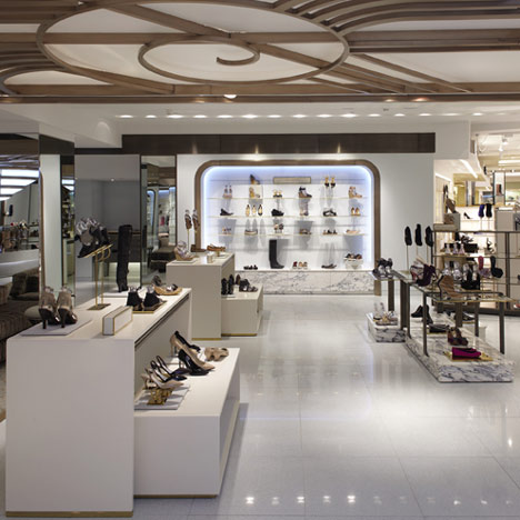
Interior designers Shed of London and Singapore have completed the women's shoe section for London department store Harrods.
Designed with an Art Deco theme, the interior features swirling patterns over the ceiling, marble floors with brass seams and a blue glass composite floor.
Shoes are displayed on marble stands and glass shelves edged with brass.
Conical chandeliers hang over featured collections.
More retail design on Dezeen »
Photography is by James Winspear.
The information that follows is from Shed:
SHED CREATE NEW HARRODS SHOE SALON
With a portfolio that includes luxury retail brands Vertu, Prada, Spencer Hart and Hunter, Interior architects Shed had all the right credentials when approached by Kurt Geiger to re-design the prestigious Harrods Shoe Salon.
Shed wanted the design of the department to be synonymous with everything that Harrods stands for.
They have created a dramatic space with a real sense of expectation which customers experience from the moment they arrive.
The aesthetic draws inspiration from Art Deco and combines classicism with the spirit and true glamour of the Golden Era.
This can be seen in every element of the environment, in the materials, colours, lighting and furniture as well as the architectural treatment of the space as a whole; Sorbet coloured marbles, solid brass fixtures and lacewood veneers are feminine and luxurious.
The floor is a sleek, sparkling ice blue, glass composite, punctuated by Guggenheim inspired brass trims that make sweeping curves and statement lines.
The Shoe Salon will carry 80 brands and a total of around 3500 shoes within its 15,000sqft; Service and experience were the key factors Shed needed to consider.
From personal consultation to making a purchase all from the comfort of a seat, Shed used their skill in retail design and Kurt Geiger’s knowledge of service to develop a department that would both excite and entice the customer.
Furnished areas will play a big part in this customer experience.
Shed chose soft carpeting and specially commissioned George Smith to produce one-off pieces of furniture in bold prints, hand made Chinoise embroidery and feminine ice-cream colours - adding to the drama and luxury of this exquisite space whilst encouraging customers to linger in very beautiful and elegant surroundings.
A magnificent 30m light feature stretches above the main area, creating a real sense of place to the department.
A colonnade of chandeliers dropping low into the space shapes the new walkway and below each a bespoke fixture will preview the newest and most popular collections.
See also:
.
| Shoebox by Sergio Mannino |
Camper store by TAF |
Sneaker dept at Dover Street Market by Studio Toogood |

