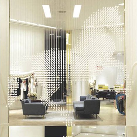
Stella McCartney Las Vegas by APA
There's a horse made of crystals hanging in fashion designer Stella McCartney's new Las Vegas store designed by London studio APA.
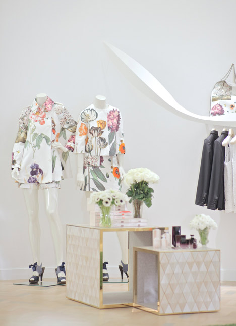
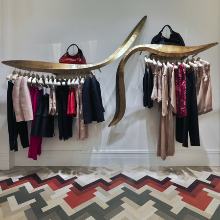
Clothing is displayed on swooping rails and tiled cubes.
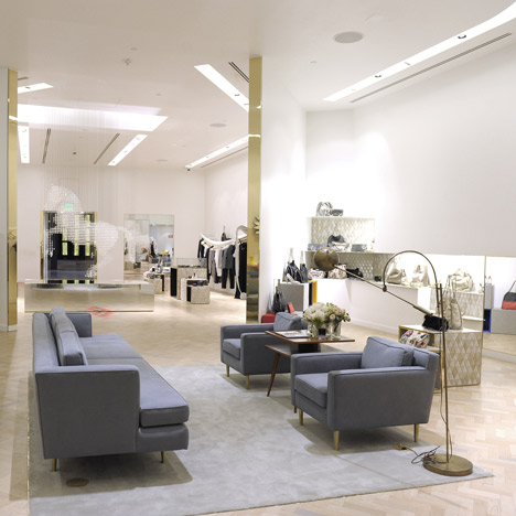
London designers Raw Edges with Established & Sons were commissioned to created the coloured wooden herringbone floors.
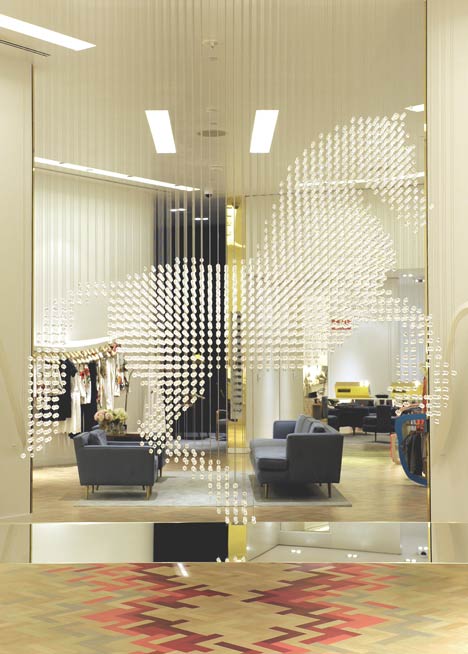
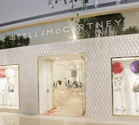
Located in the Daniel Libeskind-designed Crystals City Center, the store is clad in diamond-shaped tiles with brass window frames.
More about Stella McCartney on Dezeen »
More retail design on Dezeen »
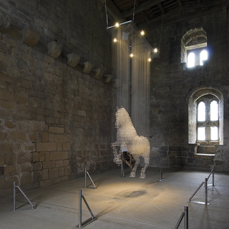
Above: the crystal horse at its previous home in a Scottish castle
Photographs are by Denise Truscello and Chris Weeks.
Here's some more information from APA:
Located within The Crystals City Center project, the Las Vegas Stella McCartney store nestles between two inclined thirty storey 'crystal' towers. Like huge glass shards they create a landmark space in their shadow within the Daniel Libeskind designed building. This is the new epicentre of Las Vegas - a complex cluster of angular forms which houses marques from around the world under thirteen (lucky for some) twisting rooves. The Stella McCartney store sits next to Cartier, close to the Aria Casino entrance - a simple brass facade. Formed with rhombus ceramic tiles defining two large display windows, the central entrance opens with a colourful threshold. This is the beginning of Stella McCartney's Vegas.
Stella McCartney have collaborated with architects APA from Soho, London with whom they also worked for stores in Paris and Milan, (in association with an experienced local team) to propose the ambitious new store which houses a remarkable crystal horse at its very centre. Imported from a Scottish Castle, the horse 'Lucky Spot' is named after Stella McCartney's mother Linda's own horse. Hanging within a vast fourteen foot ceiling space, the crystals are suspended mid air to describe in light the form of George Stubb's famous equestrian painting 'The Whistle Jacket'. It is an act of theatre combined with design artistry and a slightly wicked but healthy sense of playfulness. The horse is surrounded by the Stella McCartney latest collection on an array of sculptural sweeping clothes rails and with geometric cubes housing her accessories merchandise. A subtle sense of joy is, we hope, evoked.
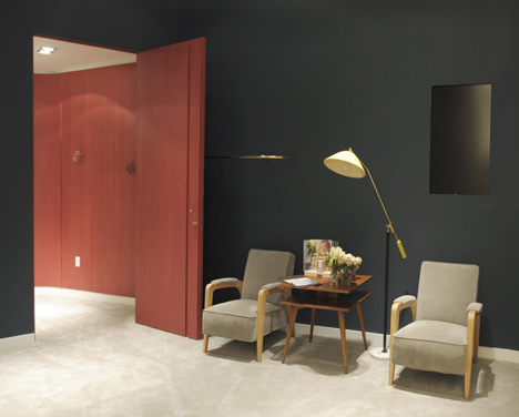
On the floor, a traditional Herringbone (designed by Raw Edges with Established & Sons) has been commissioned which subverts the classical feel in beautiful nude tones to depict an enormous sweeping curvature guiding the customers though the collection. At the back of the store, the pattern becomes a classic dotted check plaid subtley merging to a warm luxurious lounge punctuated by brass clothes rail and English furniture. The fitting rooms go a step further in spectacular tones of veneered maple of warm red, azure turquoise and deep rich flannel grey ; a further inflexion of the traditional, this time in timber panelling set within a room of deep Hague blue.
The new environment mediates between design, artistry and the bravura of Las Vegas in a confident and uncompromising manner.
See also:
.
 |
 |
 |
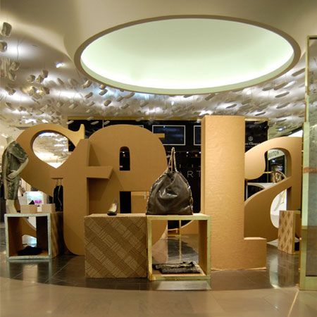
| Pop-up store for Stella McCartney by Giles Miller | Stella McCartney Milan Store by APA |
More retail design |