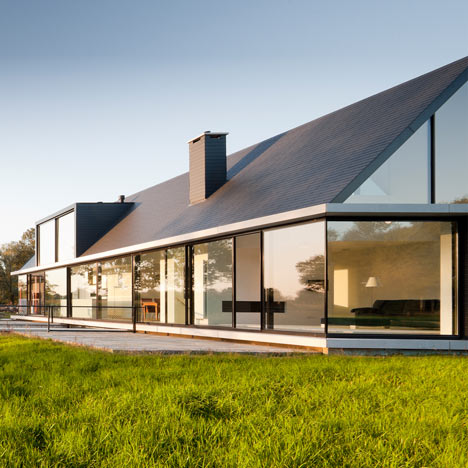
Dutch firm Hofman Dujardin Architects have completed this glazed villa in the Dutch countryside near Geldrop.
Bedrooms and bathrooms are sheltered at basement level, arranged round a courtyard with a ramp sloping up to the garden on either side.
Living spaces on the ground floor overlook the garden through long panels of glazing while a study nestles into the eves of the pitched room.
Photographs are by Matthijs van Roon.
The information below from the architects:
Villa Geldrop designed by Hofman Dujardin Architects
Hofman Dujardin Architects designed a large villa set in the Dutch countryside. It is no ordinary house, however. What appears at first sight to be a simple block with an angled roof turns out to be a complex composition of space and light as well as a study of the modern home's function.
The building is placed at the rear of a large, flat site with the horizontal lines of its façade reflected in the pathway from the road. The roof and the ground floor are both large, angular and dark blocks which are set off by large panes of glass that keep the geometry clean and the appearance uncluttered. Below grade, the story changes.
At the front of the house, running parallel to the pathway, concrete steps lead down towards a basement-level patio, opening to a glass hall-way/family room. On either sides, this subterranean space is lined by bedrooms. At the rear of the house, the gesture is continued in the shape of a long, sloping ramp up into the garden.
Villa Geldrop is a house for a businessman with a family. Seen as a home, it is easy to analyse. Bedrooms and bathrooms are sheltered below ground. Living room, dining room and kitchen are all walk-through areas on the ground floor. On the upper level, more intimate than the others due to its angled roof, a study area has been created. This space benefits from the indirect light that is generated by the composition of glass and the opening up of the area by considering it to be a kind of mezzanine.
Click above for larger image
This results in a house which, despite strong geometry, feels spacious rather than large, and cosy rather than crisp. The building is more than a home, however. Primarily as a result of the different but complementary wishes of the client and the architect, the project lends itself to a multi-layered analysis. There is line-of-sight connection through the house's main axis which runs along the concrete trench that defines the spatiality of the project. This effect is increased by moving the two staircases to the side. Both stairs run up from the lower level to the ground floor, one of which continues to the attic level.
Click above for larger image
Using the floor plans as a guide, the project can be viewed as a modern interpretation of the classic box plan made famous by Italian renaissance architects such as Palladio. This allows the essence of the project to reveal itself. The channel cutting through the building and the orientation of the rooms towards the garden at the rear are an affirmation of the importance of light and the quality of the space created. In this sense, the orientation of the rooms becomes clear as a clever organisation of space and light, to powerful effect.
See also:
.
| Warehouse by Shinichi Ogawa & Associates |
House in Paço de Arcos by Jorge Mealha Arquitecto |
Solbrinken Ordinary House by In Praise of Shadows |

