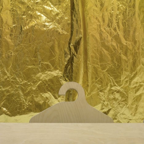
The Surgery by Post-Office
Here are some photographs of Dezeen's new offices at The Surgery in north London, designed by London studio Post-Office.
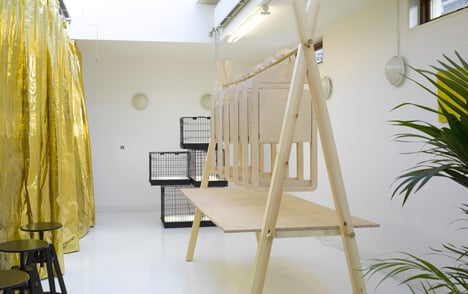
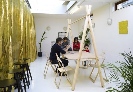
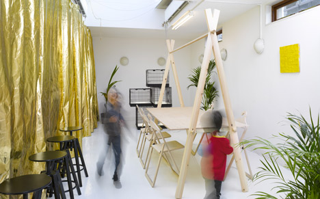
One wall of the entrance and meeting room on the ground floor is covered by a long golden curtain, concealing doors to the kitchen, bathroom and storage.
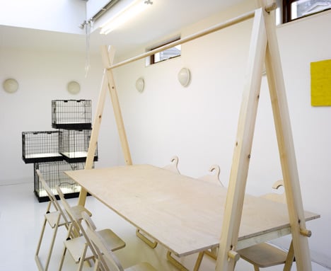
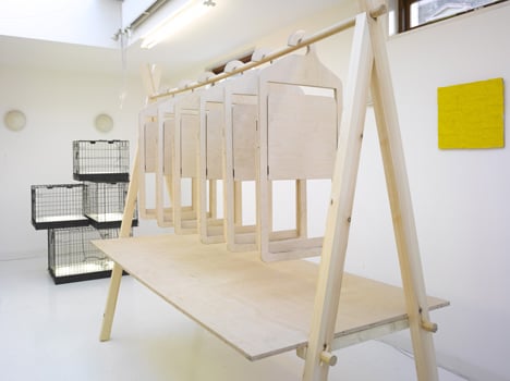
The meeting area is furnished with London designer Philippe Malouin's Market Table (see our earlier story here) and Hanger Chairs (see our earlier story here).
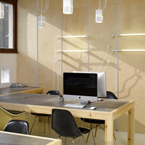
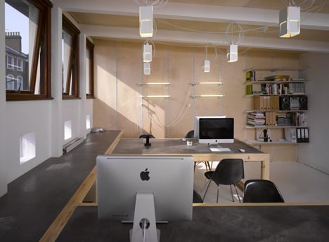
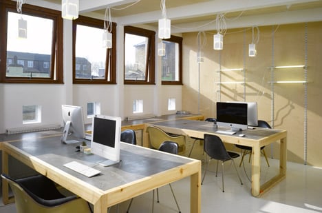
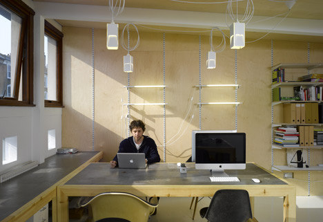
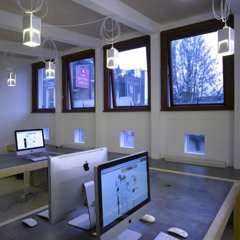
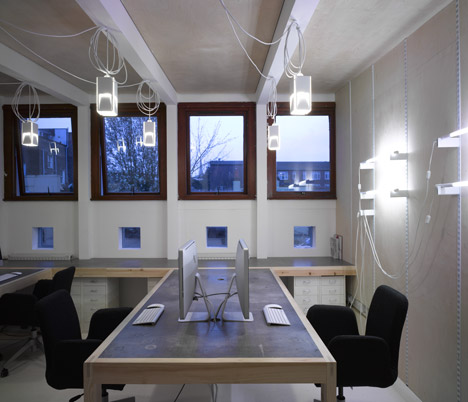
The first floor office features mobile work benches made of standard-section softwood and grey MDF.
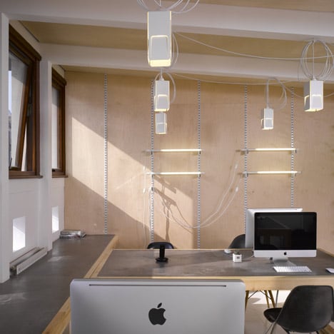
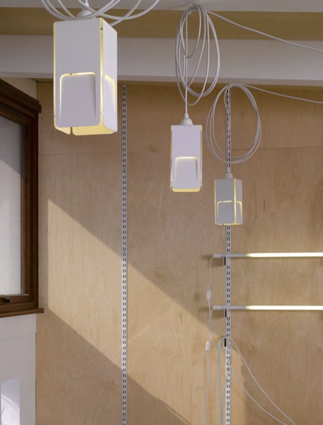
Lamps by Malouin on long flexes and a standard shelving system mounted in one wall allow storage and lighting to be reconfigured as needed.
The interior is painted white throughout with a hardwearing gloss floor.
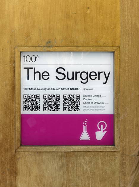
The Surgery branding is by Zerofee.
Photographs are by Edmund Sumner.
Here are some more details from Post-Office:
Dezeen
Working with a compact space and budget, our brief was to turn an old doctor's surgery in Stoke Newington into a light, clean place in which the Dezeen staff could work and relax.
The brief led us to develop solutions that were inexpensive and lo-tech, both designing custom items and adapting existing products from Philippe Malouin to suit the needs of the Dezeen office. Within the building, the upstairs-downstairs axis helped clearly delineate a work and relax programme; the ground floor acting as entrance and meeting space, the first floor a separate place of work.
Thematically, the two spaces required different approaches - upstairs was designed as a 'workshop', using untreated raw materials and an almost monochrome, muted colour palett. The walls and ceiling are clad in birch plywood, with all other structural surfaces painted white, including using a cost effective hard-wearing floor paint.
The custom designed moveable desks utilise standard shop-bought timber for the frames and grey MDF desktops. Standard shelving uprights are integrated into the plywood wall to allow for an adaptable configuration of shelves, coat hooks and strip lighting.
The ground floor space was designed as a clutter-free, light-filled oasis, combining exuberant touches with the restrained raw material aesthetic established upstairs. The focus of the room is a custom built meeting table, also constructed from standard timber elements with a construction plywood tabletop, designed to hang objects such as magazines and the Philippe Malouin 'Hanger' chairs, which can be hooked onto the central bar or lifted off and unfolded for use.
In addition, the clean gallery-like space serves as an ideal backdrop for the Dezeen Watch Store. The reflective gold curtain brings an unexpected touch of luxury and play, whilst enhancing the brightness and warmth of the large skylight overhead.
This project aimed to celebrate economical raw materials and create a space that was flexible, functional and enjoyable.
Established in 2009, Post-Office is a London-based architectural and interiors design practice lead by Philippe Malouin. The Post-Office aesthetic mixes unexpected materials with an artful sensibility to create clean, utilitarian yet often surprising spaces.
See also:
.
 |
 |
 |
| Facebook Headquarters by Studio O+A |
Google office by Scott Brownrigg |
Wieden + Kennedy offices by Featherstone Young |