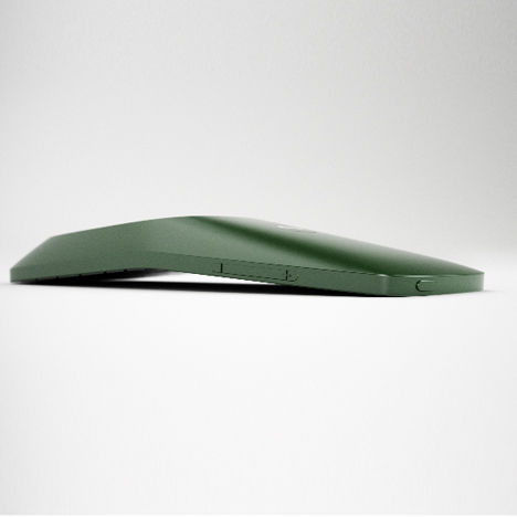
Folded Leaf by Claesson Koivisto Rune
Milan 2011: Swedish designers Claesson Koivisto Rune unveiled this mobile phone design at Superstudio Piu at Tortona Design Week in Milan.
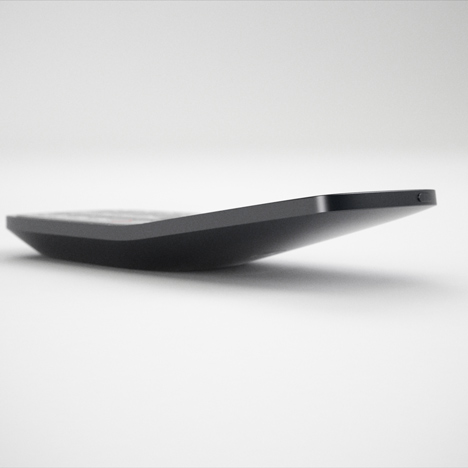
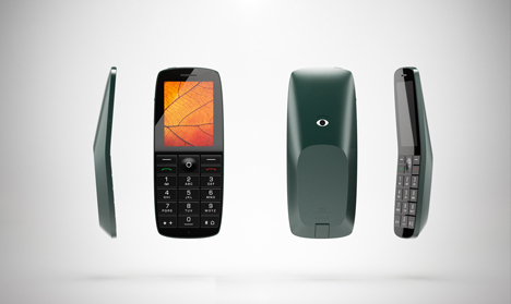
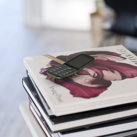
Called Folded Leaf, the phone for telephone company Huawei is bent in the middle to lessen the risk of scratches to the screen when placed face down.
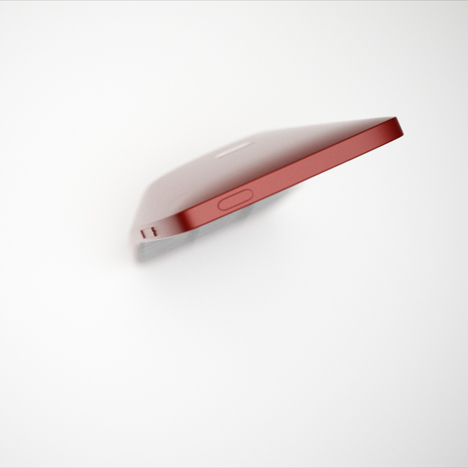
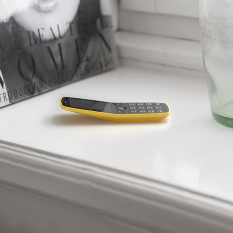
It has a flattened surface on the back, allowing it to rest face up and be operated with one hand on a table top.
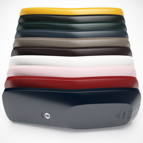
See all our stories about Milan 2011 »
More about Claesson Koivisto Rune on Dezeen »
Here are some more details from the designers:
FOLDED LEAF
A new mobile phone design by Claesson Koivisto Rune
Folded Leaf will be exhibited at Superstudio Piu, in Zona Tortona, during Salone del Mobile.
The following text is an abstract from the book ‘FOLDED LEAF / CLAESSON KOIVISTO RUNE’ published by Huawei to accompany the exhibition of Folded Leaf, launched at Superstudio Píu, Salone del Mobile, Milan 2011
Barely two decades old, the cell phone market has experienced exponential growth as mobile communication has become central to most of our lives. As the technology continues to mature at breakneck speed, so does the pace at which new product iterations reach the market. Huge consumer demand has given rise to frightful competition between producers. As technical advances have enabled superior functionality, the tendency has been to just keep adding more and more features. Lured in by the promise of yet more options (culminating in the latest generation of ‘smart phones’), it is no surprise that many of us are questioning the need and inherent complication of so many buttons, options and add-ons.
This reality was core to the design brief set by Huawei to Swedish architecture and design studio, Claesson Koivisto Rune, which was appointed by Huawei to work on a new mobile phone design in 2009.
As a reaction against overloaded functions, the motivation was geared towards confidently reducing the device to the essence of a phone, whilst enhancing the design attributes and creating a beautiful object. Stefan Munther, Head of Concept Creations at Huawei, explains, “We wanted to reach the delicate balance of a classical mobile phone but with no compromise on design and quality. It is our aim to launch the industry’s first truly design-driven phone that is accessible to all.”
Claesson Koivisto Rune’s mission was to create a design that re-engages with a more simplified and intuitive notion of communication and that sidesteps the functional hyperbole of many smart phone devices.
“It was my impression that the team at Huawei were initially attracted to our studio because we have an eye for architecture and furniture design, Our multi-disciplinary approach means that we were unlikely to approach this project like an experienced mobile phone designer.” Reflects Ola Rune. “We talked about designing a ‘phone-phone': the kind of phone that focuses on the core functionality of making and receiving calls and text messages.” Rune recalls. The idea of simplifying the offering and inviting a more intuitive response to the device’s functions seems quite obvious. Strangely, it is often a secondary concern for the industry.
Every aspect of the phone has been designed with the user in mind. Claesson Koivisto Rune were keen to achieve a design that would offer an enhanced physical and ergonomic user experience and that would complement and support the features of the human body.
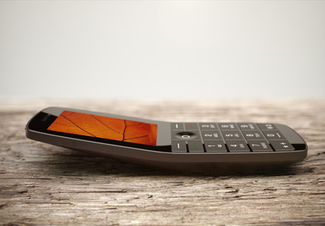
As the name suggests, the shape of the Folded Leaf takes its cue from nature. Primarily, however, the gentle fold in the body references the curvature of two familiar and successful phone typologies: the classic (if not slightly cumbersome) handset of the late 1930s and the ‘clam shell’ or ‘flip’ phone of the late 90s. These designs possess userfriendly qualities, namely a well-considered ear-to-chin angle as well as a more instinctive distance between ear speaker and microphone. The result is a body shape that is more ergonomically attuned – its contours complementing the natural curve between ear and mouth. Furthermore, the phone is ‘cupped’ and almost cradled by the hand when in use, either when held to the head for a conversation or when gripped in the hand to navigate its various functions.
When it comes to portability, the phone’s gentle fold is designed to respect the curvature of the human body – after all, the chest, hip or thigh are not flat surfaces. Therefore, the handset becomes a more natural accessory for its user – slightly rounded so that it feels natural to grip yet with some defined edges so that it doesn’t slip out of the hand like soap. “Every curve, facet, angle, and proportion optimises the user experience,” Eero Koivisto proudly states.
With all of these ergonomics considered, one can’t ignore our obsession with miniaturisation. In our quest to make phones ever smaller, many have shrunk to a size that is too fiddly for most human hands. In contrast, the need to pack in multiple features has turned smart phones into rather uninviting and clunky communication tools. Is it fair to say that the industry has drifted in its correct engagement with the end user, in favour of meeting other performance-related expectations?
The point of balance is in the lower half of the phone, which means the weight is centred in the palm of the hand making it easier to use the buttons. The relative length of the phone allows for a better sized keypad that doesn’t require miniature fingers to handle.
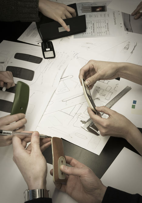
The underside of the phone is flat and allows the phone to sit flush on a tabletop without compromising on the structure’s integrated curve. As a result, the display lifts slightly and is angled towards the user, enabling better screen visibility and reduced reflection. Furthermore, should the phone be placed face down, the angle in the body prevents the front from scratching.
The desire to reduce the thickness of the phone was only made possible by scrutinising the internal circuitry and calculating where space saving could be afforded. Due to the component parts, it became clear that there was no need to achieve a uniform thickness, so the design studio made best use of that fact by angling the top half of the phone and tapering it off to a point. This detail defines a new visual direction unlike any existing design on the market.
As is typical of Claesson Koivisto Rune, the formal characteristics of their designs are often softened with one or two subtle ‘smile-inducing’ interventions. In the case of the Folded Leaf, the tiny camera on the back has been shaped to mimic the human eye, playing on the fact that it is quite literally an eye on the world. “We sometimes refer to this design as the ‘eye phone’,” jokes Koivisto.
Max Fraser
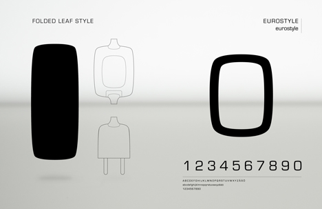
List of design features of Folded Leaf mobile phone design
1. Volume control. Clearly labelled + and - minus symbols in raised relief. Easy to locate and intuitive to control in mid conversation.
2. A comfortable angle to talk
An optimal angle between the mic and speaker makes for comfortable calls. The fold in the phone’s body is also adapted to your body, making the phone comfortable to carry in your pocket.
3. A separate on/off button
Keeping the functions of the phone clear makes it easier to use.
4. Speaker
Although Folded Leaf is thinnest near its top edge, there is enough room for a good performance speaker integrated into the front of the phone.
5. Comfortably-sized and clearly read keys
A clearly read font, a minimum of graphic symbols and keys that fit your fingers.
6. Microphone
Positioning the mic near the bottom of the phone’s front minimizes the risk of accidentally covering it with a stray finger mid conversation.
7. The Eyebrow
The loudspeaker helps frame the camera ’eye’ and provides speaker phone sound.
8. Look in to my eye - and smile!
The camera becomes a surprising and even memorable feature that has a haptic association to its function.
9. The Facet
This flat surface allows the phone to rest face-up on a surface. It is stable when messaging with one finger. Also, it helps in gripping the phone during calls. Finally, it gives Folded Leaf a sculptural quality that is pleasnt to the touch.
10. Integrated USB port
When not in use, the port is closed and flush with the rest of the phone’s body. It flips open for charging, data transfer and connecting to the hands-free headset.
11. OLED display
The OLED display has a higher density of pixels, making images and text clearer. It is also brighter than todays standard displays yet needs less power helping prolong battery life.
12. Navigation button
The depression in the middle of the five-point navigation button is easy to feel and fits the thumb well. It also help locate the thumb when pressing the button to select.
13. No scratches
The fold in the phone’s body protects the display screen from easily being scratched when laid face-down on a surface.