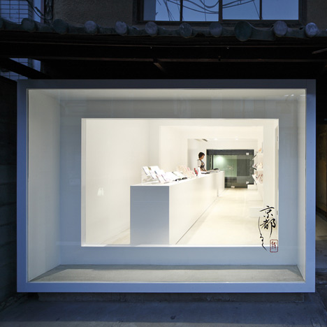
Architect Keiichi Hayashi of Japan has converted this traditional timber townhouse in central Kyoto into a cosmetics store.
The renovation retained the original planning of the traditional "machiya" building, with the addition of structural steel frames to the ground floor.
The ground floor houses the cosmetics shop and a courtyard, with an office and gallery on the first floor.
More stories from Japan on Dezeen »
More interior stories on Dezeen »
Photographs are by Yoshiyuki Hirai.
The following is from the architect:
Kyoto Silk by Keiichi Hayashi Architect
Kyoto, Japan
Kyoto Silk, a beauty cosmetic shop, is located in the centre of Kyoto, which is a famous cultural city in Japan. The project was to convert a ‘Machiya’, a Japanese traditional wooden townhouse, into a small shop. The building was required to be reinforced because the original building was deteriorating rapidly and it did not have the enough strength to meet the safety standards. Therefore, on the ground floor of the two stories, thin steel frames were fixed on the inside of the original wooden frames. And on the first floor, a plywood structure was used on the floor to keep the horizontal rigidity.
A typical ‘Machiya’ consists of ‘Mise’ ‘Niwa’ ‘To-ri Niwa’. ‘Mise’ means the life space in the room, ‘Niwa’ means the small courtyard, and ‘To-ri Niwa’ means the workspace and the passage of the half-outside air-well void. During repeated study and considering the ventilation, lighting, movement, privacy, approach to the street, and taking in the nature, it became clear that the constitution of ‘Machiya’ was most suitable for the new program as a building in a narrow space in the centre of the city.
As a result, in this project, I focused on the way that function as a beauty cosmetic shop could be complimented by the space limitations of this ‘Machiya’.
What is most important for this plan of a sales place is to make the products clear for the customers. (not simply as beauty display, but making it clear to the customer exactly what the product is.) A homogeneous, hard optical environment and simple shelves were considered so that the products never look exaggerated.
The courtyard is placed at the back of the sales space and is the space for the guests and the staff to take a rest. At the same time, it is the space to take in the small nature of the store. The space is able to be accessed directly through from the street. These relations are exactly the same as the original ‘Machiya’. The first floor of this building is used as an office and gallery.
Project Information:
Project name: Kyoto Silk
Location: Kyoto, Japan
Architect: Keiichi Hayashi
Design Period: February, 2009〜 April, 2009
Construction Period: May, 2009〜 June, 2009
Function: shop
Site Area: 52.38㎡
Building Area: 37.33㎡
Total Floor Areas: 67.58㎡
Stories: 2 stories
Structure: wooden frame (original)
Structure Engineer: Satoru Shimoyama / Shimoyama structure Office

