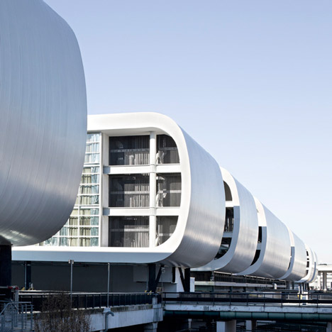
Sheraton Milan Malpensa Hotel by King Roselli Architetti
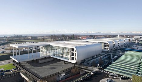
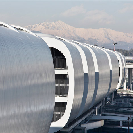
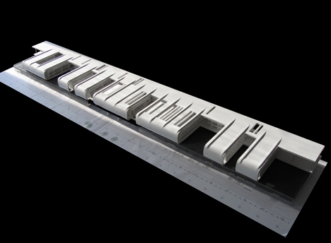
This 436 room hotel situated next to Malpensa Airport, Milan, has a rounded shell cut into seven bays, designed by Italian firm King Roselli Architetti.
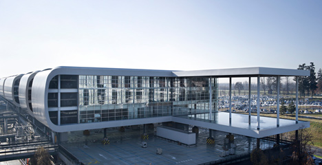
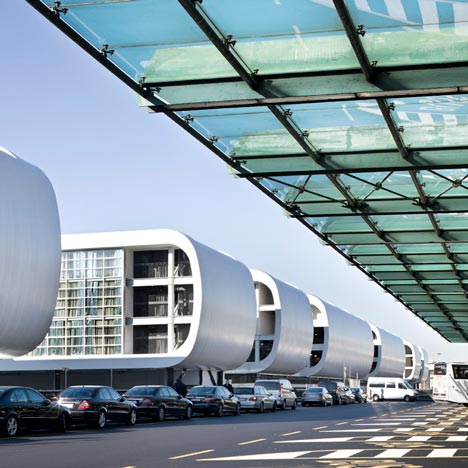
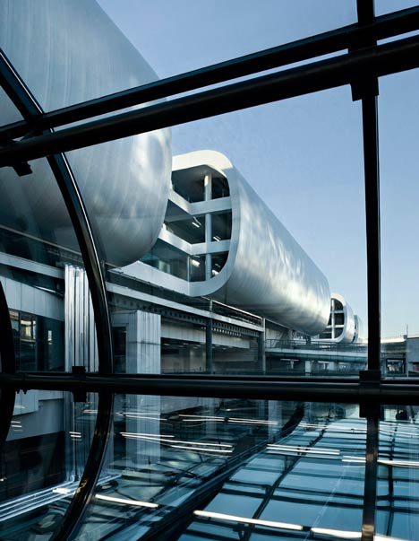
The Sheraton Milan Malpensa Airport Hotel & Conference Centre has a continuous fibreglass skin exterior which is wrapped around a series of steel arches to give the building its curved shape.
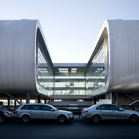
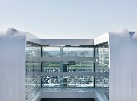
Hotel windows face out from the recessed openings, avoiding any direct views into the rooms from the adjacent airport.
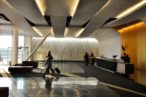
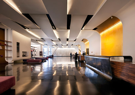
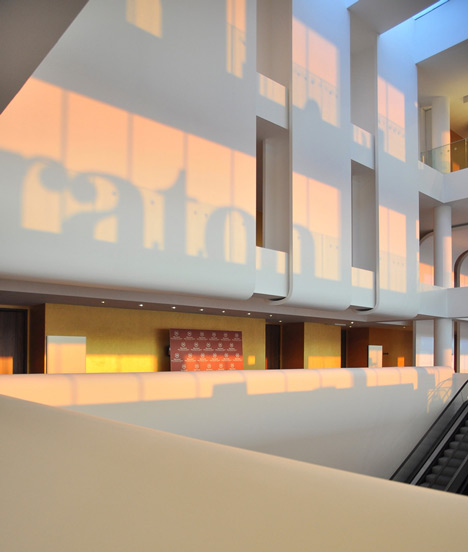
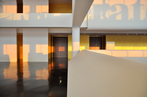
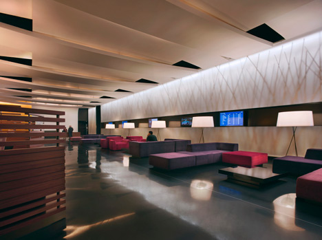
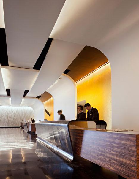
Internally the hotel lobby is defined by a woven ceiling, which is reflected in the polished terrazzo floor.
Exterior photography is by Santi Caleca.
More stories about hotels on Dezeen »
Here is some information from King Roselli Architetti:
King Roselli Architetti
The Sheraton Milan Malpensa Airport Hotel & Conference Centre- 2005-2010.
Design for architectural exteriors of hotel at Malpensa Airport (Milan, Italy).
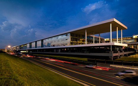
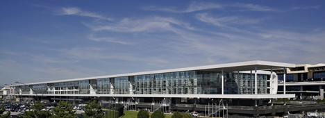
We were commissioned to design the exteriors of this large hotel in front of Malpensa International Airport as a result of our competition winning entry for the overall design of the building. Despite its size (420m long, 64m wide, 21m high) the building was conceived as a design object. Partly because Milan is Italy’s design capital, and partly because we were interested in investigating the technical and architectural properties of a skin or membrane to be perceived dynamically as façade not only on its four sides but also the roof- visible from the access road to the airport complex.
The hotel itself is set on an existing base consisting of a huge car park over the railway that passes underground. The hotel has 436 rooms, a conference centre, a spa accessible directly from the airport via an existing connecting bridge over the surrounding ring road.
Membrane
We were looking for a seamless shell to fold around the functional volumes of the buildings. After researching and detailing a number of alternatives- titanium zinc sheeting, Corian and similar solid surfacing, sprayed polyurethane damp-proof membranes, and waterproof concrete-resin based finishes- we finally opted for pultruded fibreglass panels. Pultrusion is a manufacturing process combining extrusion and pulling fibreglass through a die that can provide panels up to 1400mm wide and almost infinite lengths- we needed lengths of up to 25 meters. Aside from the lengths of the panels, the material has a series of qualities highly suitable for building: it is light weight, elastic, very stable in extreme temperatures (-20°C to +50°C), fireproof and waterproof. Reduced costs and construction times coupled with the inherent qualities and finish of the material have proved to be decisive in achieving the desired result in this project. This material is more often used for industrial products and so an enormous experience of precision detailing to tight tolerances has been accumulated over the years which came in very useful in the detail design of the membrane.
The shell is curved around a subframe of pultruded structural profiles and steel arches, wrapping the entire length of each bay, or module of the hotel in a smooth, continuous skin. The length of the hotel comprises seven bays separated by courtyards, with the curved façades facing the airport, and the rooms looking out on the courtyards. The almost flat roof, is treated as a façade to be seen from the airport, with openings onto terraces, light-wells or interior courts. The plant extracts and ventilation “breath” through vents twisted out of the roof membrane.
Guest Room Blocks
The layout of the rooms are organised around these courtyards which give a bar-code form to the plan and avoid a direct view from the airport into guest rooms. The western face of the hotel is left open to emphasis the horizontality of the volume with shallow water pools set into the lower level at the ends.
Grille
The car park is to be clad with a grille open for natural ventilation but opaque from the outside, to create a visually solid base the entire length of the building.
Façade
On the open (west) side these blocks of rooms articulate the façade in an irregular sequence of solid and void. The solids in turn are articulated by a series of thick sculptural PVC blackout curtains which give both depth and dynamic to the overall elevation. The folded shell alternates with the glass transparency of the enclosed volumes in which the reflective curtains mirror the external lighting conditions to produce a building that is constantly changing aspect. Though normally considered an item of interior design, the black-out curtains were seen as an integral part of the façade from an early stage. The regularity on the mullion and transom grid is syncopated by the irregularity of the curtains seen through the extra-clear glass.
Dynamic
The movement of people as they arrive and leave the airport, the tension created between solid and void, curved and straight line, the play of light reflected off and through the building, provide a variation of views and give a dynamic to the architecture that were looking for.
Escalator connection between ground and main floor lobbies
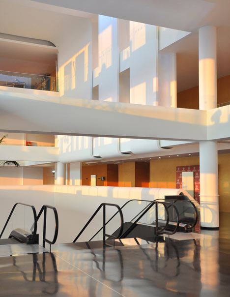
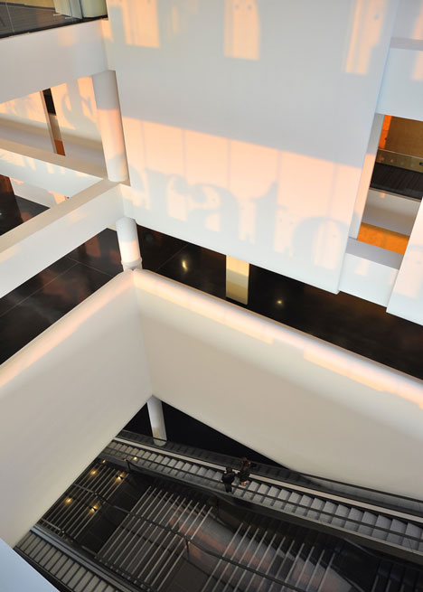
The escalator block was also considered as an element of the architectural volume rather than an aspect of interior design. The central portion of the whole building needed a visual and volumetric connection between the ground floor entrances, from/to the railway and the main car park to the west, and the main entry lobby from the airport 9,61m above. This is achieved by taking the lower edge (at +6,25m) of the shell enveloping the whole building and pulling a section of it down to the ground (at -3,30m) at though it were elastic. The volume created contains the escalator block. From the inside the escalators catapult the visitor to the first main level of the hotel opening into a full height void topped by large light-well. From the outside the volume strongly signals the western entrance to the building with connections to the railway below, the airport behind-on axis, and the hotel above.
Tensile Structures
Between each block of rooms the emergency staircases, also seen from the airport side through the transparent corridor links, will be clad in a tensile structure (to be built in the coming months). Stretching over the staircase and between the blocks, this essential component completing the design of the western façade with its sculptural organic form, bonds the parts together and gives a tension to the overall composition.
Building as large scale Product Design
The perception of the building, often seen as a whole despite its length, held together in a seamless shell reinforces the idea of it as a piece of product design on an urban scale.
Interiors
About half-way through the design of the building exteriors we were asked by Starwood (Sheraton) to design the main entrance spaces of the hotel. All other interiors (guest rooms, conference centre, restaurants) were designed by Saporiti Design Hotel.
Ground Floor Lobby (-3,36m)
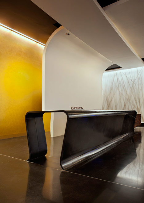
The ground floor lobby main space is defined by a giant trellis false ceiling. A back-drop of bamboo canes behind a translucent film on both sides provide back-lighting to the Sheraton Link and sitting areas. The dark reflective floor in venetian terrazzo reflecting the ceiling and light walls is plied over the wood volume of the reception desk. Another example of surfaces, be they interior or exterior, folded to define a space.
First Floor Lobby (+6,25m)
The space connects all three levels of the hotel via the escalator block down to the ground floor entrance and the false ceiling originating at the top floor level and serves as the conference centre reception.
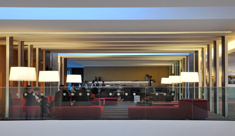
Club Lounge (+14,25m)
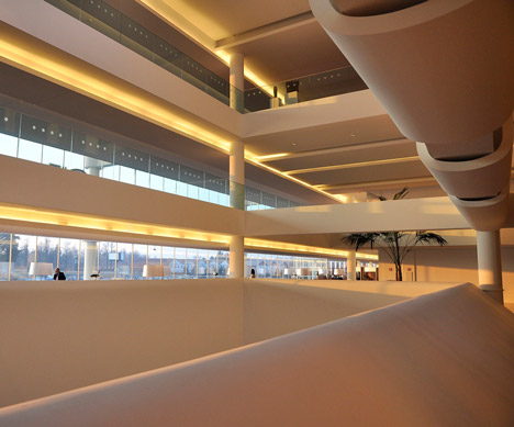
The Club Lounge is situated on the upper level of the hotel with a spectacular view of Monte Rosa. The warm tones of wood and gold, purple and violet of the furnishing contrast of white and reflective surfaces of the exterior structure.
Client: DEC
Area: 50.000 m2
Guest Rooms:436
Budget: 64m euro

Credits
design: King Roselli Architetti
project leader: Riccardo Roselli
project architect: Arianna Nobile
interior design: Daniele Del Prete
design team: Andrea Ricci, Mario Augusti, Katia Scarioni, Giandomenico Florio, Fabrizio Bonatti
landscape: Dana Vocino
consultant: Federica Pistola, Andrea Imbrenda
general contractor: DEC Spa Gruppo De Gennaro
fiberglass facade: P.C.R. Progettazione Costruzione Ricerca