Book and Coffeeshop in Madrid by MYCC
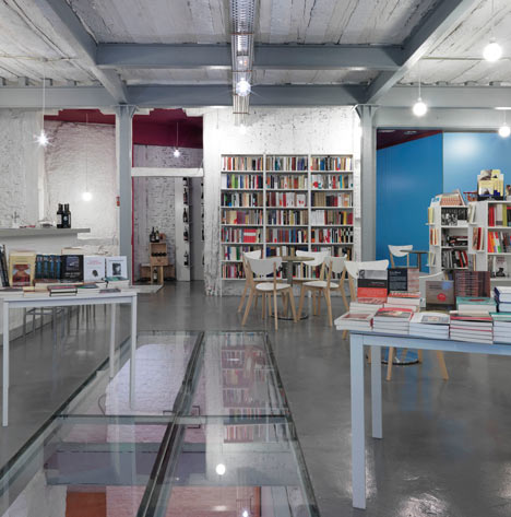
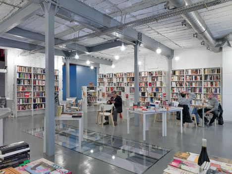
Spanish architects MYCC have designed the interior for a combined coffee and book shop in Madrid, exposing the original warehouse structure and inserting a glass floor between storeys.
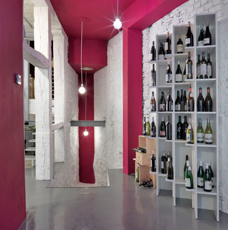
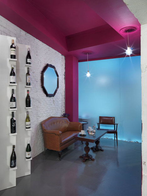
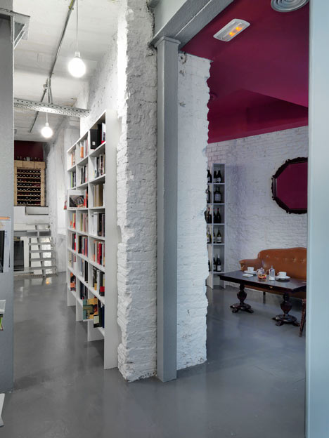
The coffee shop is open plan with white walls, flooring more typically found in a garage and flashes of orange and pink.
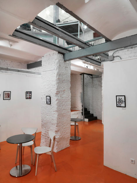
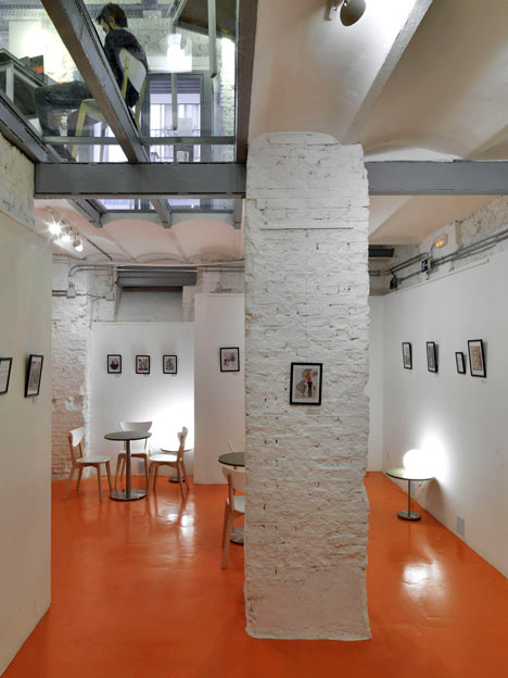
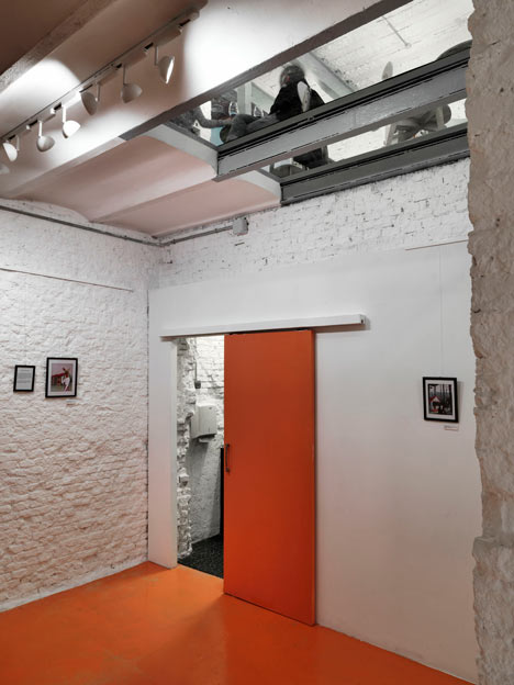
The glass floor allows a view to the basement, which has an orange floor and is used for exhibitions and events.
Photographs are by Javier Ortega.
More stories from Madrid on Dezeen »
The following is from the architect:
Intervention in a space of this kind means a job of strata, successive throughout his long life.
The typology of this place is no different from the typical that can be found, with minor variations, in the center of Madrid. Such spaces at the street with parallel structure to the walls of the main facade and a basement below ground level that has neither natural light nor ventilation. It holds no other tasks that serve as a warehouse.
By the time we receive the job, we found a long succession of these actions along the building's history and what we offer is a simplification exercise. We simply provide an attractive space that is capable of serving as a container for the uncertainties of the program. It was never clear how many square meters would occupy the area of afternoon coffee or the amount of books that would go on sale and how many different issues, or presentations and events of various kinds had to be on the top floor or below or evening cocktails weekend and revenue could sum up more surface than other different uses.
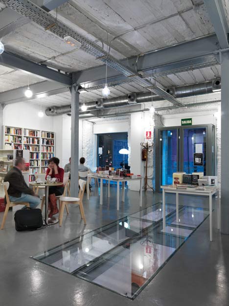
It follows the result. To this we add a really tight budget. We get a space that has direct reference to the New York loft and referrals to the art galleries of the early seventies. The idea was to design a site with an important legacy. It should be able to converse with the various activities that take place there and to the different types of visitors. This is a cleaning and lighting job in the very literal sense of the word. We had to expand the industrial side of this place and to file the excess of minimalism, in which it is easy to fall but we were not ready. Therefore, white paint, garage flooring, naked daylight bulbs should be complemented by an intense spatial relationship. Also a series of interrelated spaces should be developed, in order to provide a sensory experience of the visit. Should be a place of action more than for observation.
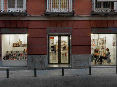
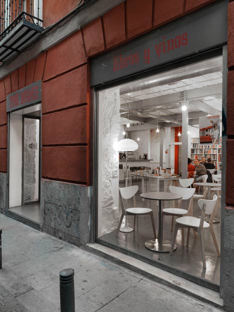
The place calls the attention of passers from the street by a large and light bare space that gives us the impression that there is sufficient height and surface to hold all you could be offered. We convey the idea of space left over; there will be far from being tightened ... Inside, continuous drift between haphazardly arranged tables and neither empty nor totally full shelves. In the back there is a more intimate and relaxed atmosphere painted in a wine colour, while a glass floor reveals a striking orange to invite to continue the journey. We are led to a basement that will serve as exhibition gallery even if it has to live with other programs.
Architects: MYCC oficina de arquitectura
Project architects: Carmina Casajuana, Beatriz Casares, Marcos González
Client: Tipos Infames
Location: Madrid, Spain
Project year: 2010
Photographs: Javier Ortega