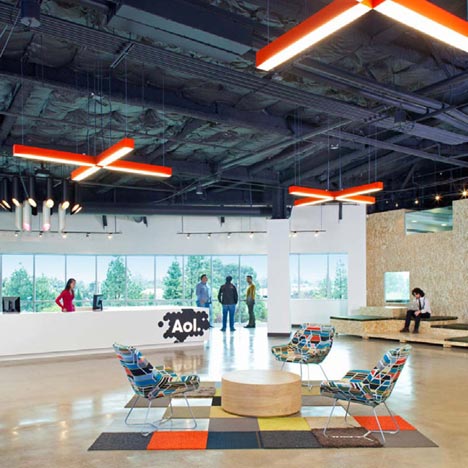
Here some photos of the new Palo Alto offices of internet services company AOL, designed by San Francisco designers Studio O+A.
The interior features an open-plan layout with exposed ceilings, concrete floors and meeting areas built from oriented strand board.
Cylindrical booths made of oriented strand board and translucent fiberglass form collaborative working spaces.
The company's logo is superimposed on imagery taken from abstract patterns, nature and pop culture to make custom-made wall coverings throughout the space.
Studio O+A were also responsible for the interiors of Facebook's Palo Alto headquarters.
Photographs are by Jasper Sanidad.
Here are some more details from Studio O+A:
AOL Offices
Palo Alto, California
AOL launched a company-wide initiative to adapt to changes in online culture—which the company had been instrumental in creating in the first place. As part of this effort, AOL moved its West Coast headquarters to a new corporate space in Palo Alto and brought in Studio
Here are soem images of AOL's new offices in O+A to give the office a fresh design.
The existing space retained a distinctly 1980s corporate aesthetic: drop ceilings hanging over every office, high cubicles separating employees into tightly defined workstations, dark finishes, and oblique lines.
O+A restored the space to a clean, white canvas—exposing the ceilings, stripping the walls to reveal the structure, and generally creating a spatial equivalent to the transparency that AOL was bringing to every aspect of its business.
Key to this approach is the concept of “honest materiality”—the embrace of materials and processes that originate in the construction industry and that increasingly provide the finish motifs for modern workplace design.
At AOL, for example, oriented strand board (OSB), typically used by contractors to separate spaces on construction sites, was sanded, shaped, and finished to serve as a contemporary accent throughout the complex.
Exposed ceilings, concrete floors, expansive sightlines, and modern furniture all contribute to the industrial look. The result is a space that communicates what it is made of and how it was built.
In keeping with this theme of transparency, O+A’s floor plan emphasizes collaborative space—a change from segregated private offices to open workstations and the collegiality of shared environments.
Two features of the AOL design highlight this concept. The first is a series of circular pods positioned throughout the main work areas as impromptu meeting rooms. Constructed of OSB and translucent fiberglass, these cozy silos provide a space for informal collaboration and spontaneous creativity. To encourage that spontaneity, the pods are open to all employees and cannot be reserved.
An even more prominent feature is the large, bright, collaborative space AOL has dubbed the Town Hall. Part kitchen, part play space, part kick-back area, the Town Hall also functions as an all-hands common area (Ariana Huffington spoke there when AOL acquired the Huffington Post), modeled after late-night eateries in San Francisco’s Mission District.
The kitchen’s bench-seating, ample light, and bursts of color against a white palette go well with the game and relaxation area. Centrally located to bring together staff from departments that might not otherwise interact, the Town Hall is designed to foster the kind of creative cross-pollination for which tech companies like AOL are renowned.
And then there are graphics. AOL’s new logo—the company’s initials in a simple white font—can be placed effectively on any colorful background. Those playful backgrounds vary throughout the headquarters and include both abstract patterns and imagery drawn from nature and pop culture. All wall coverings in the space are custom designed.
The design embodies the elements of the new AOL—transparency, collaboration, creativity, and playfulness—to create a stimulating environment for the firm’s staff.

