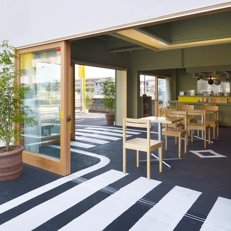
The asphalt surface of a car park extends inside this cafe in Shizuoka, Japan, by Japanese architects Suppose Design Office.
White-painted road markings continue across the interior floor surface, denoting route directions and zebra crossings.
Door frames and furniture details are picked out in yellow, matching the flagpoles of a driving school that occupies the car park.
Recycled car seats are used as chairs and benches are modelled on bus-stop seating.
Large glass panels slide back to remove the walls between cafe and car park.
More projects by Suppose Design Office on Dezeen »
Photography is by Toshiyuki Yano.
The following information is from the architects:
Café/day
When I was a child I caught some killifish and kept it in a sink. If I was in the same situation now I will by a fish tank. When a fish tank is called a fish tank it will be used as a fish tank. This is something simple but the sink could have been called a fish tank as it had similar function as a fish tank. When you give a name to an object it inherits the function of the name but if you design a place without a name then it is free to develop its own name by the occurring activities.
Café/day is located within a quiet residential area 5minutes from the train station of Numazu-shi, Shizuoka. The project was to renovate two unit of a Izakaya (Japanese style bar) located on a ground floor of a two storey building.
In front of the building there are car parks, a road, and a driving school and it felt like the road continued forever. When observing the driving school, there were a lot of yellow cars and even the poles that configured the driving lane was yellow. The colour yellow was very influential and the surrounding feature gave influence in designing the café.
The plan was to make the two Izakaya into one big space by demolishing the party wall and to selectively demolish parts of the wall to open up the space. The counter, lighting fixtures, and fixed furniture were painted to a single colour to make it abstract and erase the name of Izakaya from the space. The only new material that was use was the flooring was the most apparent feature of the surrounding, asphalt was continued into the shop and identify the internal space and external space by the white lines on the floor. The café was able to establish itself as a true open café.
The furniture also incorporates the characteristic of the outdoor space. The bench was designed to mimic a bus stop bench and for the sofa, the car seats were modified and changed to become a sofa.
Click above for larger image
Inside the café, similar to the driving school, the colour yellow have been placed in the café and it creates a feel that the café is a part of the driving school.
We designed the space so that the bar counter to became book shelves, and the Izakaya itself to a café and the activities of gathering, talking and drinking coffee made the it more like a café.
We used power of names in a paradoxical manner and found a new approach a design process in renovation works. We would like to start with no names in the process of designing in future.
Click above for larger image
Location: Numazu city, Shizuoka, Japan
Principal use: cafe
Construction Company: Kanou kenchiku
Structural Engineer: N/A
Main Structure: existing building
Site Area: N/A
Total floor area: 73.71sqm
Completion: December. 2010
Design period: May - September. 2010
Construction period: October 2010-November. 2010
Project team: Suppose design office | Makoto Tanijiri,
in-charge: Hajime Nagano

