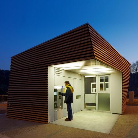
Parking Attendant’s Pavilion by Jean-Luc Fugier
French architect Jean-Luc Fugier has designed a contorted timber hut to house a parking ticket machine.
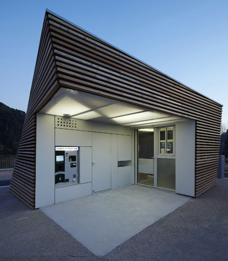
Located in a car park outside Aix-en-Provence, the small building also houses a parking attendants office, a kiosk window, a restroom and a bin.
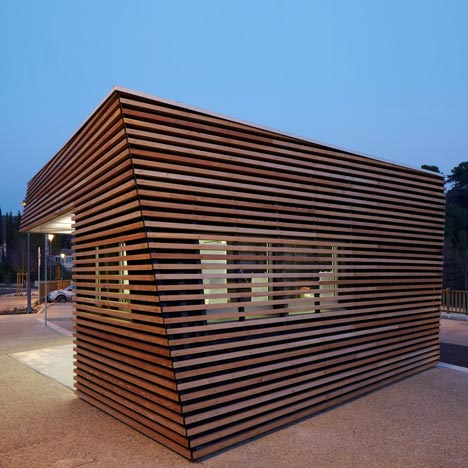
Horizontal timber batons wrap the exterior of the hut and an integrated canopy shelters ticket-purchasers.
A few other small projects featuring timber batons have been recently featured on Dezeen - see also a temporary theatre in Estonia and a pavilion of offcuts in Atlanta, Georgia.

Photography is by Philippe Piron.
More information is provided by the architects:
Parking Attendant's Pavilion
The Story of a Parabolic Hyperboloid in Provence, France
The Task
To reduce downtown traffic congestion, the Communauté du Pays d’Aix (CPA) developed a strategy to encourage the use of public transit through drop-off parking lots in strategic locations around Aix-en-Provence. The first two parking lots used a simple prefabricated building that reflects the Provencal cabin, equipped with all of the characteristics meant to guarantee their local identity. For their third parking lot in the north-east area of the city known as The Pinchitats, the CPA decided to commission an architect to design the parking attendant’s pavilion instead of using that of the Planning Department.
Delighted by this opportunity of change, we were inspired to work with a reputable city open to contemporary architecture. Typical of design, the project emerged out of concern for the cultural context of the city. Is there place for a contemporary architectural project? What can we do to open their minds?
The interest in such a project proved to be much more than its small size, as it was quickly considered to be an amazing experimental opportunity. A bit of research on micro-architecture revealed that we were voyaging into a line of work called architectural follies.
How can a building so modest in size, with such dense program requirements and site restrictions find its identity? It must develop its own image while exhibiting to the project’s environmental concern and maintaining the simplistic quality of similar small-scale public buildings.
The Project
The parking lot is situated outside of the city centre surrounded by a lush landscape, placing the building in isolation and consequently it is highly visible against the flat parking lot. The presence of the original parking program forced us to design on a cramped piece of pavement at the entrance. These conditions prompted us to focus on the value of the project as a symbol as well as its morphological autonomy.
The objective is simple: control the entrance and exit, guide the vehicles, ensure a clear view of the entire parking lot, all while offering the public a welcoming and informational space. The architectural expression of the pavilion was found in the contradiction between controlling and welcoming the public, forming a duality between a plain building that groups the necessary mechanisms for control while realizing that which is necessary to create a welcoming public atmosphere.
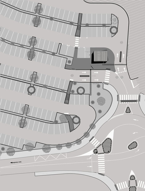
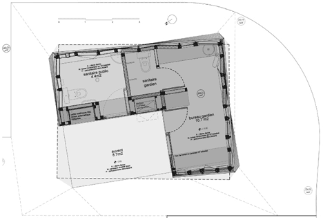
To create a presence on the plot between a fence and the parking lot, we had to start by finding our place and a way to profit from the traces of the original building and its restrictions. In plan, the building respects the existing guides of the site by running parallel to the road and the fence. It begins to twist at grade to direct the reception area towards the pedestrian walkway. The goal was to reinforce the opening of the building towards the public through a simple and clear visual context. The twist heavily influenced the project by materializing the programmatic tension between controlling and welcoming the public, resulting in a hyperbolic paraboloid shape.
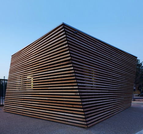
A single lowered corner allows the roofline over the entrance to project, creating a unique slope. The apparently simple geometric form hides the kinetic game at play, influencing the way in which one perceives the building and making it difficult to understand. The contortion attempts to go along with the flux in circulation that encircles it. It is in this simple distortion that a complex shape is generated, achieving the project’s objective: a discrete yet intriguing contemporary form found in the diversity of its perceptive approaches.
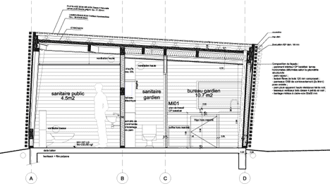
We chose an L shaped plan that optimizes the attendant’s view of the parking lot with openings on every facade. The layout creates a large area that is both open and protected from the elements. A canopy which is lit at night reinforces the presence of the structure and its program after dark. This space assembles and shelters the group of public services in such a way that all of the amenities such as the restroom and attendants office are easily accessible, while the exterior service fixtures (automated ticket machine, waste receptacle, newspaper dispenser, alarm, climate control and lighting) are integrated into the wall.
Constructed entirely in wood, the building presents its geometric form through the use of materials. The rough cladding sets up rows of identical lines of the same size that materializes the function of the building as an environmentally friendly service pavilion. They are successively contorted by a slight rotation that helps one perceive the movement of the building. The filtered envelope controls what one sees, allowing the attendant to see without being entirely seen. Although it is relatively simple, the cladding groups the dense variety of programs into a single exterior treatment, guaranteeing it’s symbol as a public building and addressing the wishes of the city. It is necessary to disguise the windows and ventilation, to design the blinds, lights, waste receptacle, displays and hardware in such a way that everything is integrated and protected.
The envelope system ensures the protection of the glazing in terms of thermal heat loss and security. It functions as a brise-soleil and helps with the ventilation, addressing the need for comfort during summer months. Inside, the cladding is composed of bakelised plywood. This material is used in the form of strips placed horizontally along the geometry defined by the structure. Backlit polycarbonate alveolar panels for the ceiling laminated flooring, and a natural resin complete the interior materials used to contrast with the rough exterior envelope.
Driven by the environmental context from which the project is derived as well as the surrounding landscape, we looked at the concept of a cabin. Natural and environmentally friendly materials from local industry that were acquired from nearby businesses and carried out by local labour with remarkable skill demonstrate a real approach to sustainable architecture, from concept to construction. It’s about giving meaning to architecture that is capable of expressing the environmental goals established by vehicle drop-off programs.
Client: Communauté du Pays d’Aix – Displacement Services
Project team: Jean-Luc Fugier lead architect, FeST Architecture associates
Location: Drop-off parking lot on Sisteron Road, Aix-en-Provence
Program:
- Parking attendant kiosk equipped with office for surveillance, restroom and kitchen
- Public reception area equipped with an accessible restroom, ticket machine, information and payment window
Type of mission: Complète limitée au bâtiment
Cost of the works: 62 500 Euros HT
Project area: 30 m²
Duration of Research: 9 months
Duration of Design: 3 months (including 3 weeks on the construction site)
Project year: December 2010