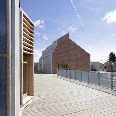
Sarah Wigglesworth Architects designed this school in Wakefield, England, using red bricks and industrial building shapes that reflect the surrounding vernacular.
The Sandal Magna Community Primary School was constructed using timber and bricks, while the landscaping utilises reclaimed bricks from the demolished Victorian school that the building replaces.
The bell from the old school building now hangs in a new bell tower in the centre of the site.
Classroom blocks and the school hall have asymmetrical roof profiles that accommodate ventilation stacks.
Allotments behind the classrooms allow children to grow plants and vegetables.
The library is contained behind a screen of timber louvres.
The school provides education for children up to the age of 11 and a community room for adult education.
The school is close to the Hepworth Wakefield Gallery that was completed earlier this year by David Chipperfield - see our earlier story.
Photography is by Mark Hadden.
See more stories about schools on Dezeen »
Here's some more information provided by the architects:
Sandal Magna Community Primary School in Wakefield opened in October 2010 and recently won a RIBA Award. The new school is one of the most carbon efficient schools in the UK.
Sarah Wigglesworth Architects were appointed by Wakefield Council to design a replacement for the Victorian Sandal Magna Primary School, which had come to the end of its life.
The new building accommodates 210 pupils aged between 5-11 years alongside nursery provision for 26 children. The school also contains a community room for use by parents for adult education and other activities, and has been designed to permit expansion in the future to a 315 place school.
The brief called for high quality sustainable design addressing: functionality, sustainability, buildability, efficiency, aesthetics and durability. After several site visits and meetings with Wakefield Council, the school, staff, parents, the local community and other stakeholders, Sarah Wigglesworth Architects established the following key issues which would inform the design of the new school:
- » importance of new identity for the school with a positive street presence
» maintain a sense of history and memory (a new bell tower for the old bell)
» provide a welcoming building for students, parents and teachers
» site security and robustness of materials
» scale and relationship of new building to the site
» flexibility of spaces within the new building
» provision of a variety of play spaces
» importance of a community space
» importance of energy efficiency and sustainability
The school’s design takes its cue from its vernacular surroundings, and is laid out as three parallel single storey wings that reference the surrounding pattern of terraced houses and back streets. The red brick of those terraces is also used extensively throughout the school. Along the teaching block, sturdy ventilation stacks echo the rooflines of neighbouring houses while, at the centre of the site, the school is crowned by a striking new bell tower evoking the tall chimneys of Wakefield’s industrial heritage.
Click above for larger image
The overall design, however, is highly contemporary. A range of cladding materials such as raw timber, weatherboarding and corrugated rainscreens is used to denote different uses within the school, and adds further interest to the sharp, angular geometries of the building.
Click above for larger image
Inside the school, services and building elements such as ventilation, soundproofing, sprinklers and a rainwater harvesting system are all proudly visible. This is quite deliberate: part of the brief was to make the building a demonstrative tool to form part of the curriculum for learning about buildings and sustainability.
Click above for larger image
Funding was secured from the former DCSF Standards Fund for a range of low carbon measures at the school. The sustainability features of the school include:
- » completely natural ventilation
» a ground source heat pump to provide heating, hot water and cooling
» 100 sq m of photovoltaic solar panels to power the ground source heat pump
» a masonry structure providing thermal mass throughout the classrooms
» reuse of reclaimed bricks from the old school in retaining walls and garden features
» a set of allotments for pupils within the school grounds
Click above for larger image
A key aim of the design was to produce a safe learning environment for the pupils. The flexible classroom design and “street” layout of the school encourages different numbers and age groups of children to meet and learn together, while the main circulation space between the classrooms, ICT and library spaces is an additional learning hub. The layout avoids hidden corners and blind spots, and careful thought has been given to landscaping to provide different types of outdoor play space including areas for learning, planting, quiet zones and games. Each classroom has direct access to the outdoor playgrounds and views to the surrounding landscape.
Click above for larger image
Sarah Wigglesworth said:
“I am so proud of Sandal Magna Community Primary School. As our first completed school it’s a milestone for our practice. In our work we strive to produce thoughtful, low-energy buildings that are simple to use, cherished by their occupants and economical to run and maintain. I hope we have achieved that at Sandal Magna and demonstrated that we can apply our architectural principles on a larger scale.”

