London Tube Map by Mark Noad Design
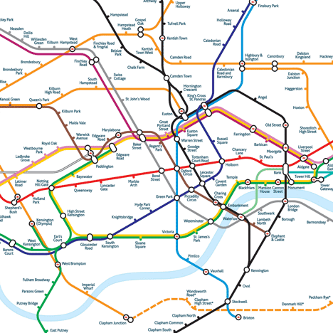
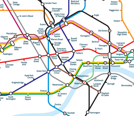
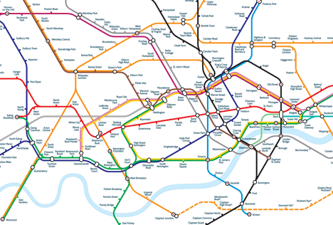
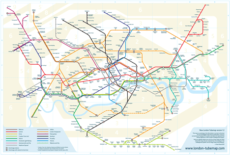
London designer Mark Noad has revamped the London Underground map to be more geographically accurate.

The diagram uses lines set at 30 and 60 degree angles, unlike the original map by Harry Beck that uses 45 degrees angles only.

Station names are typed in a more space-efficient font that can be easily read on mobile devices as well as in print.

An interactive version of the map can be viewed on a dedicated website.
See also: city street maps that can survive being being screwed up and stuffed into a pocket or bag.
Here are some more details from Noad:
As a born and bred Londoner, I’ve always taken the Tube Map for granted, but as a designer, I’ve listened with interest to friends from outside London and overseas saying how confusing they find it. The major criticism of the diagram is that it bears little or no relation to London at street level.
The original London Underground diagram, designed by Harry Beck is one of the greatest designs of the twentieth century. He rationalised and clarified a complex system to produce a simple, easy to follow piece of information graphics.
Over the years, the Underground system has grown and now has twice as many lines as there were in Beck’s day (the last version he worked on was produced in 1960). Although the current diagram still follows the same principles, they have not been applied with any great care. A good example is the London Overground network which has been shoe-horned in leaving stations nowhere near their neighbours on other lines
If Harry Beck saw the current diagram, I don’t think he would be happy to put his name to it. So I wondered what he might do if asked to start again with the different parameters we have today:
- more lines and upcoming additions including Crossrail, the Docklands Light Railway extension and the Northern Line extension to Battersea;
- the Docklands Light Railway and London Overground moving the emphasis away from the Circle Line loop;
- developments in technology meaning it is just as likely to be viewed on-screen as it is in print; and
- many more visitors from outside London, especially for the Olympic Games next year.
The map I’ve created uses similar principles to Beck’s design, fixed line angles – in this case 30 and 60 degrees instead of 45 – and shortens the extremities of the lines to make it more compact.
I commissioned a new condensed typeface which makes better use of the space, New Underground Condensed, based on Edward Johnston’s original font.
There has been an encouraging initial response which has created a great deal of debate. We are now working on an update to the site that will introduce different layers for the zones, disabled access, walking shortcuts and the times between stations. Users will be able to switch between the layers to find the information they require.
We will also be adding a shop facility where we will be selling posters and pocket-sized versions of the map in response to the many requests we have had.
The app is in development with the Apple one currently being reviewed for approval and the Android one following close behind.
There have been several requests to use the map on websites and in apps and even on canvas for a hotel reception area. We are also actively looking for partners and sponsors to help fund the development of the map.
This is just the start, we want to go much further changing the way you access information from a map.