Rethinking the Waiting Room by Fuelfor
Nobody likes hospital waiting rooms. Barcelona design agency Fuelfor have designed a series of conceptual improvements to make them a little more bearable.
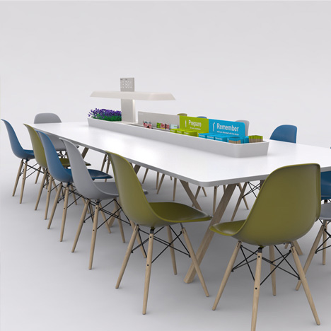
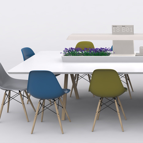
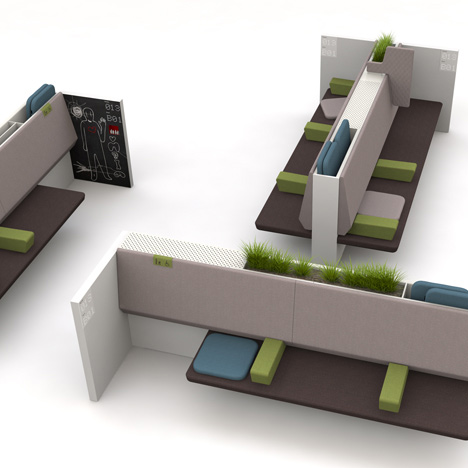
Their suggestions include a communal table where patients and their family can prepare for consultions, a smartphone application for patients to track their progress in the queue and a modular seating system that would allow pushchairs and wheelchairs to sit alongside family members.
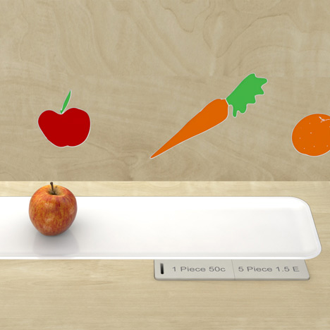
A free-standing vending machine that's styled like a kitchen counter would encourage patients to choose healthy drinks and snacks.
Last year industrial designers Priestmangoode proposed hospital wards modelled on health spas and first class airline cabins. Watch a movie about the concept here and an interview with Paul Priestman here.
See more design for healthcare here.
Here are some more details from Fuelfor:
Rethinking the Waiting Room by Fuelfor
Waiting is a common pain point in many health systems. As resources are increasingly overstretched, some degree of waiting is inevitable for most healthcare services. And yet hospital waiting rooms tend to be some of the most uncomfortable spaces to spend time, both physically and emotionally.
Research shows that a well designed waiting experience has the potential to improve the overall perception of a health care service and to optimise care delivery processes.
Gathering insights through site visits to several hospitals and clinics and discussions with care givers and patients, fuelfor has created a system of furniture, interior design, service and signage concepts that aim to make the experience of waiting in healthcare positive, effective and comfortable.
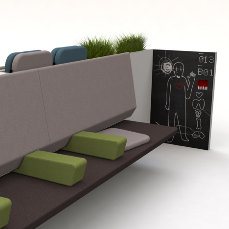
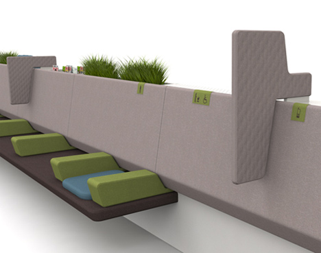
MODU is a modular furniture system that can be adapted to support different types of activities, people and facilities; elements can be reconfigured by a healthcare provider as a service evolves. Moveable arm rests and a choice of different density cushion pads allow people to create their own physical comfort zone. Wheelchair users and children in strollers have designated waiting space alongside their loved ones.
Soft design qualities communicate comfort, but not at the expense of hygiene, with specialist material finishes ensuring safe surfaces. Active and passive air cleaning is achieved through integrated ventilation and carefully chosen plants. A queue management system provides displays at each end of the seating unit, reassuringly near to people as they wait.
When you sit at a table its surface naturally creates a personal space around you. TABLEAU is a communal table for waiting rooms that provides social and private space for people to read, write, relax or socialise. Integrated lighting, storage and queue management displays create a dedicated area in which people can prepare or debrief after a consultation. Service staff can also use the table as an informal work space or a place for conversations with patients and loved ones.
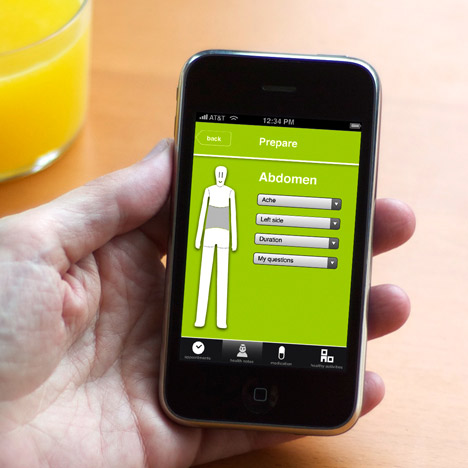
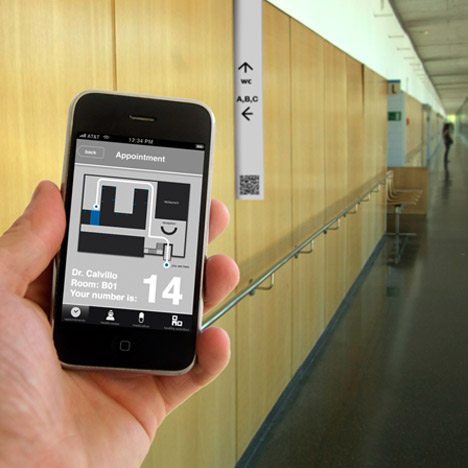
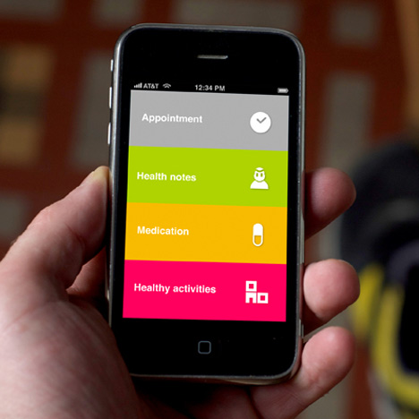
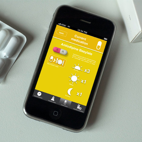
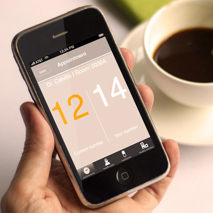
INLINE is an iPhone application that tells you more than just your number in the queue. You can use it to make your healthcare appointment, locate your doctor’s consultation room at the clinic, as well as make use of your waiting time for a better, more effective medical consultation.
Features include reassuring dynamic updates of your position in the queue, a place to keep health notes, medication records and access to information about local activities for a healthier lifestyle. Simple visual interfaces make waiting time, effective time for you.
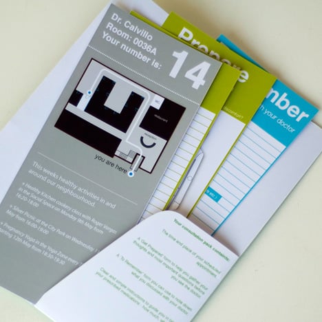
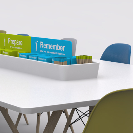
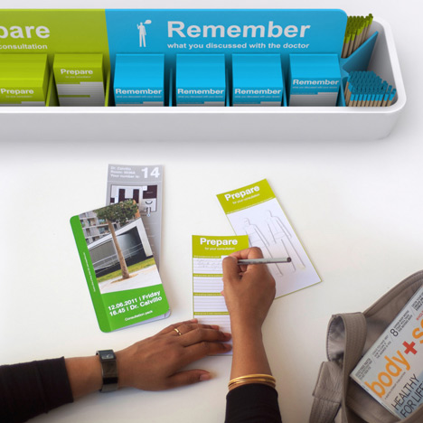
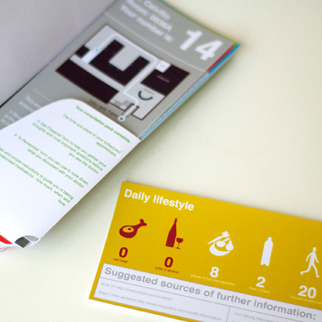
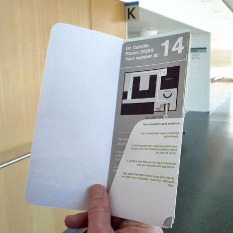
FOLIO is a low-tech solution that helps people review and organise their medical consultation records, past and present. Important details about medications and appointments are stored in a simple paper wallet.
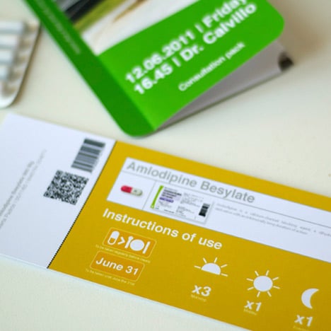
Prepare and Remember cards on which people can record their personal health notes can be kept safely in one place, ready to bring to a consultation. Information is deliberately simple, visual and color-coded for easier interaction. Individual healthcare providers can always tailor the content and branding to reflect their own health care services.
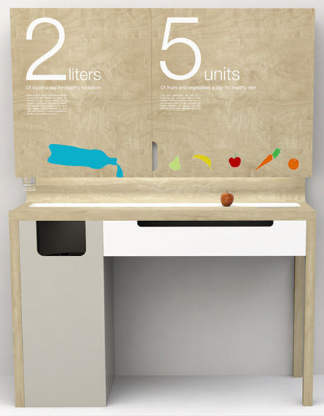
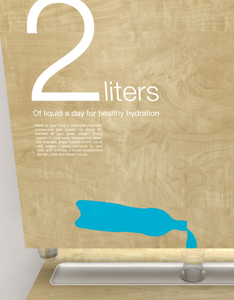
COUNTER ACT is a freestanding vending unit for the waiting room that combines a display surface for public health messages with the vending of healthy snacks and water.
More kitchen counter than vending machine, the unit triggers people to interact and practice healthy habits in a context where they are likely to be thinking about their health.
HEALTHPOINT is an interior architecture concept that is designed to promote healthy living, whatever your health condition or lifestage. A welcome wall as you enter introduces the doctors on duty for consultation as well as a variety of local healthy activities.
At the rear of the space is a workshop area that can be used by local health and social care services for group meetings, classes etc... Local citizens can share their healthy tips and stories to create a living library of community health to inspire and encourage active lifestyles.
