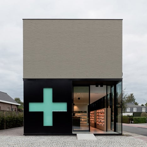
A cross-shaped window in the sliding door of this Belgian pharmacy transforms into a green sign during opening hours.
Pharmacy M was recently completed by Belgian studio CAAN Architecten and is situated on the site of a former farm in the outskirts of Ghent.
The sales floor occupies the entire ground floor of the building, while a lab can be found in the basement and a small apartment is located on the first floor.
The pharmacy is constructed from grey brickwork but also features glass walls on three elevations.
The first floor apartment can only be accessed though the shop and opens out to a roof terrace.
A few other pharmacies from the Dezeen archive include one with a facade punctured by Braille lettering and another with a tree-like green panel ceiling - see more stories about pharmacies here.
Photography is by Thomas De Bruyne.
Here are some more details from the architects:
The pharmacy used to be located at an old farm on the existing parcel. The parcel is situated next to the main road populated by a diverse array of types of building.
Due to the outdated facilities and limited potential of the farm, it was a logical step to demolish the farm and to start from scratch.
At the front side (Keistraat) the new volume has been placed on the same border line as the old farm to integrate the new construction into the existing context.
The program of the pharmacy defined the design of the building.
The ground floor locates all the necessary facilities for a modern pharmacy, such as an extensive sales area, a night safe, a preparation area…
The surrounded glass wall creates a light and transparency which leads to a greater accessibility.
The basement has been used for storage and lab area.
At the first floor a private space is located with bathroom, kitchen/ dining/ sleeping area. The terrace and green roof elevate the entire space. The green roof is also a visible mark from the street side.
The design and material choices (glass, dark grey bricks) form the modern shape of the building, which we consider to be well integrated in its surrounding context.
The transparent and minimal appearance of the building makes it more accessible, identifiable… a ‘landmark’.
The building contributes to a more contemporary way of service, which was required for this pharmacy.

