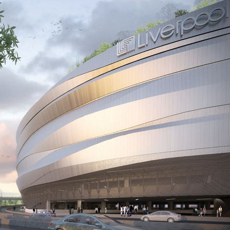
This shopping centre by Mexican firm Rojkind Arquitectos is nearing completion in Huixquilucan, Mexico.
The building for the Liverpool chain of department stores sits in the middle of a busy motorway intersection.
The façade is double-layered to protect stores and people from the car-dependant environment of Interlomas on the outskirts of Mexico City.
Light escapes between the layers of the folded façade at night.
The client, department store owners and operators Liverpool, are named after the city of Liverpool in the United Kingdom. In the 19th Century, much of the imported merchandise sold in the stores was shipped via the English port.
Other projects by Rojkind Arquitectos include the restoration of the National Archive museum in Mexico City, a new museum in Mexico City in collaboration with BIG, and A Nestle Chocolate Museum and a Skyscraper in Mexico City.
Here are some more details from Rojkind Arquitectos:
Liverpool Department Store
Understanding the new role shopping centers play in today’s society, in which they have become a magnet for social encounters and even cultural exchanges, Rojkind Arquitectos was commissioned to design a façade for the new 30,000m2 department store as part of a new era in the company’s pursuit for re-branding itself. Liverpool department stores, with a 164-year-old history, have for the most part always been one of the main anchor stores for large shopping centers in Mexico. Its strategic location plays an important role in the immediate urban context.
Located in the northern “car dependent” suburb of Interlomas on the outskirts of Mexico City, this relatively new suburb is characterized by a lack of open public space and a myriad of roads on which pedestrians are not welcomed.
The new facade responds to a fast pace of the everyday life in this isolated suburb, sitting in the middle of a very congested intersection of highways and overpasses, which give it a futuristic “Blade Runner-like” feel.
With an existing circular footprint, the customization process of fabricating directly from 3D models drove the ideas behind the façade design intent. Speed became a very important factor in the way the project is experienced. Flexibility, fluidity and dynamism drove the design process.
Click above to see larger image
The double-layered façade shelters the store and it’s users from its chaotic environment. It’s sleek stainless steel machine-like exterior, is intended to evolve in a very fluid way as the intense sun bathes it throughout the day. It’s a contradiction to the grit and chaos of its surroundings; a juxtaposition that becomes a new reference for this part of the city.
Click above to see larger image
At night the hollow cavity between the layers of the façade will be engulfed in light that will subtly escape through the fine reliefs formed at the folds in the skin. The façade transforms at night from its solid monochromatic appearance during the day to a dynamic form accented by light.
Click above to see larger image
As part of this new endeavor by the client, multiple design firms were selected to participate in the various parts of the project: the interiors were done by FRCH, the rooftop garden by Thomas Balsley and the gourmet space by JHP.
In the initial workshops sessions, it became clear that the main central interior space needed to reflect the dynamic nature of the exterior so the client retained Rojkind Arquitectos to design this space as well.
Click above to see larger image
As the visitor enters, they are met by a three-story atrium full of movement and filtered daylight that encourages the visitor to move throughout the department store.
Click above to see larger image
The curved backlit balconies are intended to be a reminder of the fluidity of the exterior façade but at a more human scale as opposed to the urban scale of the exterior façade. This play between the inside and outside is intended to create a sense of discovery for the user that culminates at the roof garden.
The roof terrace will contain a park-like setting that can be enjoyed not only by the store visitors but also by the surrounding local community, thus enhancing the social role that the department store will play.
The complexity of the project combined with a very tight schedule and a difficult urban site condition, required the combination of a highly skilled design team and collaborators in which the interconnectivity and digital design tools have radically transformed the way we design and construct buildings today.
Project: Liverpool Department Store
Architects:rojkind arquitectos Michel Rojkind [Founding Partner] Gerardo Salinas [Partner]
Program: Retail ConstructionArea_ 30,000m2
Status: In construction
Design Date: July - December 2010
Construction Date: March - October 2011
Location: Huixquilucan, State of Mexico
Client: Liverpool

